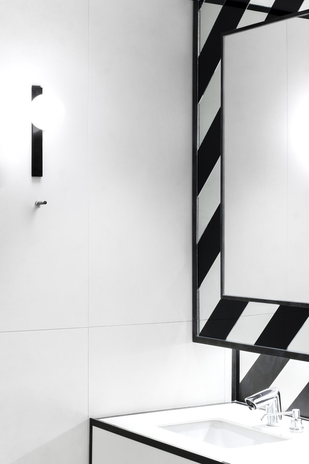
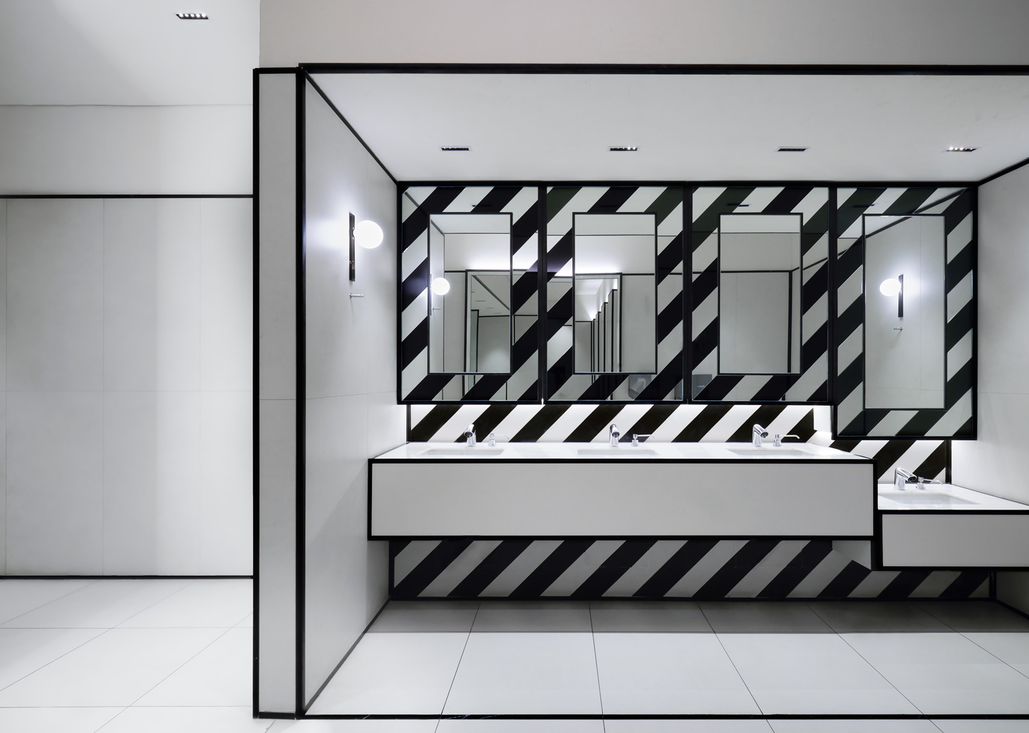
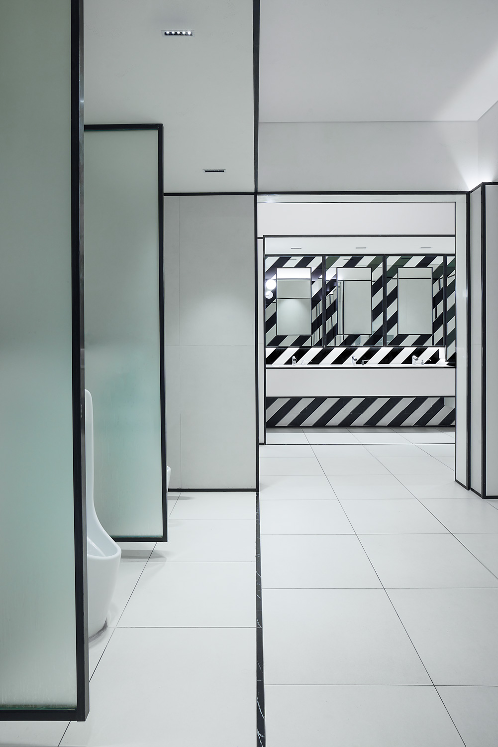
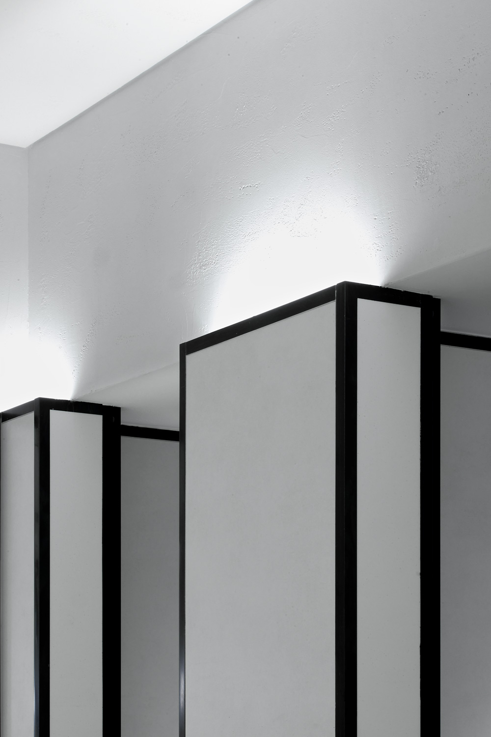
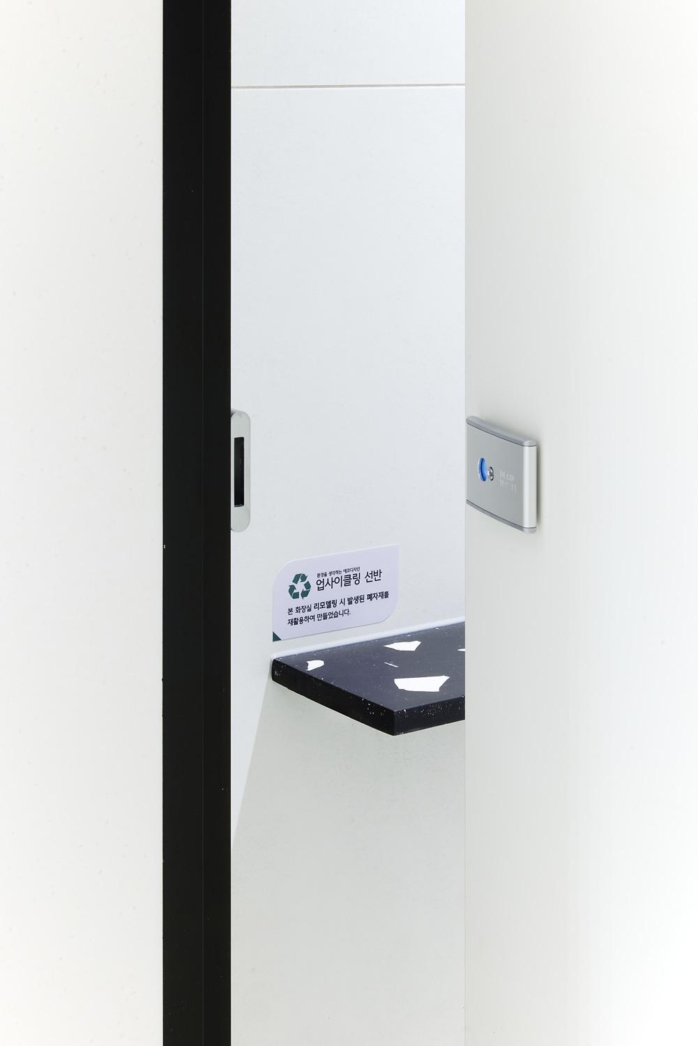
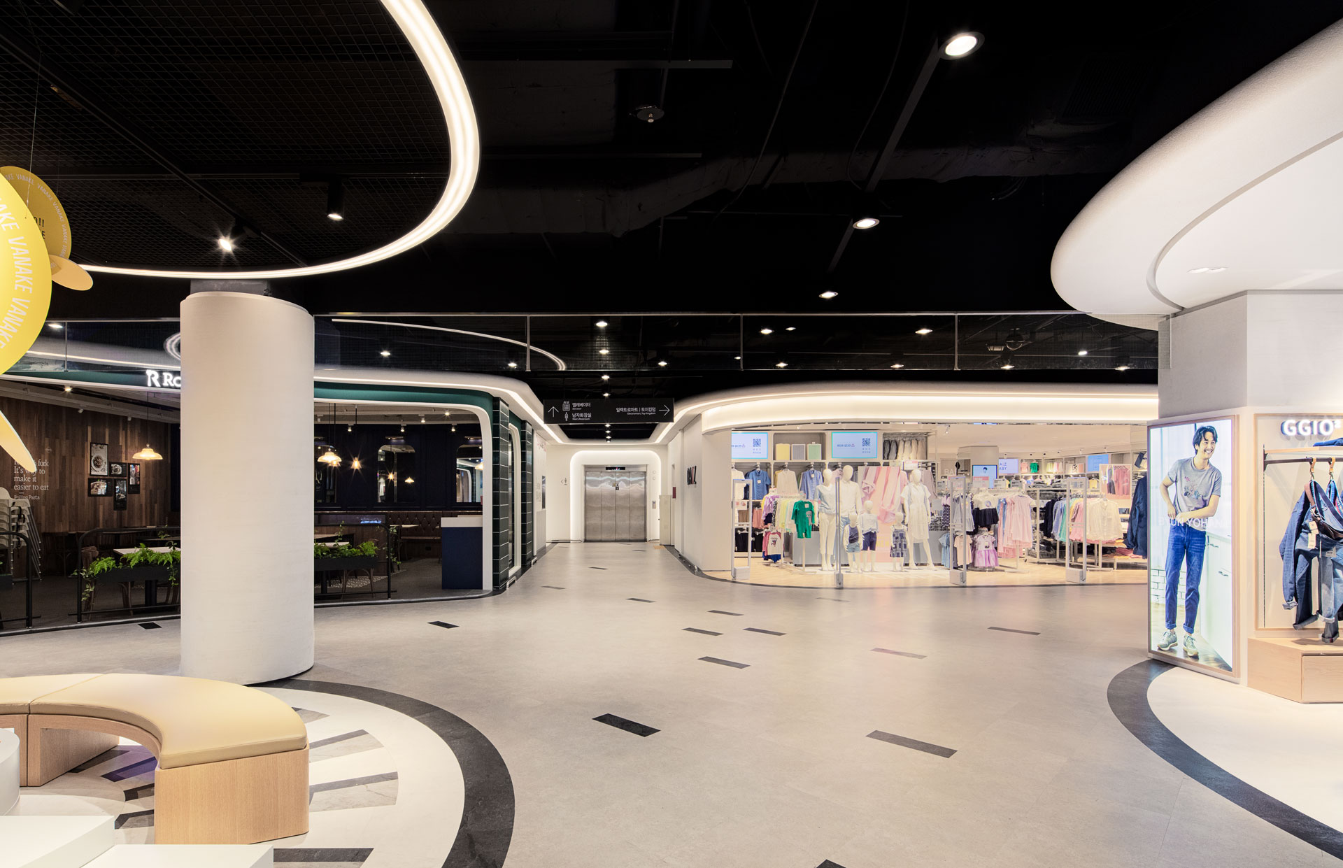
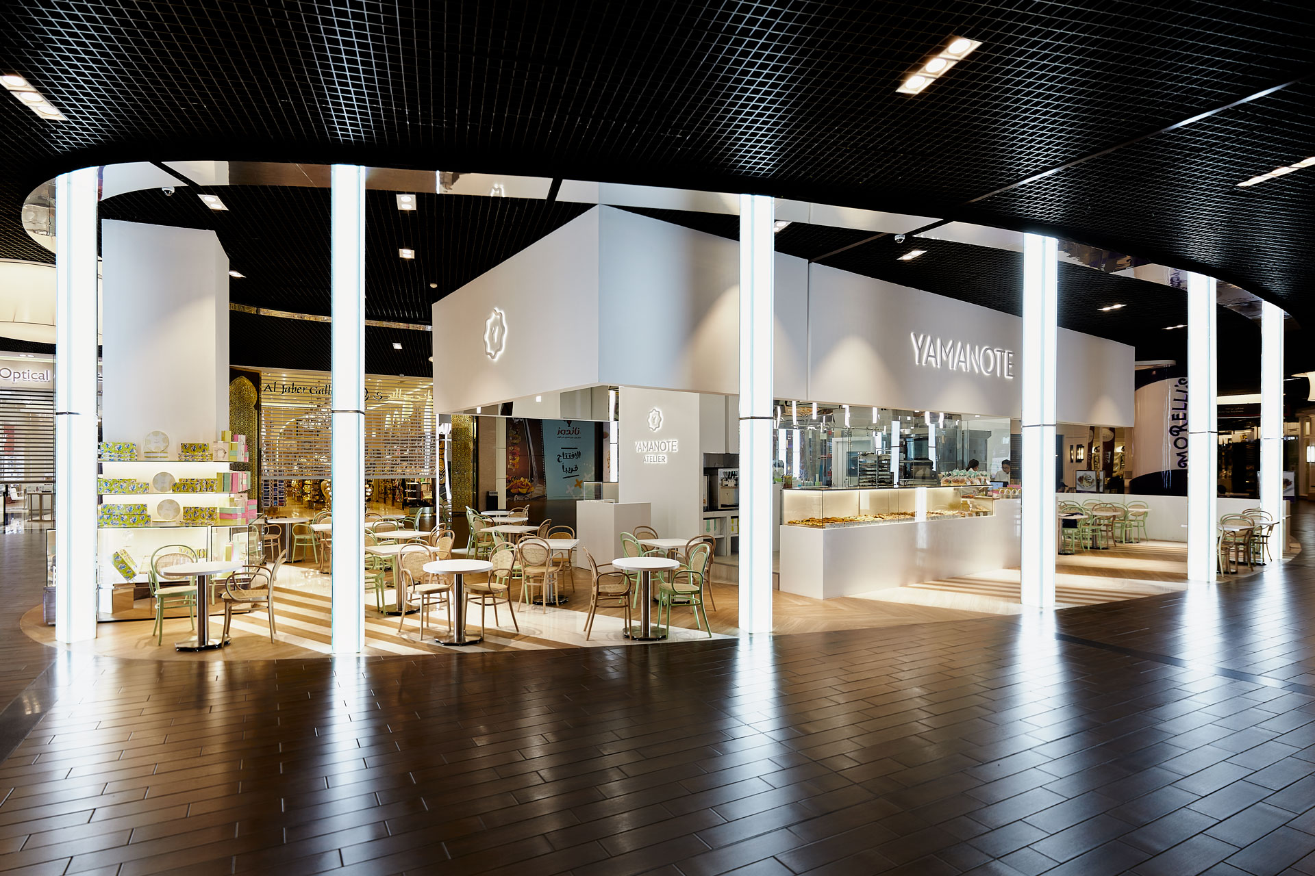
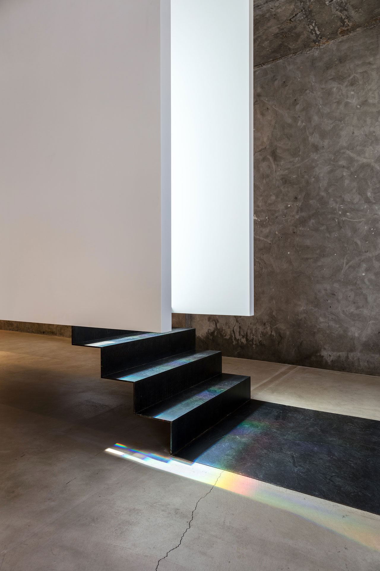
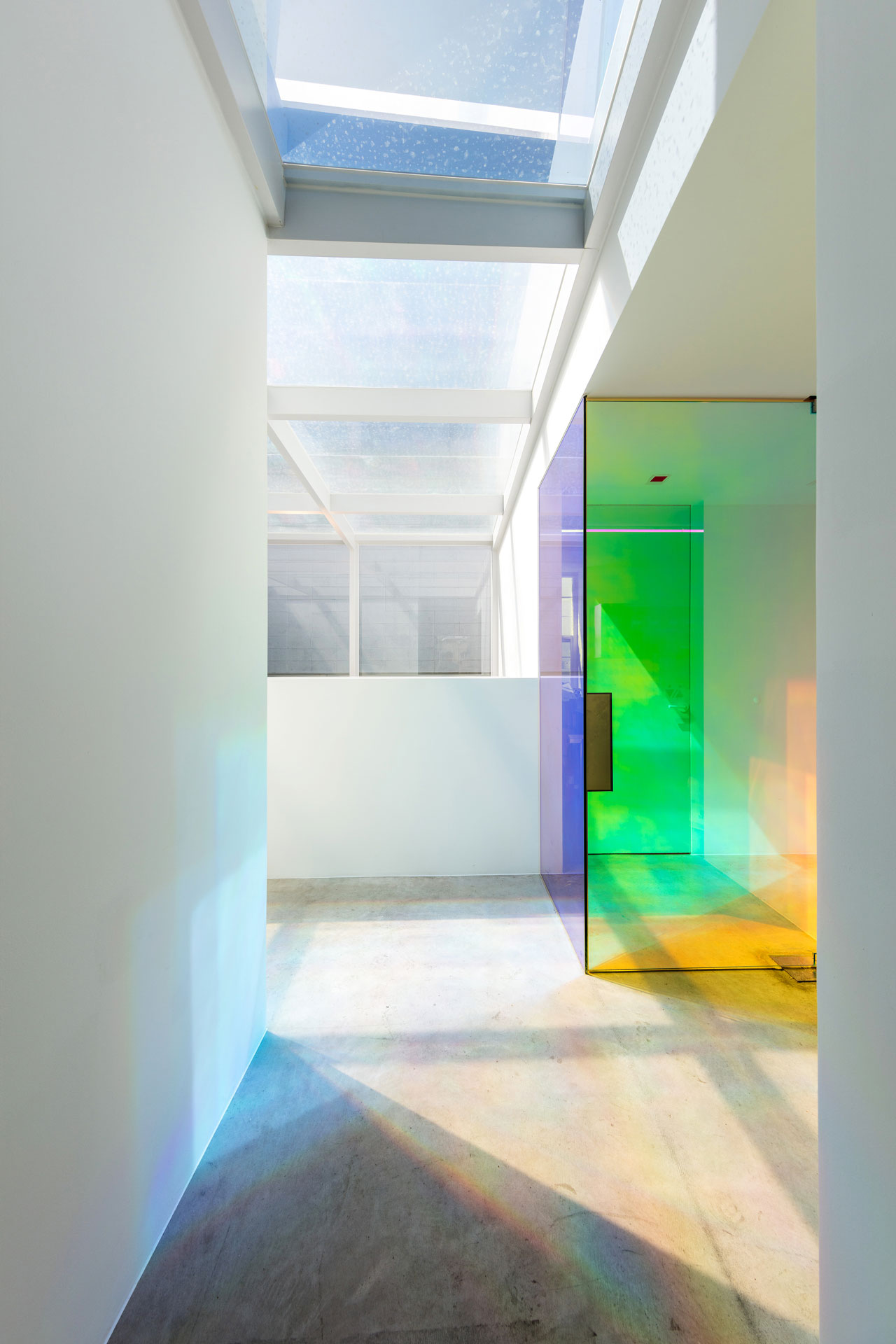
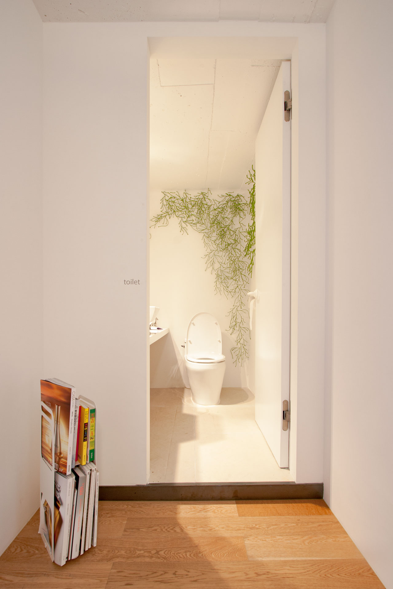
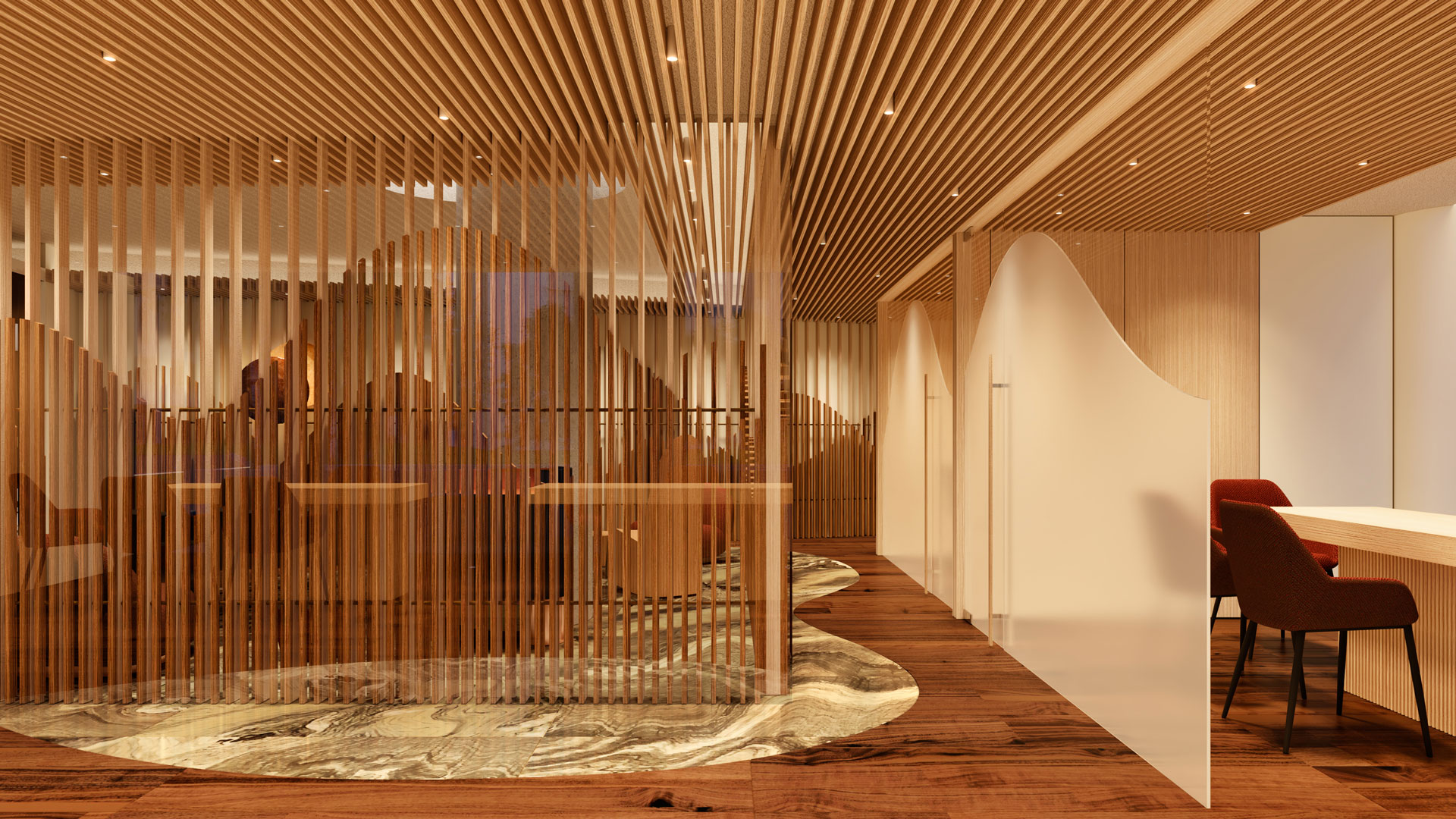
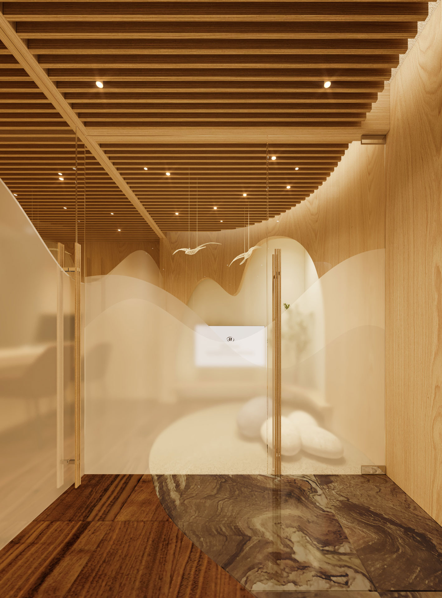
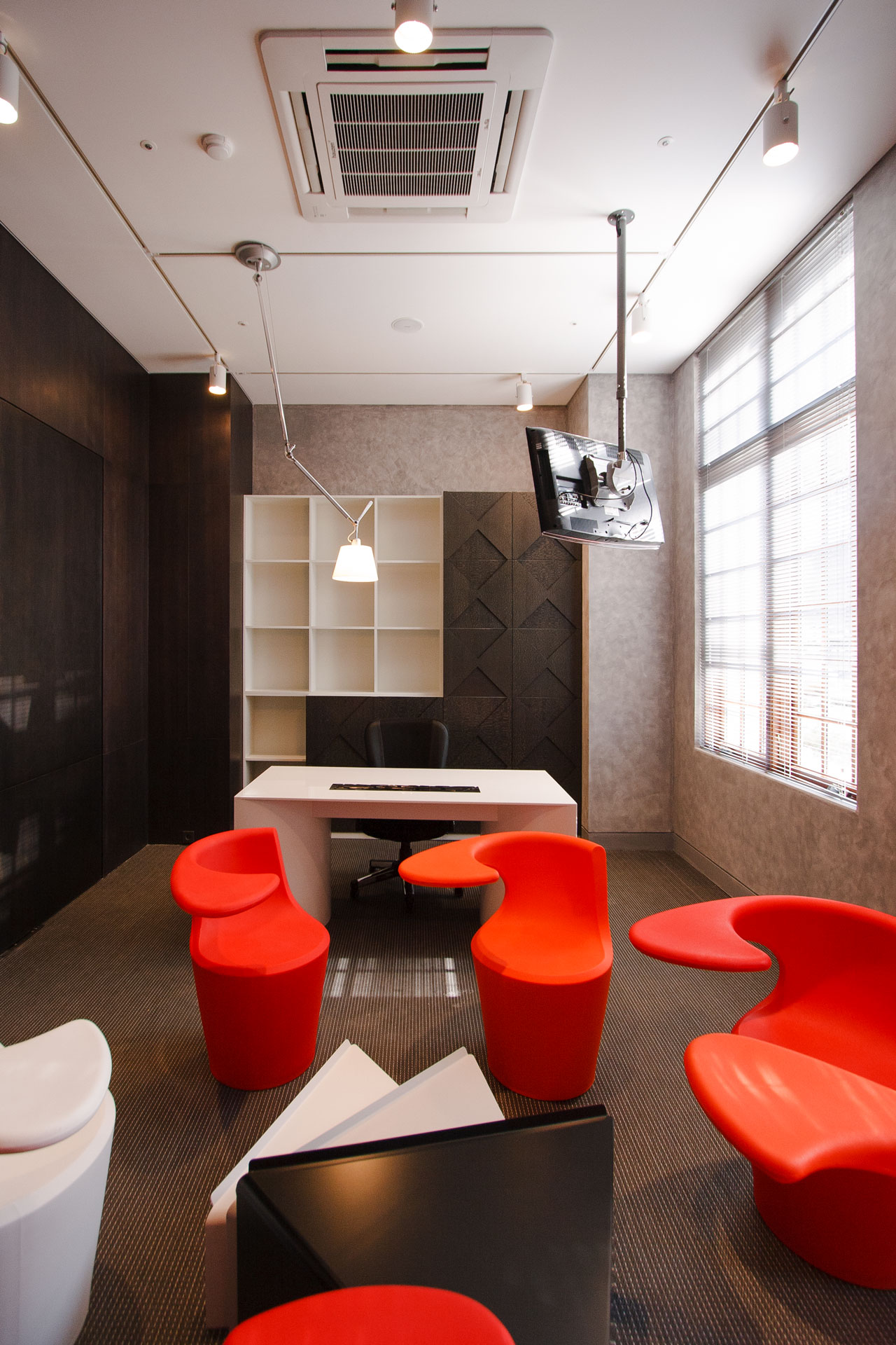
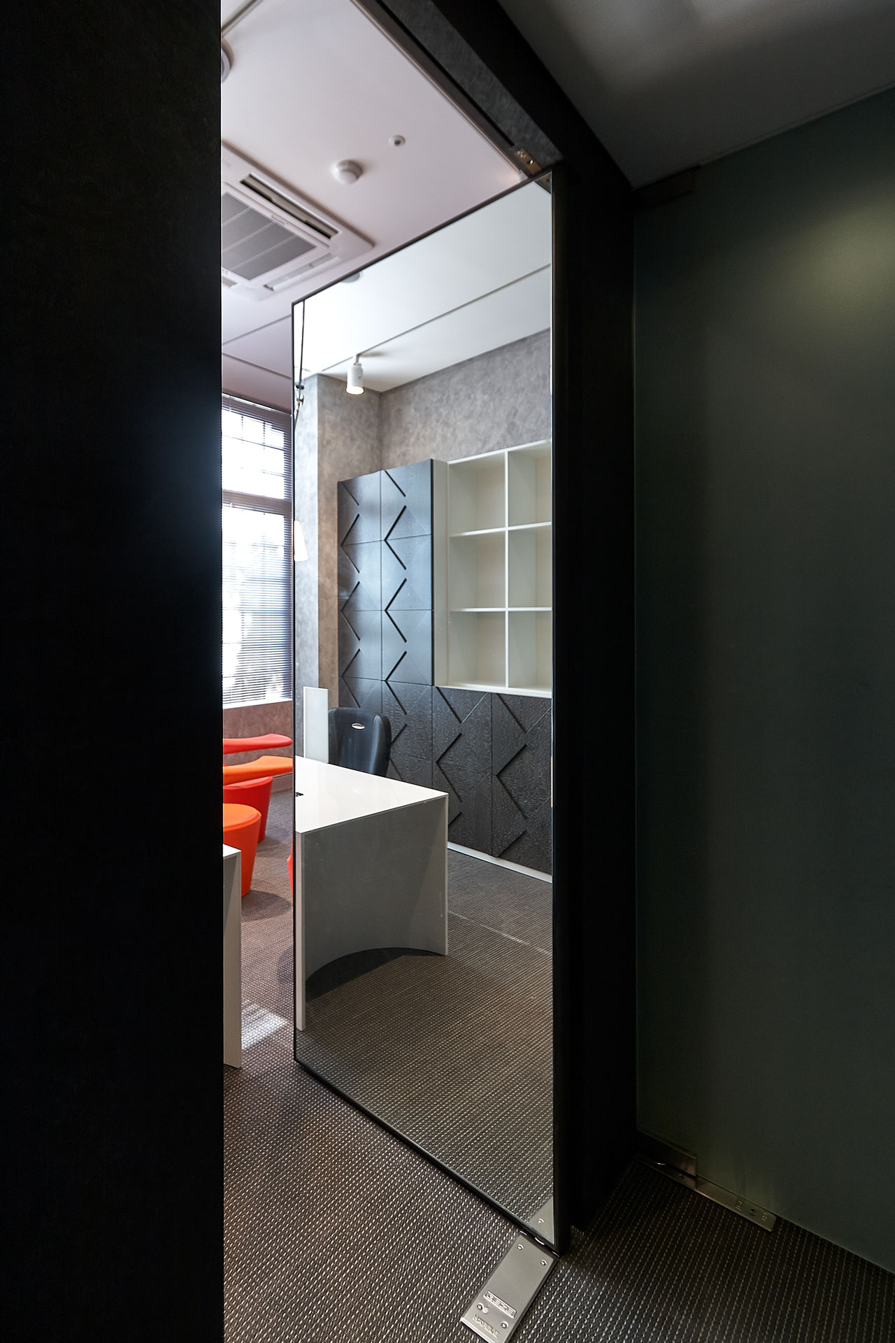
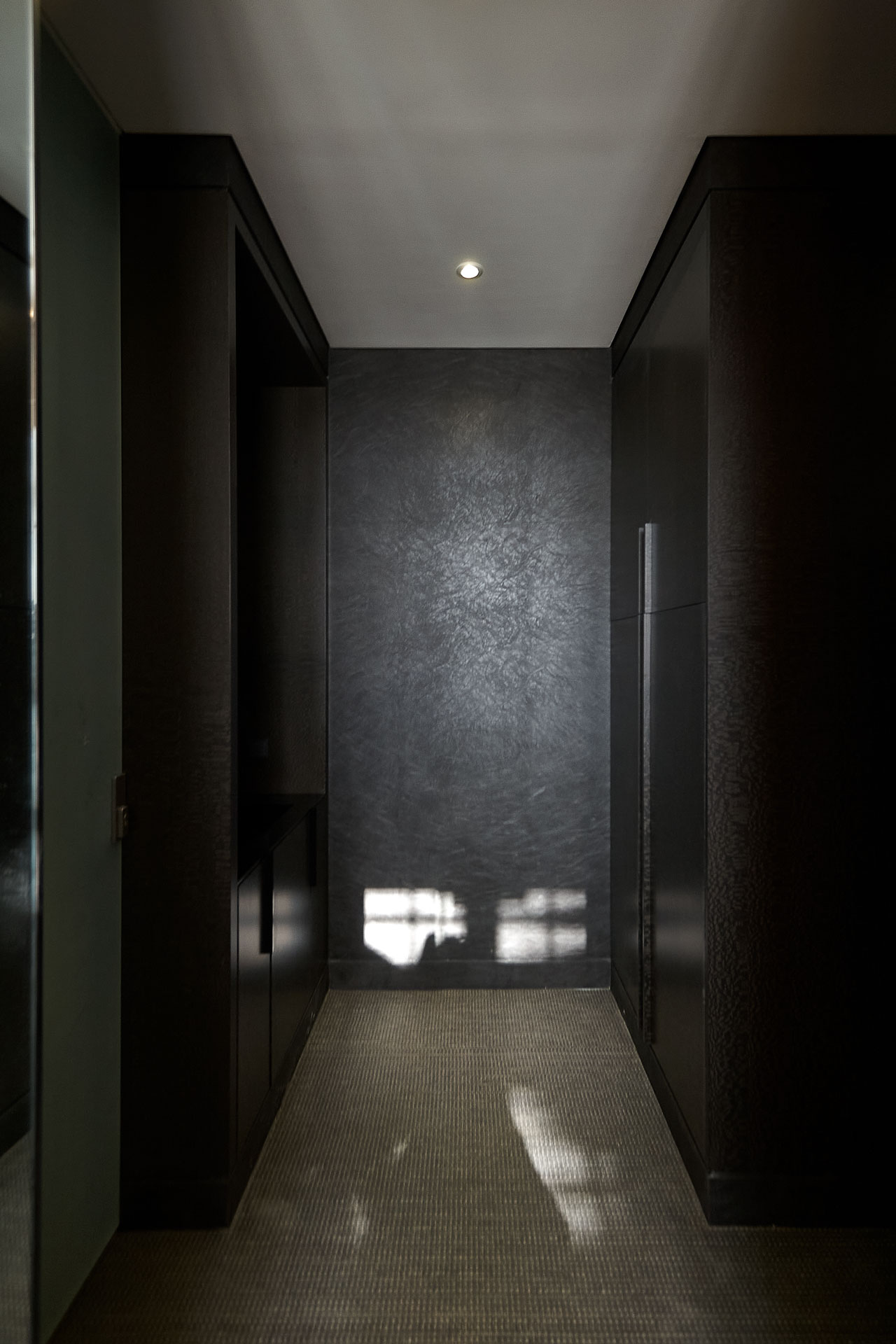
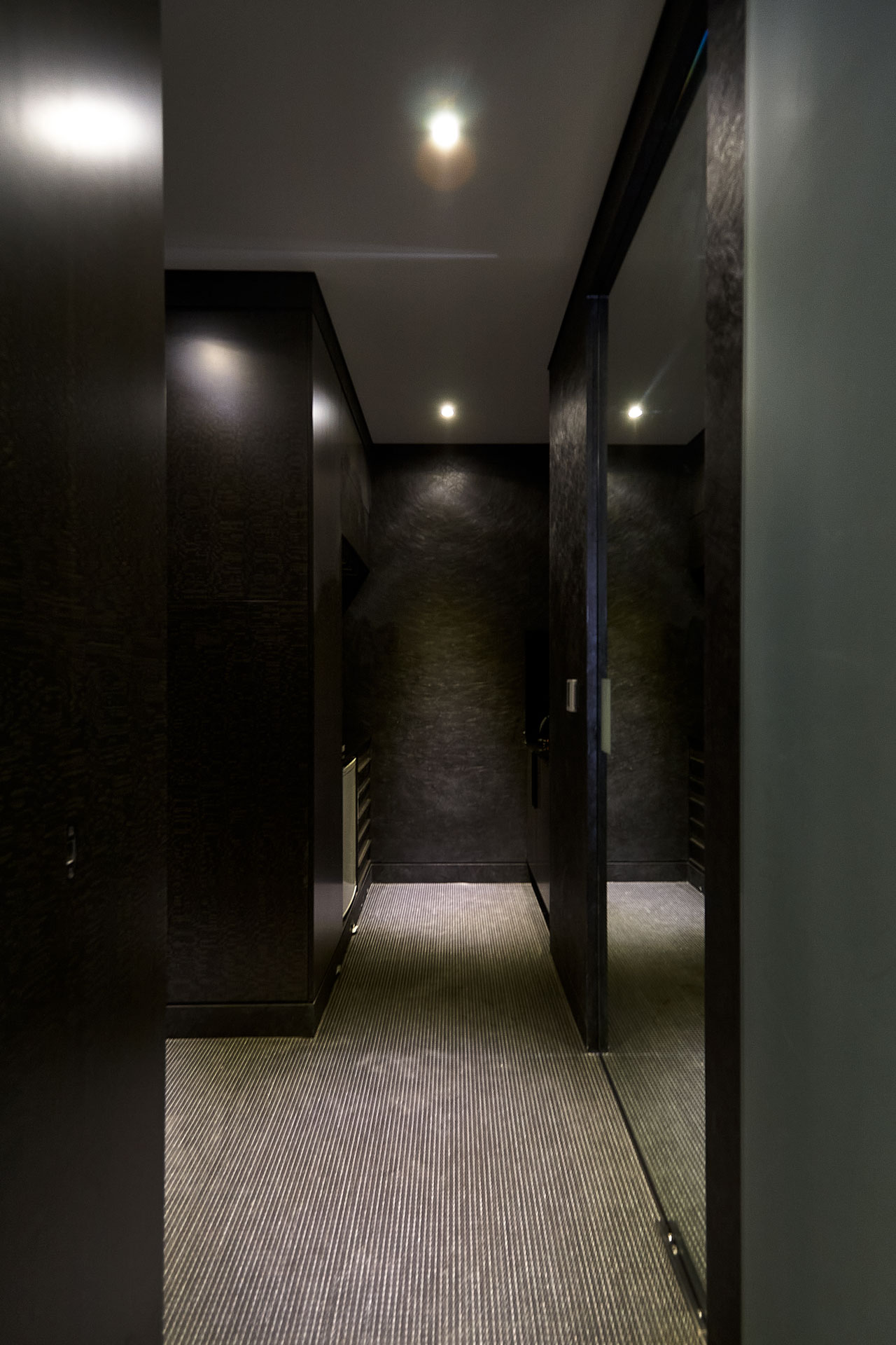
Giftium은 대한민국에서 가장 큰 규모의 복합 쇼핑몰인 롯데월드몰 내의 고객 편의시설입니다. 롯데월드몰은 쇼핑, 외식, 관광, 엔터테인먼트, 문화, 예술 등 다양한 여가생활을 한자리에서 즐길 수 있는 장소로서, 서울에서 많은 사람이 즐겨 찾는 유명한 곳 중 하나입니다.
새롭게 리뉴얼된 Giftium은 단순히 기능적인 공간으로만 사용하는 것이 아니라, 현대적이고 세련된 쇼핑몰에서 방문객들이 다양한 편의와 흥미로운 경험을 선사하는 것을 목표로 하고, 이를 위해 ‘선물과 같은 공간’이라는 차별화된 컨셉과 디자인을 가지고 있습니다. 또한 NBDC의 상상력과 트렌드가 결합된 Giftium은 방문객들의 감각을 사로잡고 롯데월드몰 내에서의 여정을 향상시킵니다.
The project “Giftium” is a collection of uniquely designed public facilities that can be found dotted around “Lotte World Mall”, the largest shopping mall in Seoul, South Korea. “Lotte World Mall” Holds the monopoly in all things leisurely, namely, shopping, dining out, sightseeing, entertainment, culture and art, all embodied within this one site, solidifying its status as, not only just a place to shop but also a site for touristic ventures.
The renovations aim to provide all customers with a satisfactory experience while also acting as a force, opposing the general consensus that necessary amenities are so often bland in their design. As for the title of the project “Giftium”, we wanted the space to provide customers with not only a pleasant but an exciting experience akin to the feeling felt upon the receipt of a gift.
special thanks to
LOTTE PROPERTY & DEVELOPMENT TEAM
Youkyung Son
Chulsung Park
Jieun Oh
Juhyun Baek
Hyunji Jung


Opening Jun. 2023
Build area B6F-6F (31 Places) 3,157㎡
Use Toilets
Client LOTTE PROPERTY & DEVELOPMENT
Interior architect NBDC
Lead designer Myeonggeun Park
Team Taeun Park, Keunwoo Park, Juwon Kim, Heegyung Noh, VOVO
in collaboration with
Lighting DESIGN LUNA
MEP Taein MEC
Interior contractor INDESIGN
Photography Jeongwoo Lee
ⓒ 2023 NBDC
All rights reserved. No part of this publication may be reproduced or transmitted in any form or by any means, electronic or mechanical, including photocopy or any storage and retrieval system, without permission in writing from the publisher.
Respect copyrights, encourage creativity!
All rights reserved. No part of this publication may be reproduced or transmitted in any form or by any means, electronic or mechanical, including photocopy or any storage and retrieval system, without permission in writing from the publisher.
Respect copyrights, encourage creativity!

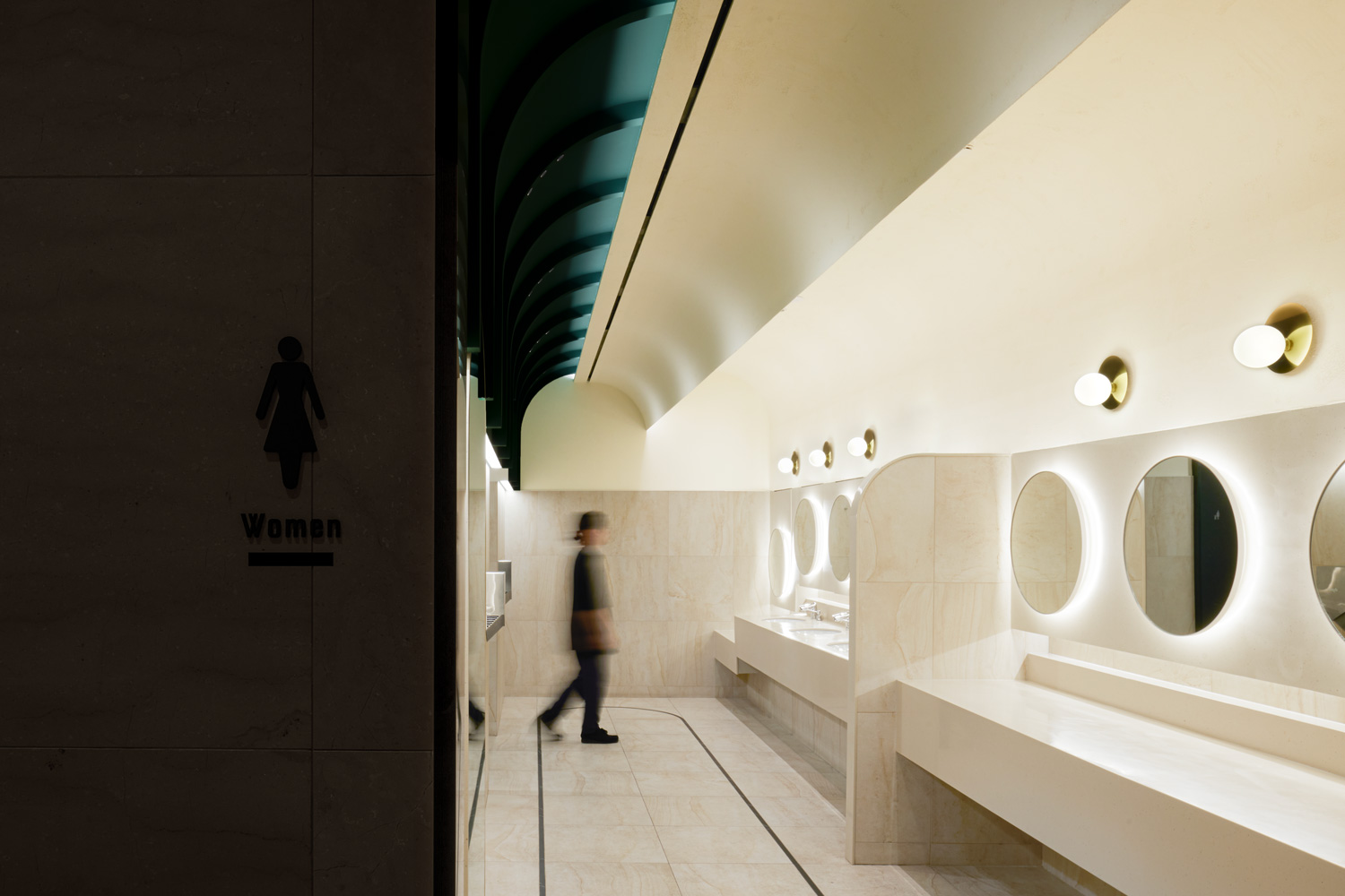
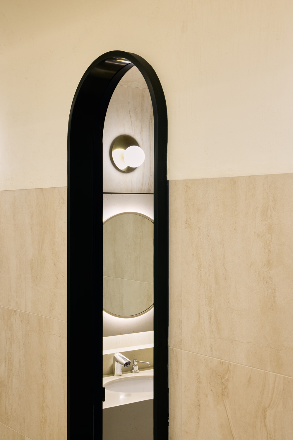
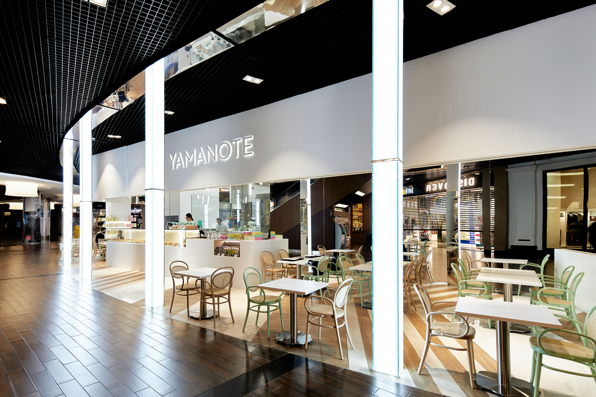
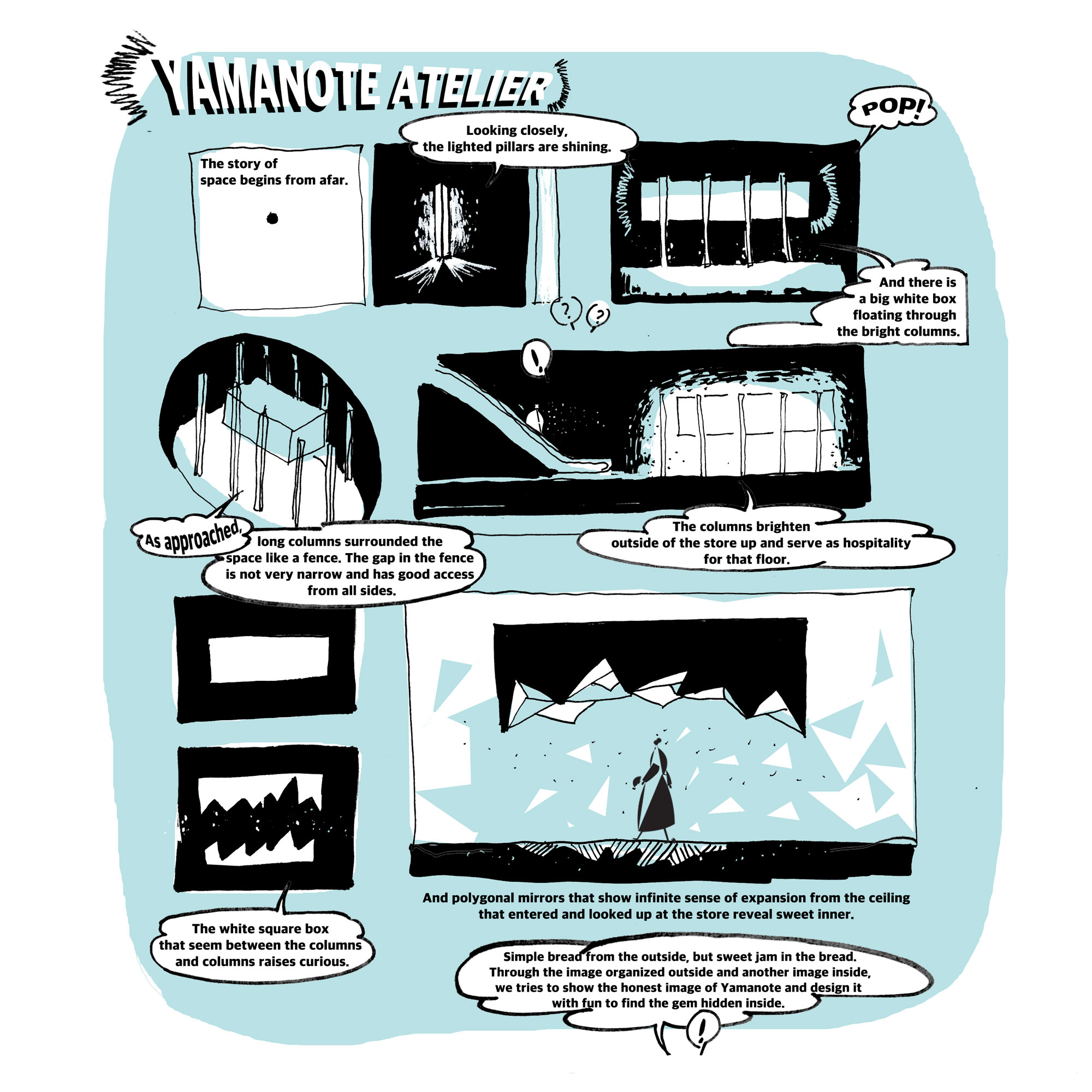
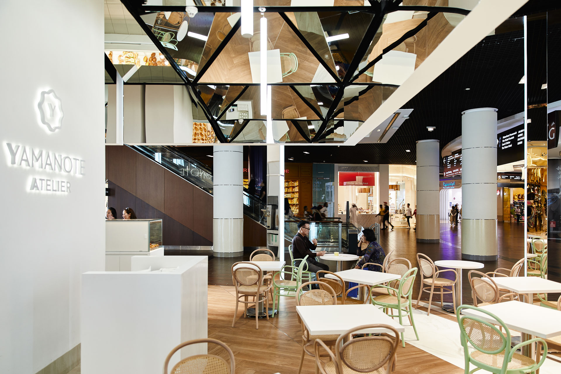
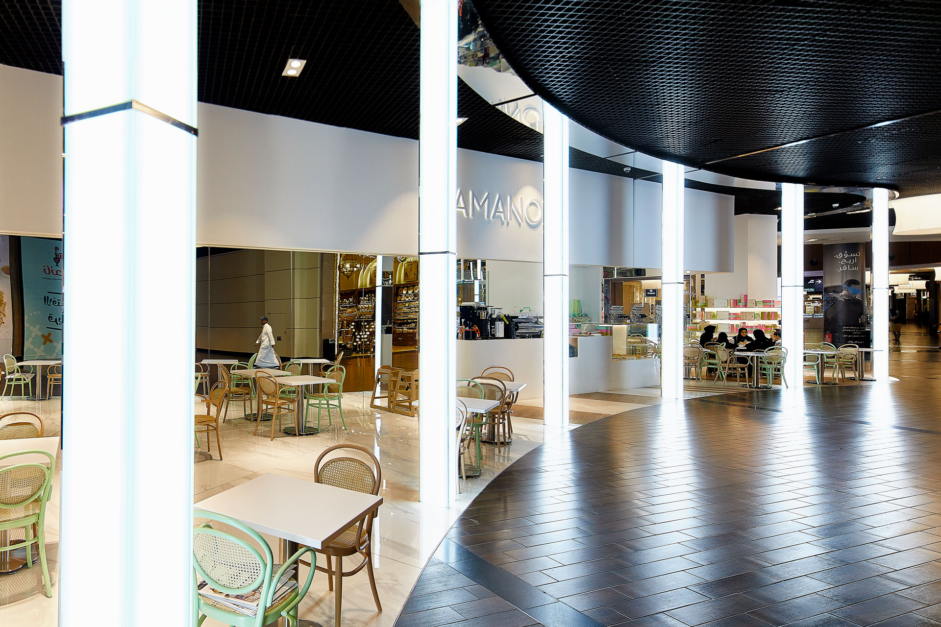
Cultural spaces open to all
“Cosmosis”
“Cosmosis”
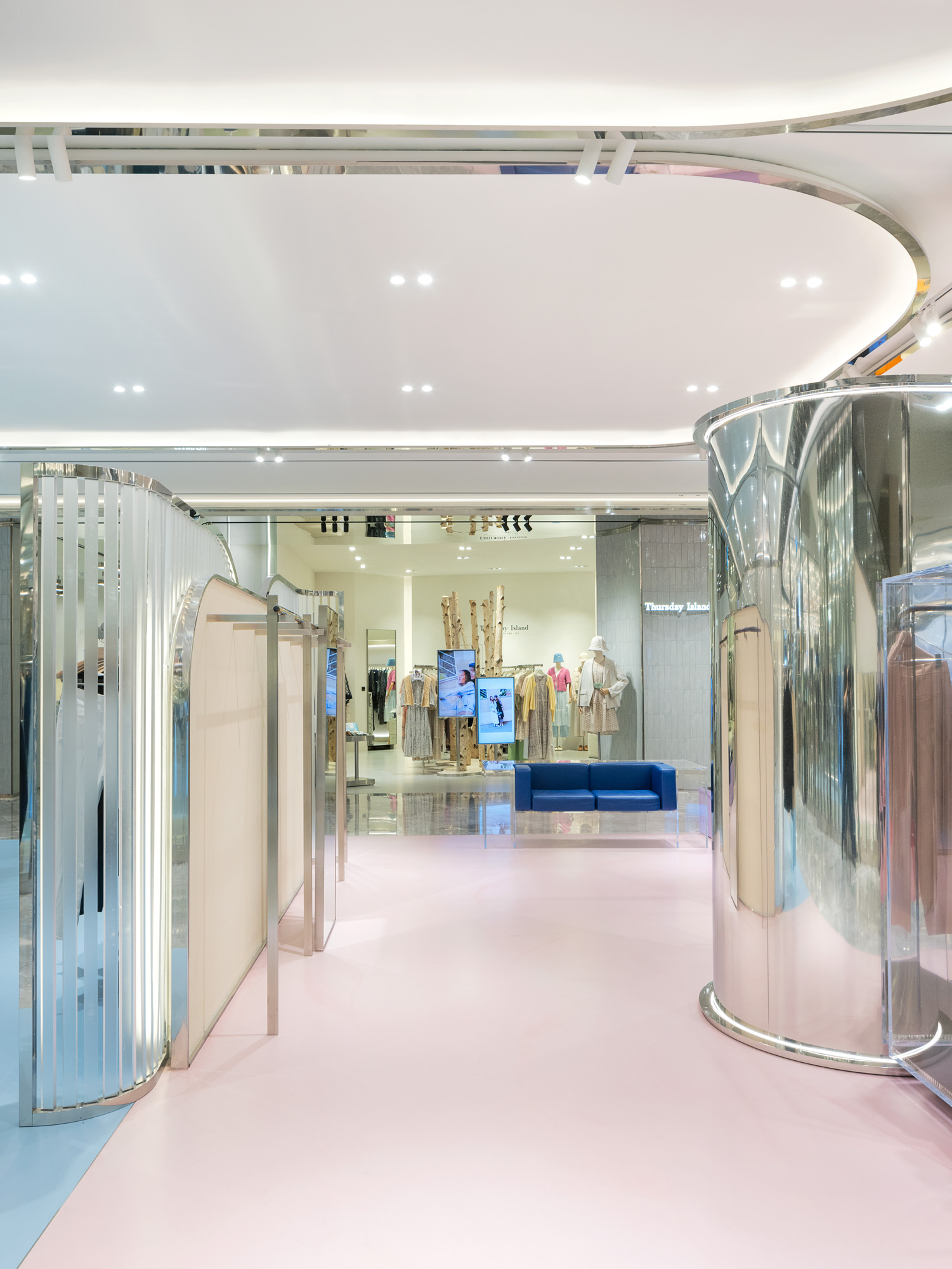
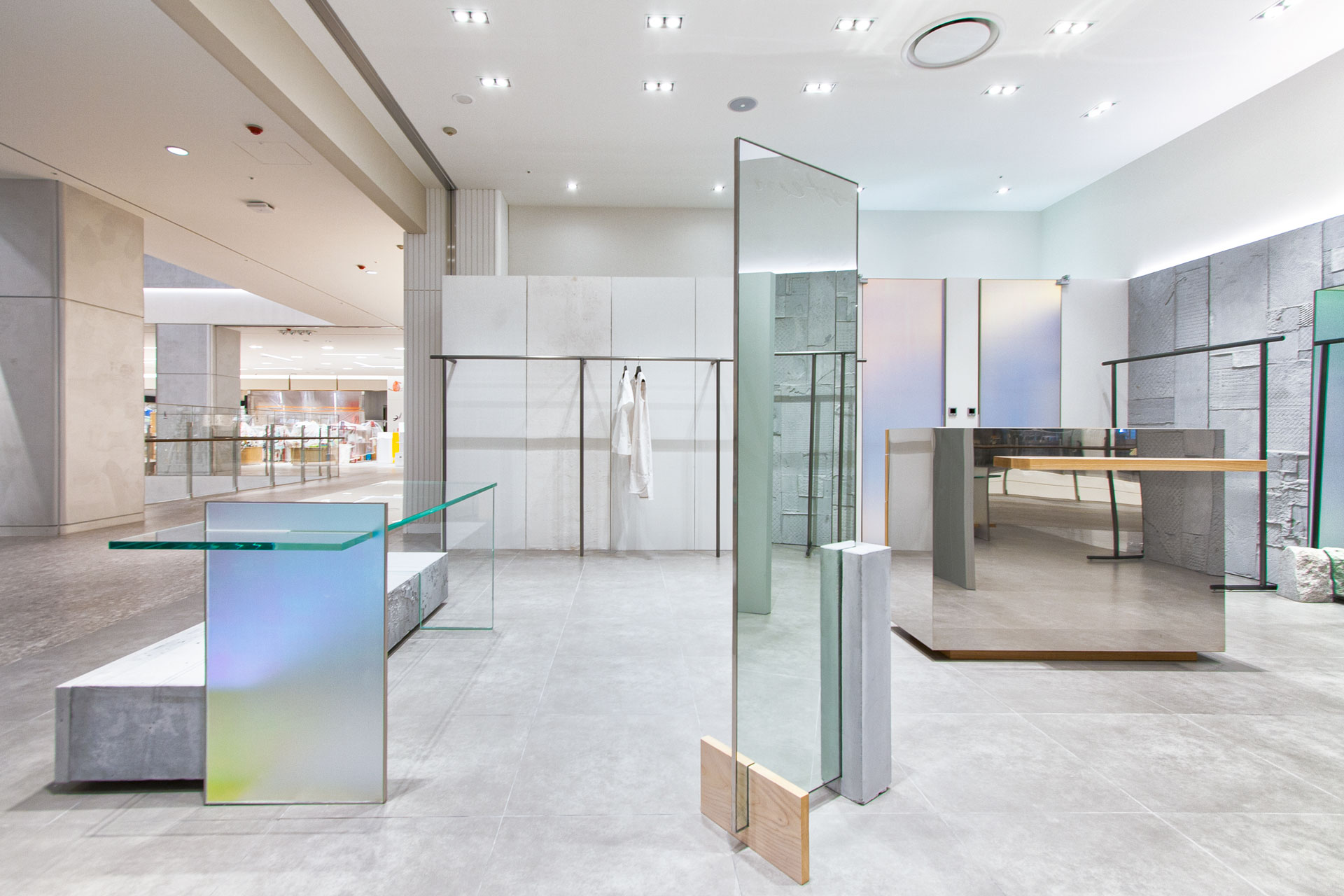
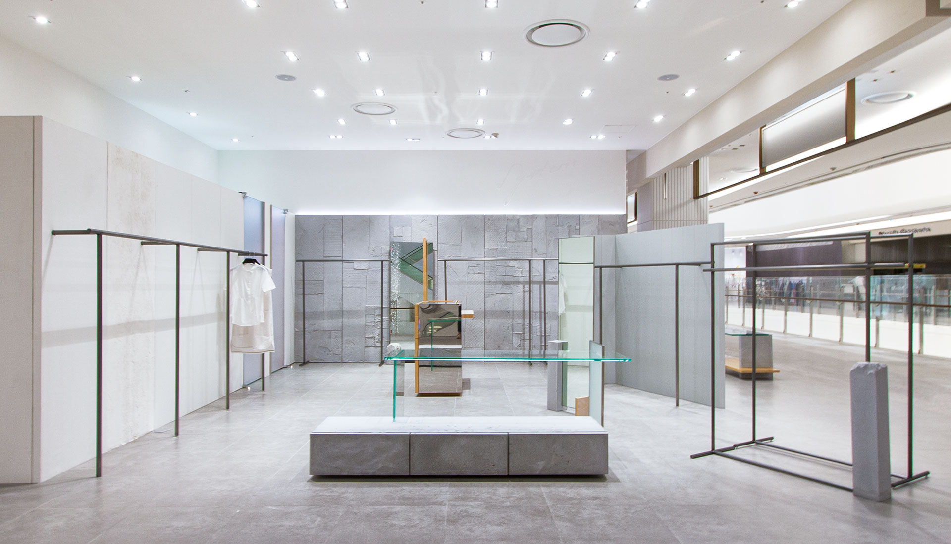
"사람들은 이야기가 있는 곳에 모인다. 문화는 그 이야기를 만드는 빛이다."
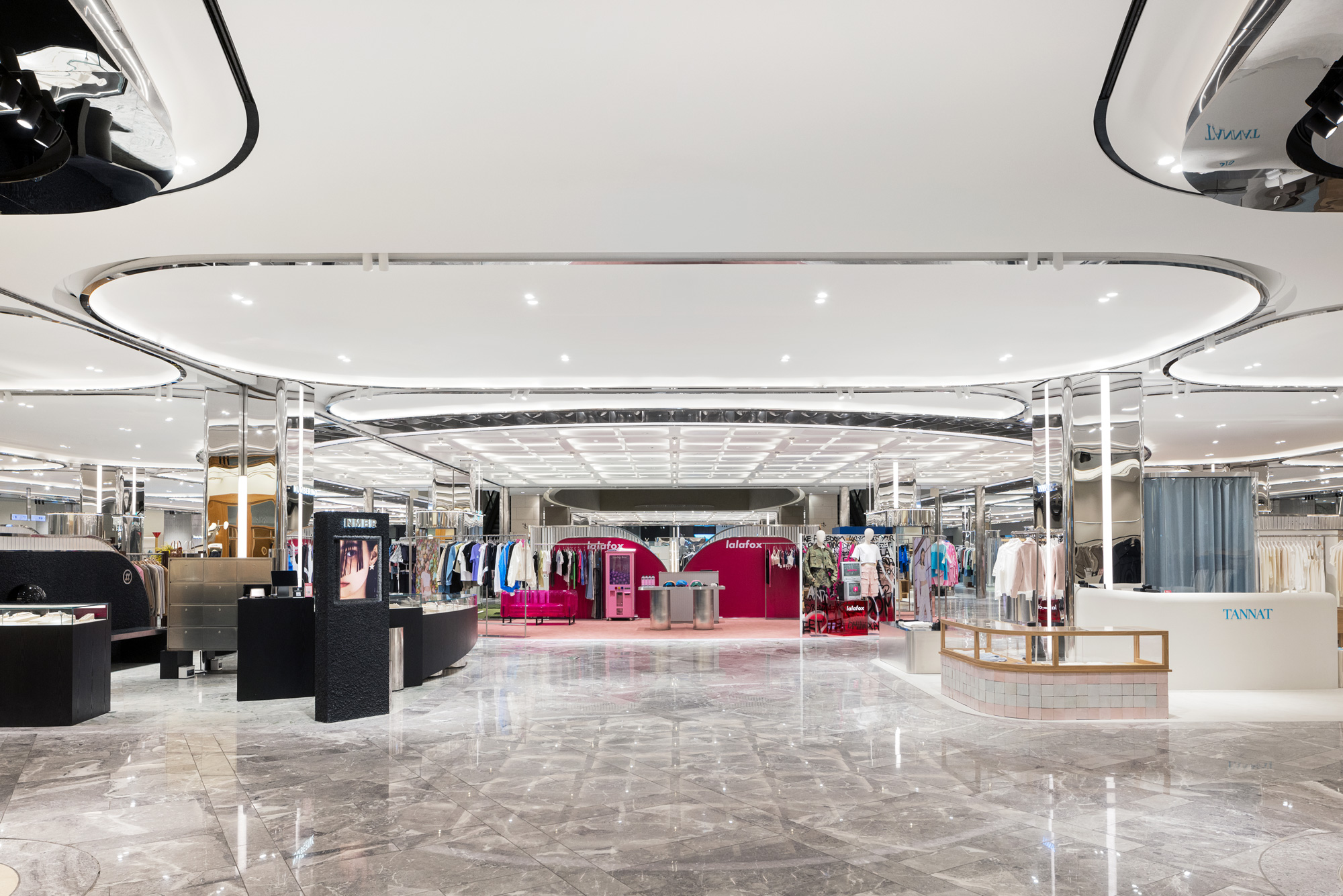
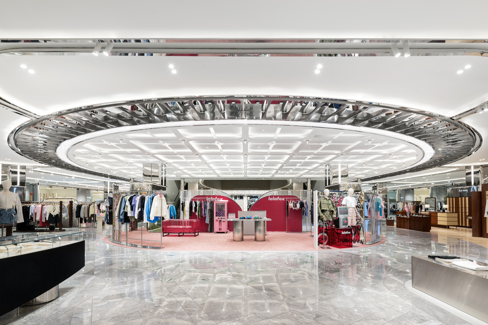
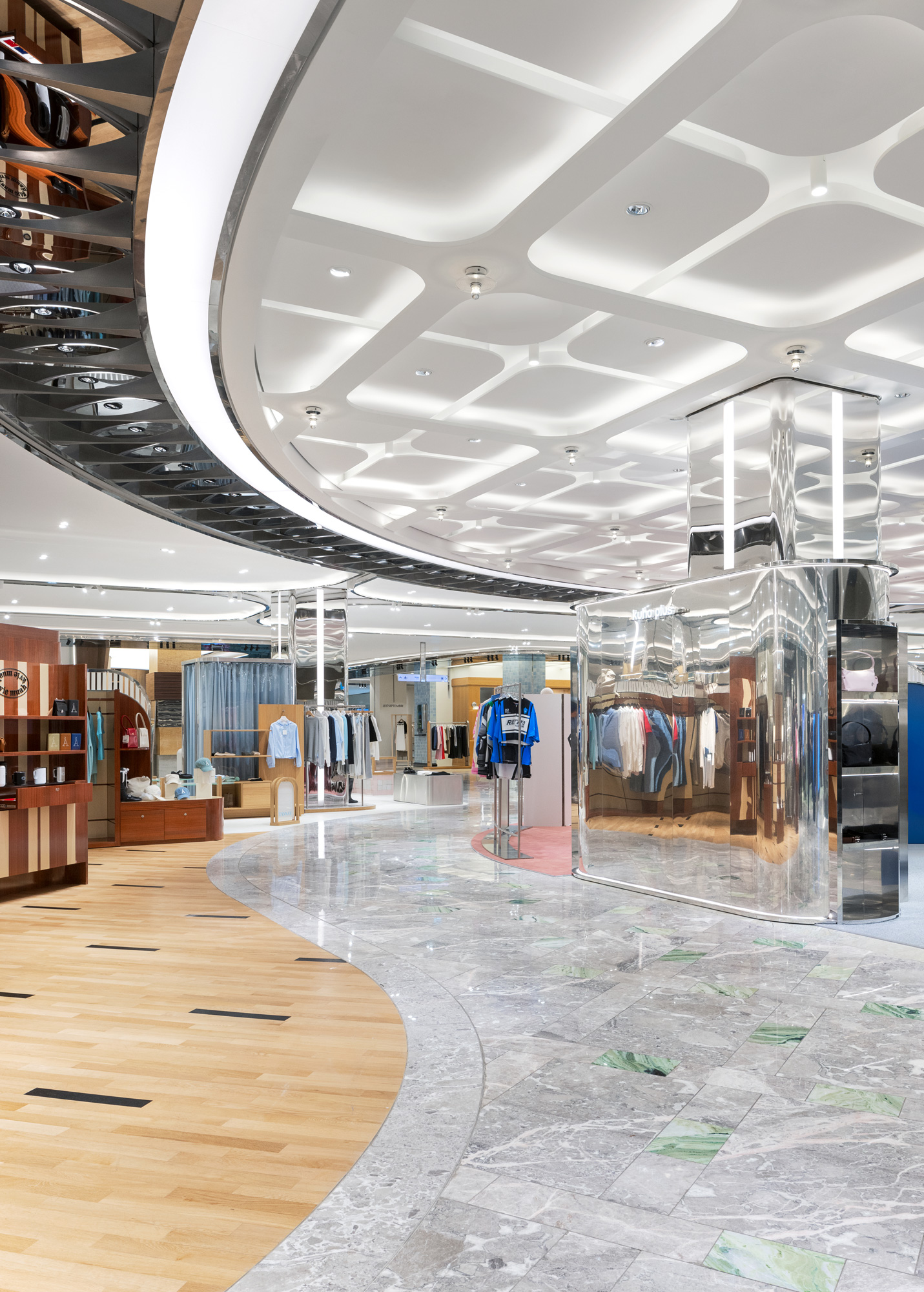
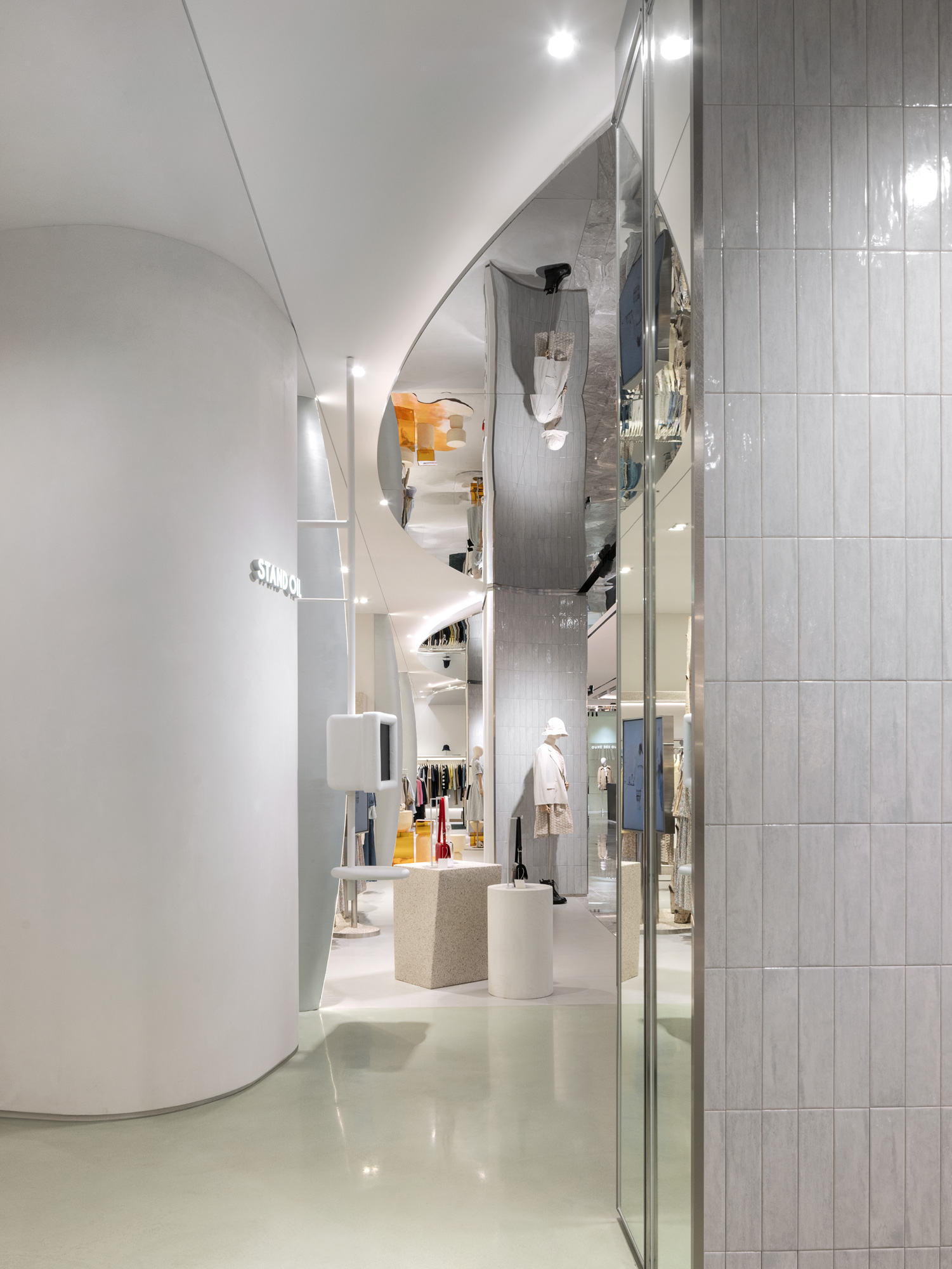
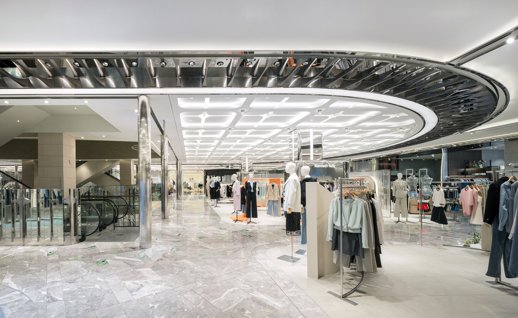
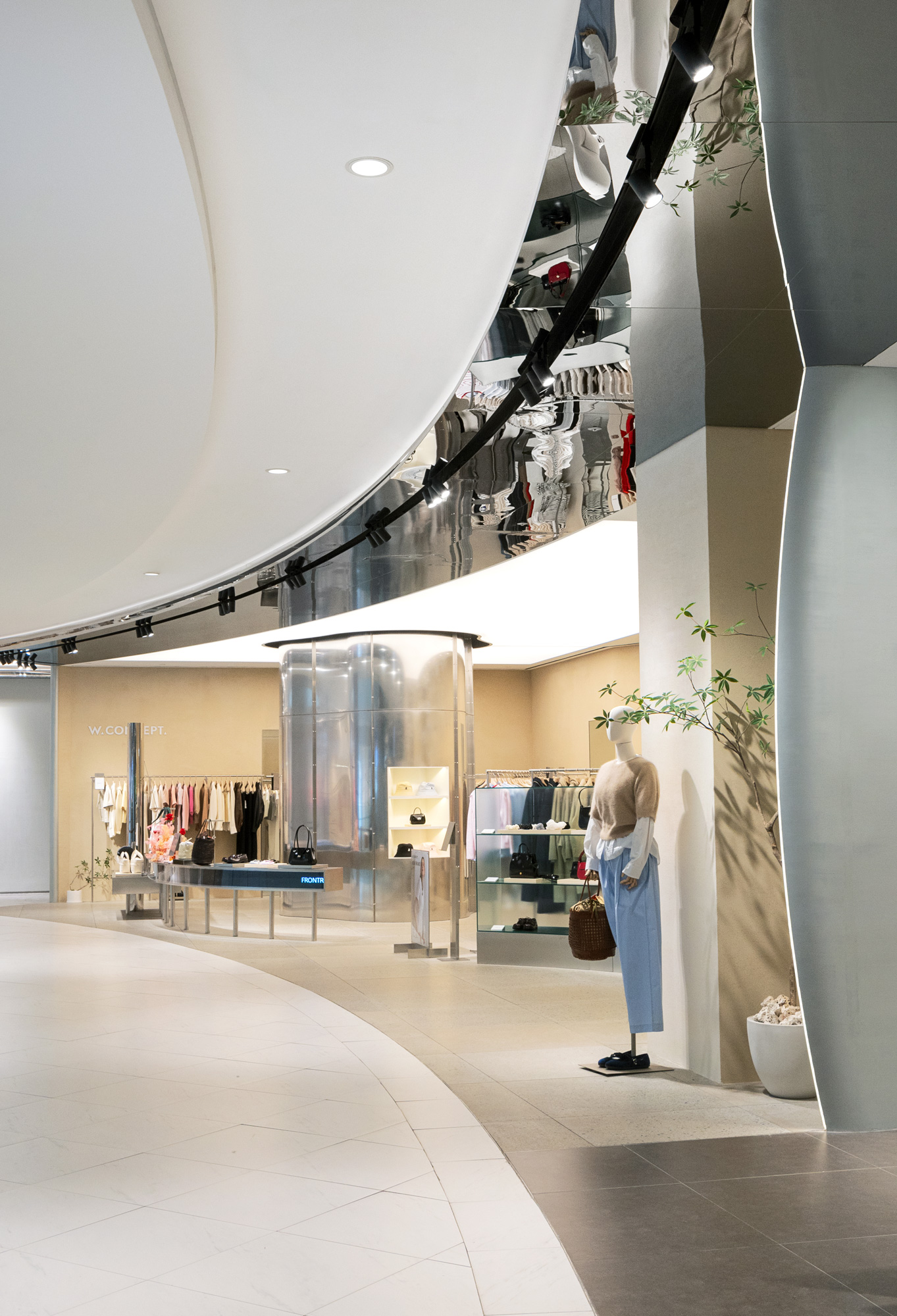
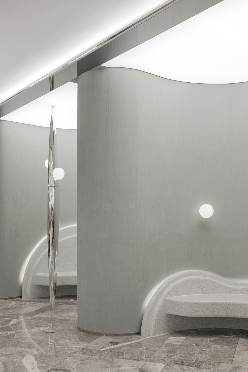
지난 여름, NBDC는 신세계 센텀시티의 새로운 공간을 'Cosmosis'로 이름 지었습니다. Cosmosis'는 Cosmo와 Oasis의 합성어로, 도시의 이야기가 모여서 생기는 문화적 공간을 뜻합니다.
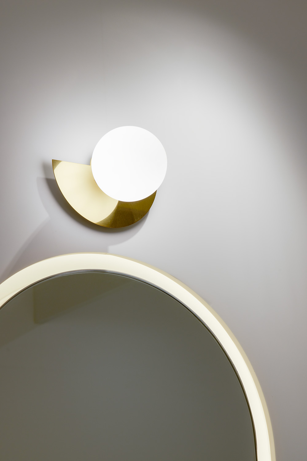
도회적인 분위기를 자아내는 Cosmosis는 도시의 문화적 갈증을 해소하고, 휴식과 교류의 장을 제공하는 패션 문화 공간으로서 다양한 형태적 언어를 통해 새로운 경험을 안겨줍니다. 이곳에는 사람들이 모이는 넓은 물가와 이야기를 나누며 쉴 수 있는 그늘진 자리가 있으며, 이러한 그늘은 개인의 영역과 공동의 영역을 느슨하게 구분하며 조화를 이룹니다.
공간은 물길을 따라 흘러가듯 전개되며, 거기서 마주한 밀도 높은 중앙부 천장은 우리를 끊임없는 순환의 여정으로 이끕니다. 순환하며 마주하는 복도들은 다채로운 장면을 만들어내며 구석진 매장까지 어떠한 경계도 없이 우리를 끌어당깁니다. 매장을 오고 가는 길에 반사되는 나와 공간의 모습들은 예상치 못한 장면을 만들어 내며 우리의 여정에 다양한 전환을 제공합니다.
"People gather where there is a story. Culture is the light that creates that story."
Last summer, NBDC named its new space in New Centum City 'Cosmosis'. Cosmosis is a portmanteau of Cosmo and Oasis, and refers to a cultural space where the stories of a city come together.
With an urban atmosphere, Cosmosis is a fashion and cultural space that quenches the city's cultural thirst, provides a place for relaxation and exchange, and offers new experiences through various formal languages. It features a large waterfront where people congregate and shady spots to chat and relax, with a loose distinction between private and communal areas.
The space unfolds like a waterway, with a dense central ceiling that takes us on a journey of constant circulation. The circular corridors create colourful scenes and draw us in without any boundaries, even to the corner stores. On the way to and from the store, reflections of ourselves and the space create unexpected scenes and provide multiple transitions in our journey.
special thanks to
SHINSEGAE INTERIOR DESIGN TEAM
Hyejung Cho
Chaewon Jung
Seunghoon Oh
지난 여름, NBDC는 신세계 센텀시티의 새로운 공간을 'Cosmosis'로 이름 지었습니다. Cosmosis'는 Cosmo와 Oasis의 합성어로, 도시의 이야기가 모여서 생기는 문화적 공간을 뜻합니다.
도회적인 분위기를 자아내는 Cosmosis는 도시의 문화적 갈증을 해소하고, 휴식과 교류의 장을 제공하는 패션 문화 공간으로서 다양한 형태적 언어를 통해 새로운 경험을 안겨줍니다. 이곳에는 사람들이 모이는 넓은 물가와 이야기를 나누며 쉴 수 있는 그늘진 자리가 있으며, 이러한 그늘은 개인의 영역과 공동의 영역을 느슨하게 구분하며 조화를 이룹니다.
공간은 물길을 따라 흘러가듯 전개되며, 거기서 마주한 밀도 높은 중앙부 천장은 우리를 끊임없는 순환의 여정으로 이끕니다. 순환하며 마주하는 복도들은 다채로운 장면을 만들어내며 구석진 매장까지 어떠한 경계도 없이 우리를 끌어당깁니다. 매장을 오고 가는 길에 반사되는 나와 공간의 모습들은 예상치 못한 장면을 만들어 내며 우리의 여정에 다양한 전환을 제공합니다.
"People gather where there is a story. Culture is the light that creates that story."
Last summer, NBDC named its new space in New Centum City 'Cosmosis'. Cosmosis is a portmanteau of Cosmo and Oasis, and refers to a cultural space where the stories of a city come together.
With an urban atmosphere, Cosmosis is a fashion and cultural space that quenches the city's cultural thirst, provides a place for relaxation and exchange, and offers new experiences through various formal languages. It features a large waterfront where people congregate and shady spots to chat and relax, with a loose distinction between private and communal areas.
The space unfolds like a waterway, with a dense central ceiling that takes us on a journey of constant circulation. The circular corridors create colourful scenes and draw us in without any boundaries, even to the corner stores. On the way to and from the store, reflections of ourselves and the space create unexpected scenes and provide multiple transitions in our journey.
special thanks to
SHINSEGAE INTERIOR DESIGN TEAM
Hyejung Cho
Chaewon Jung
Seunghoon Oh
Opening Aug. 2023
Build area 4,858㎡
Use Department Store
New Contemporary
Client SHINSEGAE
Interior architect NBDC
Lead designer Rita
Team Juwon Kim, Keunwoo Park, Jeongwon Woo, Heejeong Kim
in collaboration with
Photography Yongjoon Choi
Build area 4,858㎡
Use Department Store
New Contemporary
Client SHINSEGAE
Interior architect NBDC
Lead designer Rita
Team Juwon Kim, Keunwoo Park, Jeongwon Woo, Heejeong Kim
in collaboration with
Photography Yongjoon Choi
ⓒ 2023 NBDC
All rights reserved. No part of this publication may be reproduced or transmitted in any form or by any means, electronic or mechanical, including photocopy or any storage and retrieval system, without permission in writing from the publisher.
Respect copyrights, encourage creativity!
All rights reserved. No part of this publication may be reproduced or transmitted in any form or by any means, electronic or mechanical, including photocopy or any storage and retrieval system, without permission in writing from the publisher.
Respect copyrights, encourage creativity!
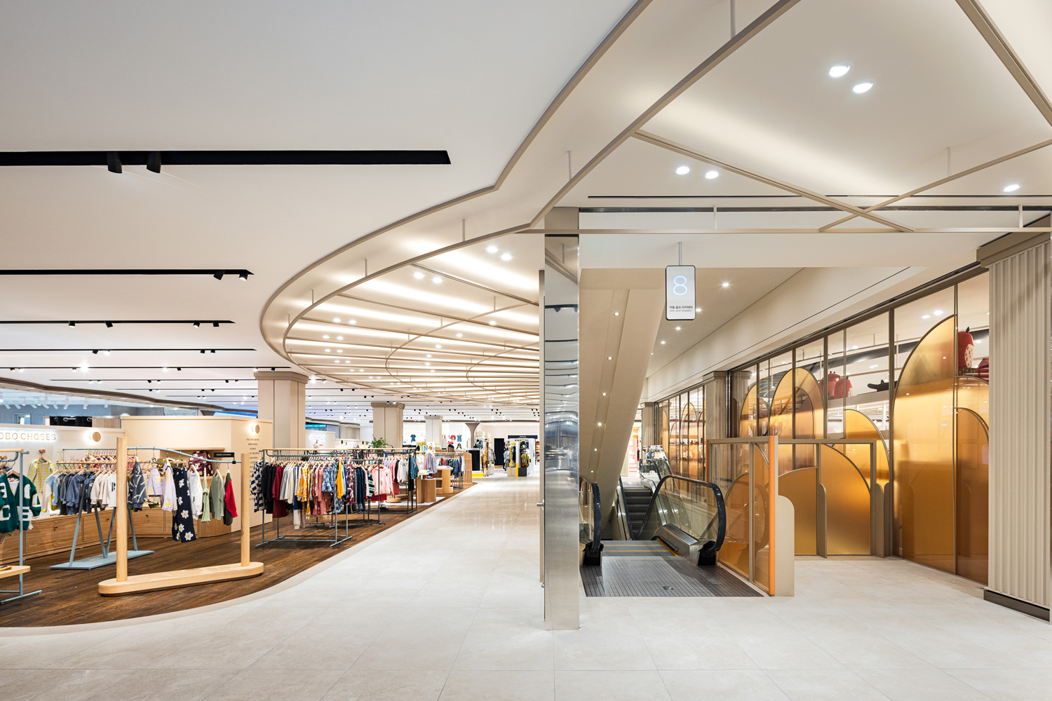
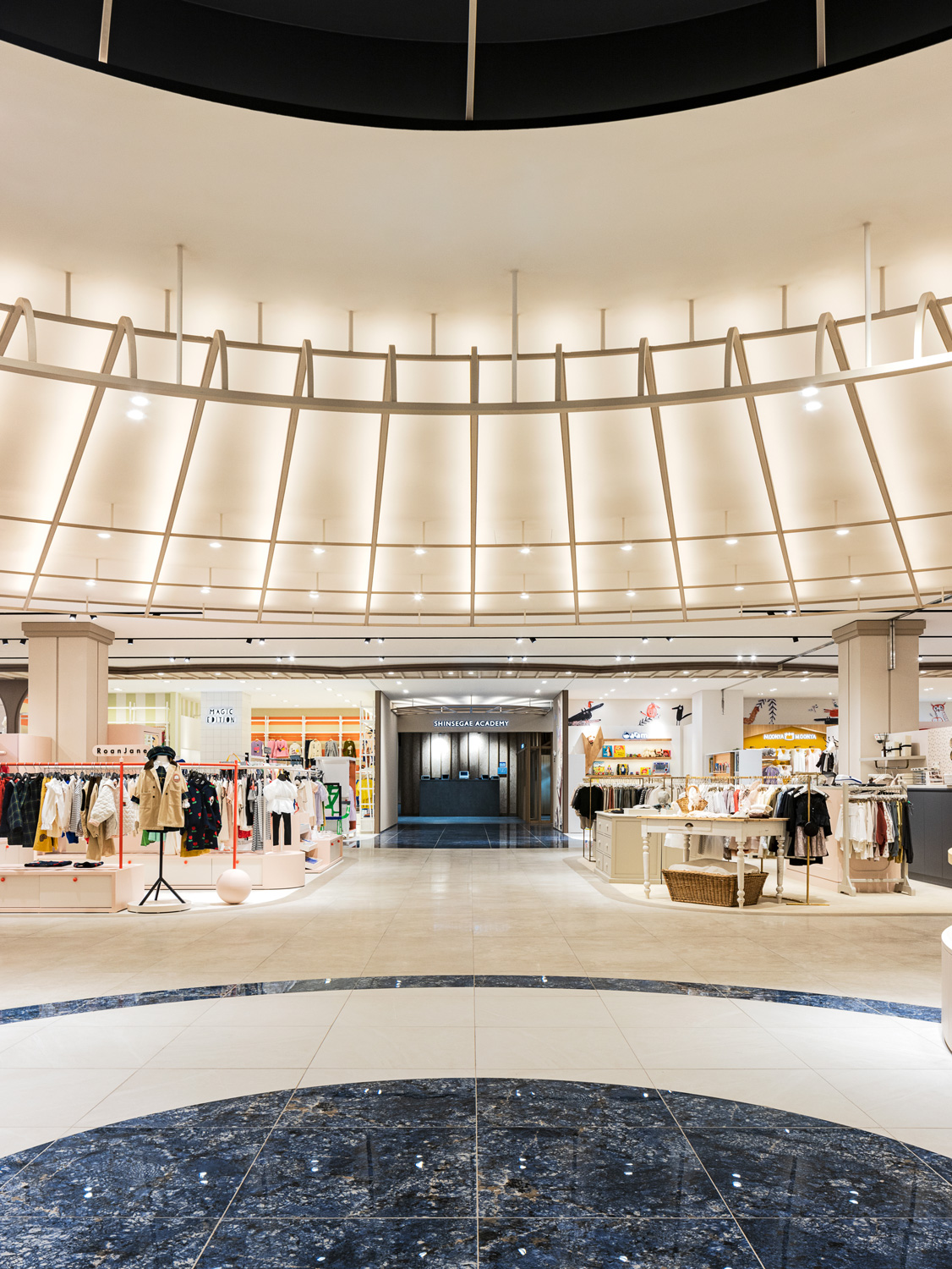
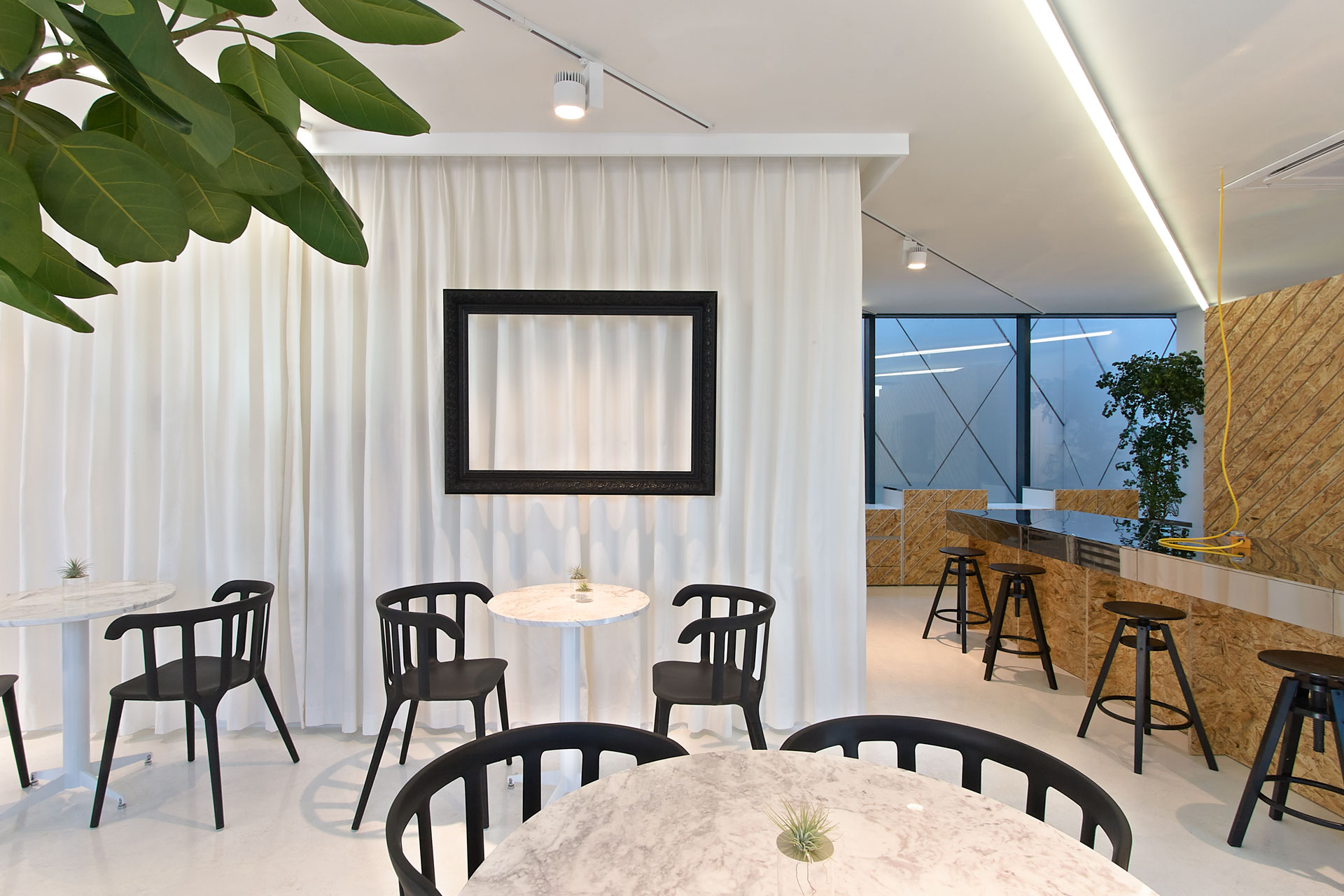
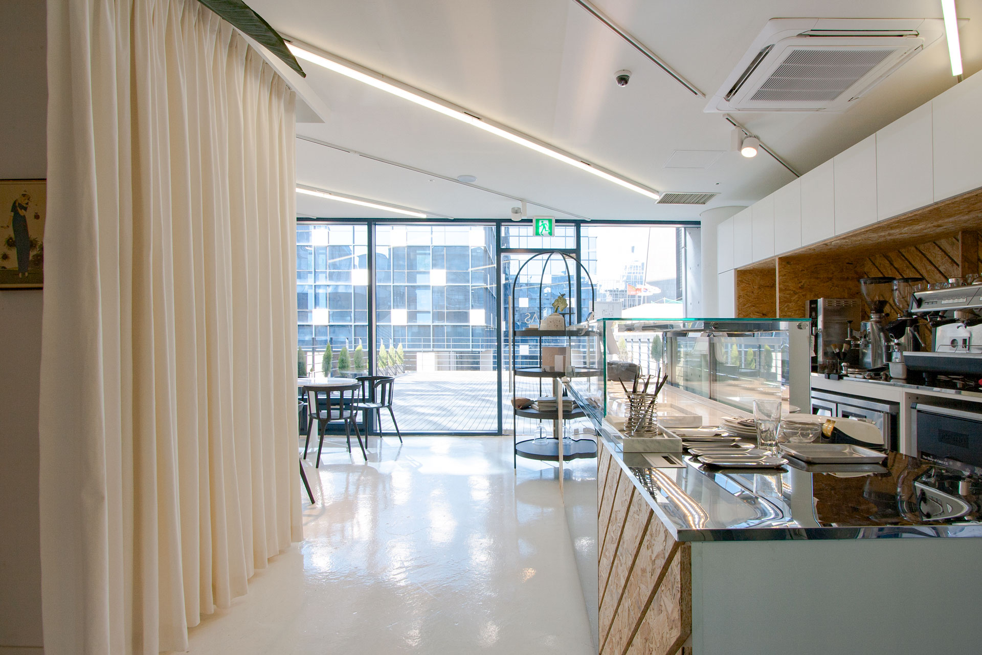
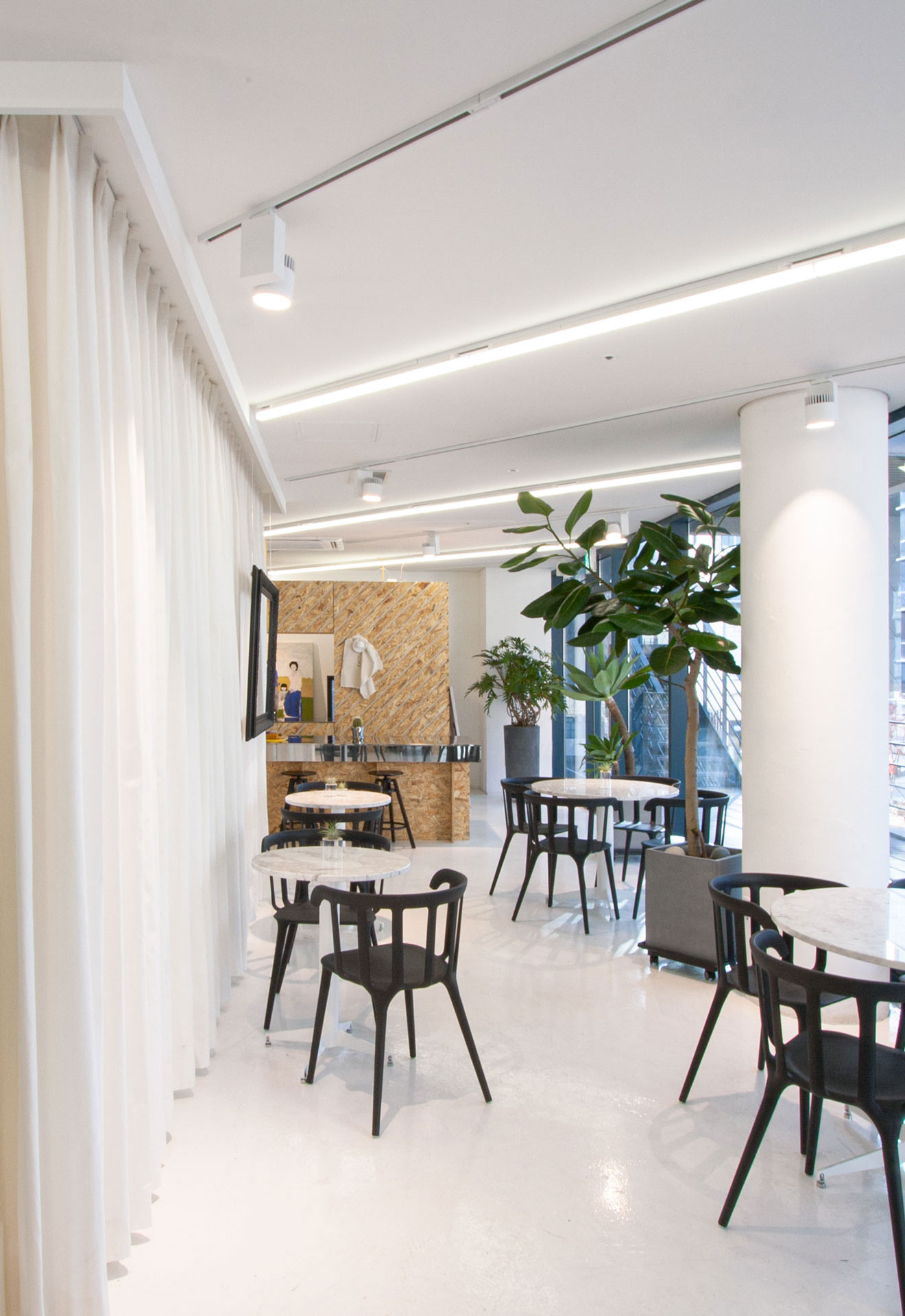
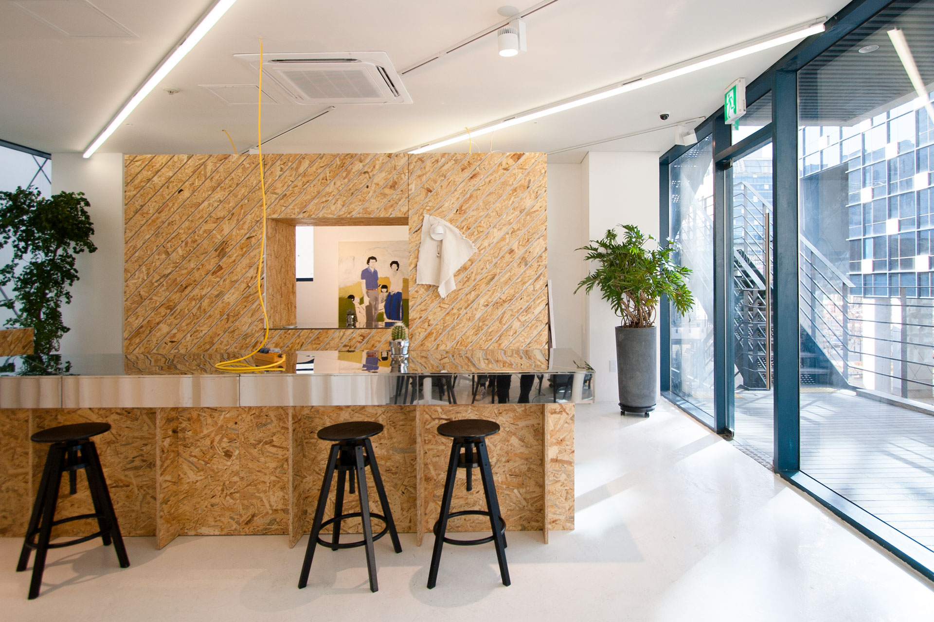
경기 남부지역 대형상권에 위치한 신세계백화점 경기점은 가족 단위의 고객이 많은 점포이며, 새롭게 단장된 8층은 하나의 ‘가족’이라는 키워드로 아동, 골프, 아카데미를 한 층에 전개합니다. 이러한 방향성에 맞춰 NBDC 는 어른과 아이의 제품군에 따라 공간의 차별성을 두지 않고, 가족이라는 공통된 특징에 집중하였습니다.
“모든 어른은 한 때 어린이였다.”라는 생텍쥐페리의 말처럼 모두는 한 때 동심과 상상이 가득한 어린이였고, 이 공간에서만큼은 남녀노소, 아이까지 모두가 즐거움과 상상력을 무한히 가질 수 있는 하나의 놀이터와 같은 공간이기를 꿈꿨습니다.
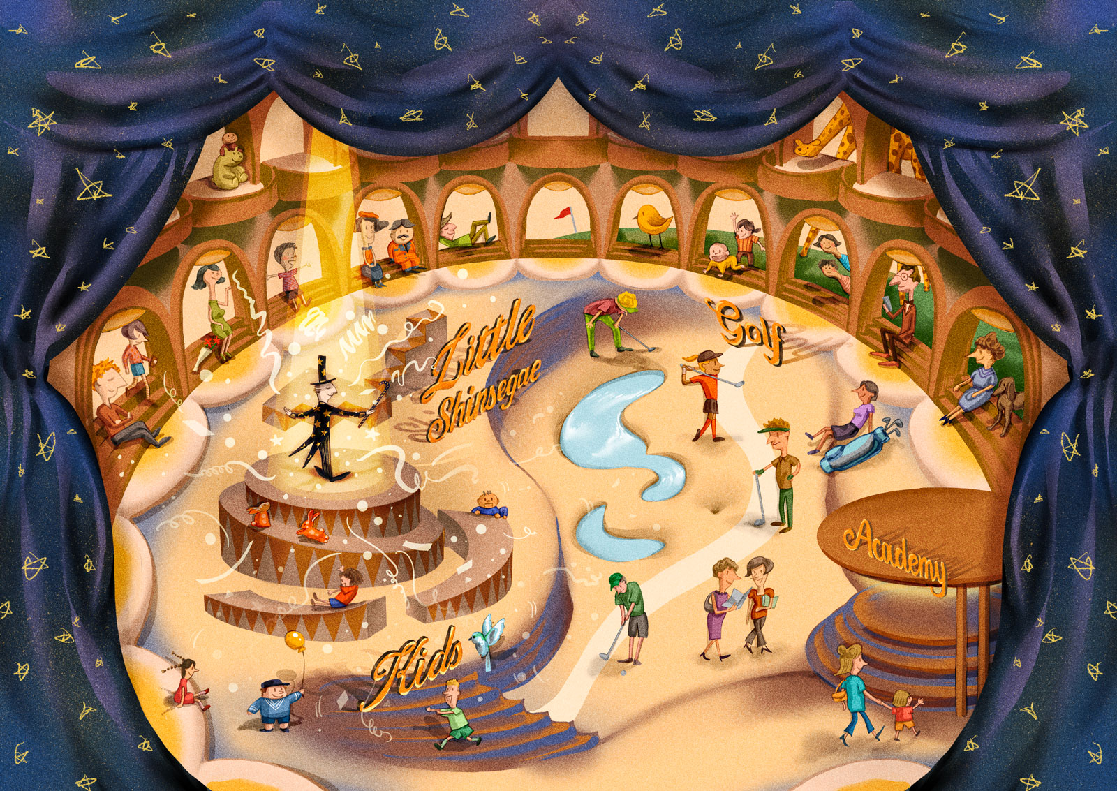
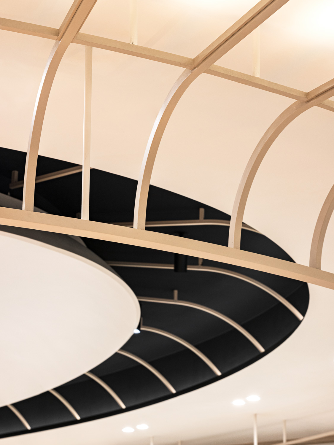
층의 가장 중앙 ‘극장’은 고전적인 천장 디자인을 통해 큰 범위를 포괄하며 모두의 시선을 중앙으로 이끌고, 도착한 중앙에선 다양하게 변하는 무대의 장치처럼 매번 흥미로운 팝업이 열립니다. 그리고 중앙을 둘러싼 외곽의 벽면 매장들은 고대극장의 ‘객석’처럼 다양한 시선으로 공간을 즐길 수 있게 함과 동시에 ‘그 자체의 무대’로서 고객들을 맞이합니다.
이러한 다양한 요소들은 마치 우리가 특정 장소에 있는 것과 같은 착각을 불러일으킵니다. 이로써 NBDC 는 하나의 ‘상상극장’이 우리에게 ‘재미있는 일상’으로 기억되기를 바랍니다.
Shinsegae Department Store Gyeonggi, located in a large shopping center in the southern part of Gyeonggi Province, has a large number of family customers, and the newly renovated 8th floor features children's, golf, and academies on one floor with the keyword 'family'. In line with this direction, NBDC did not differentiate the space according to the product lines of adults and children, but focused on the common feature of family.
In the words of Saint-Exupery, “All grown-ups were once children", and we envisioned this space as a playground where everyone, young and old, male and female, can have unlimited fun and imagination.
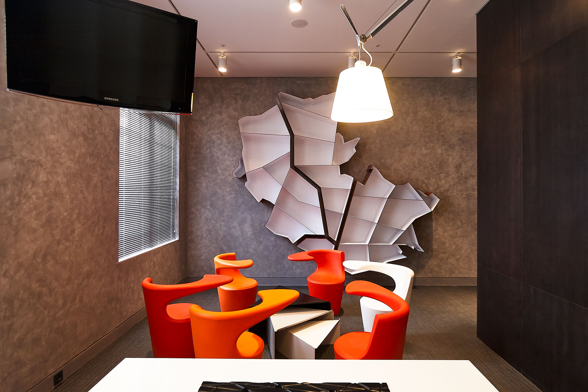
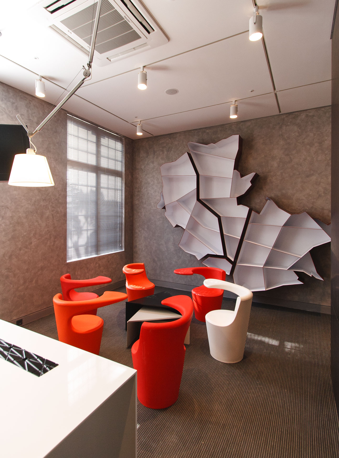
The 'Imaginarium theater' is a magical space where anything can happen, and a place of joy and inspiration for children and adults. We wanted the 8th floor of Shinsegae Department Store Gyeonggi to be like a 'theater', a place to enjoy and inspire while staying, coming, and going, so we projected some elements of old theaters throughout the floor.
The 'theater' in the center has a classic ceiling design that encompasses a large area and draws everyone's attention to the center, where, once there, an interesting pop-up opens up every time, like an ever-changing stage set. And the wall stores on the periphery surrounding the center are 'stages of their own', welcoming customers while allowing them to enjoy the space from different perspectives, like the 'audience' in an ancient theater.
These various elements create the illusion that we are in a specific place. Through this, NBDC hopes that the 'imaginarium theater' will be remembered as a 'fun everyday life' for us.
special thanks to
SHINSEGAE INTERIOR DESIGN TEAM
Hyejung Cho
Jungho Roh
Yoonyoung Han
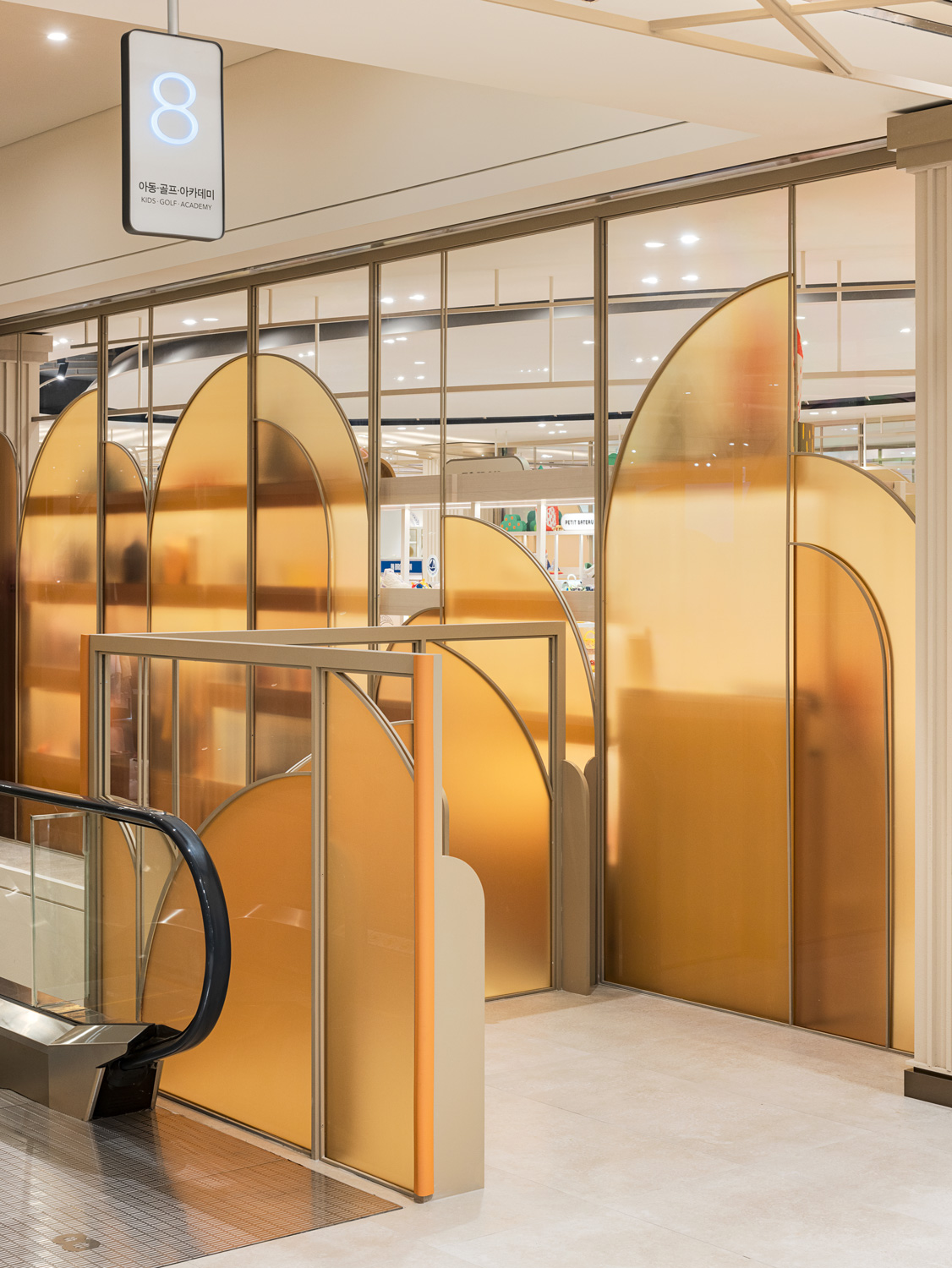


Opening Jul. 2023
Build area 4,111㎡
Use Department Store
Kid’s Wear & Golf
Client SHINSEGAE
Interior architect NBDC
Lead designer Rita, Myeonggeun Park
Team Heegyung Noh, Keunwoo Park, Heejeong Kim, Juyoung Lee
in collaboration with
Photography Yongjoon Choi
Build area 4,111㎡
Use Department Store
Kid’s Wear & Golf
Client SHINSEGAE
Interior architect NBDC
Lead designer Rita, Myeonggeun Park
Team Heegyung Noh, Keunwoo Park, Heejeong Kim, Juyoung Lee
in collaboration with
Photography Yongjoon Choi
ⓒ 2023 NBDC
All rights reserved. No part of this publication may be reproduced or transmitted in any form or by any means, electronic or mechanical, including photocopy or any storage and retrieval system, without permission in writing from the publisher.
Respect copyrights, encourage creativity!
All rights reserved. No part of this publication may be reproduced or transmitted in any form or by any means, electronic or mechanical, including photocopy or any storage and retrieval system, without permission in writing from the publisher.
Respect copyrights, encourage creativity!
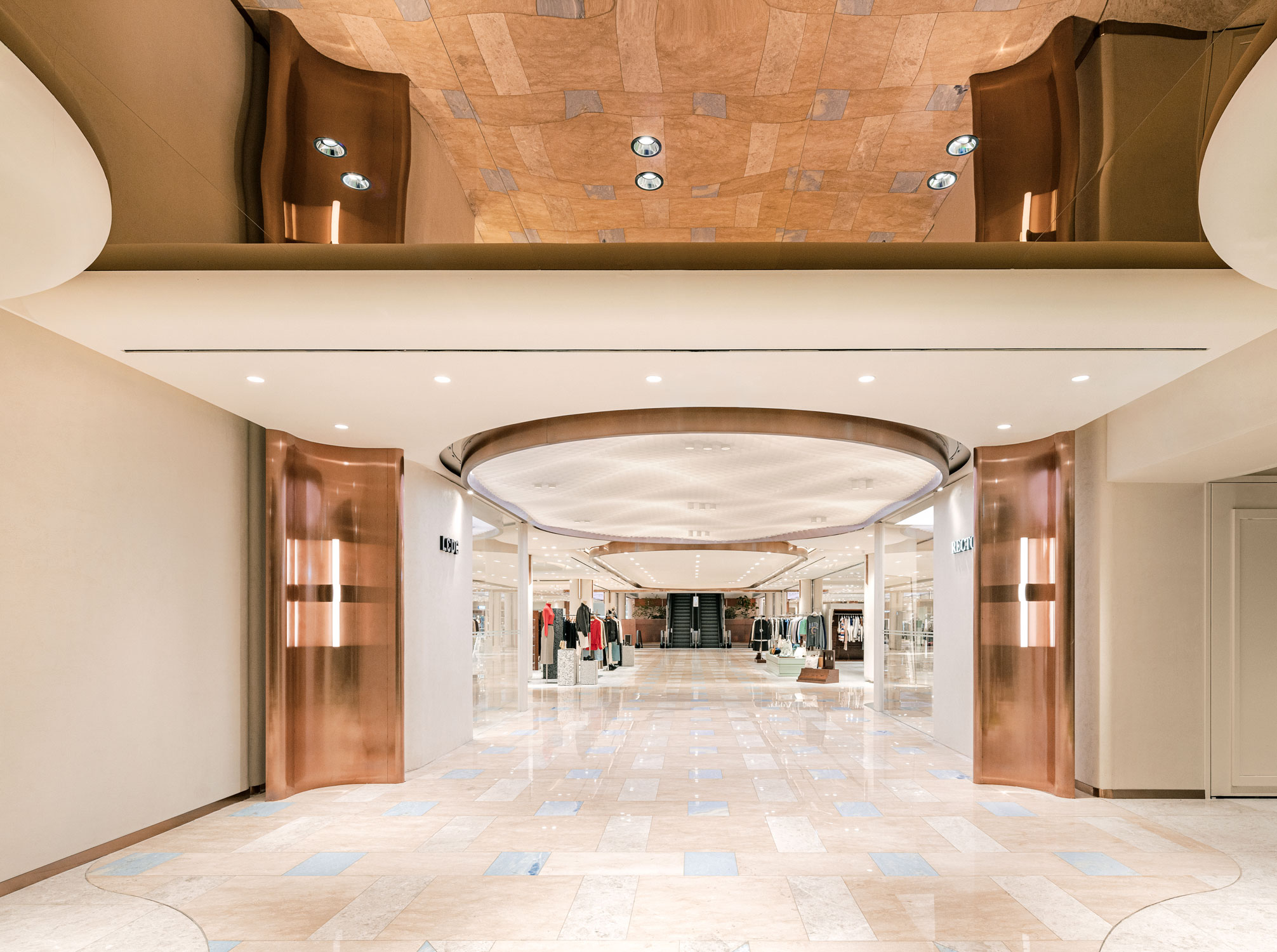
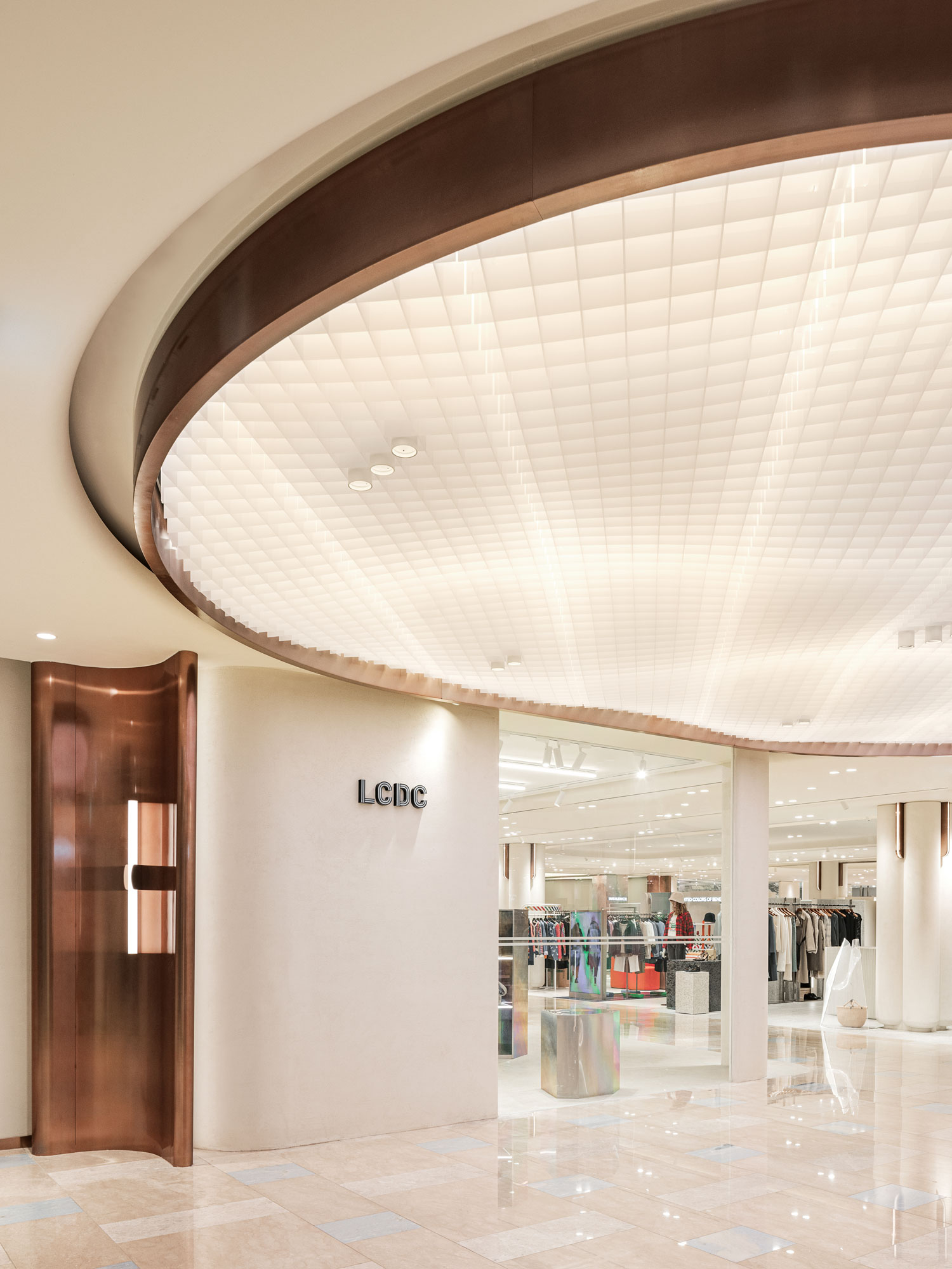
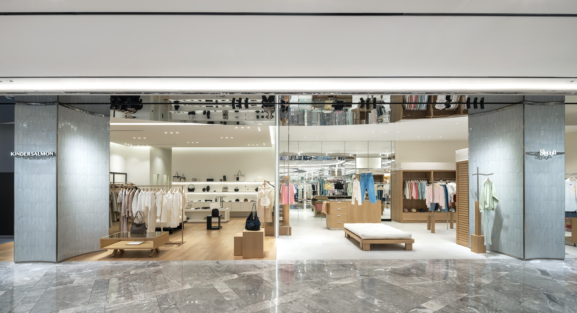
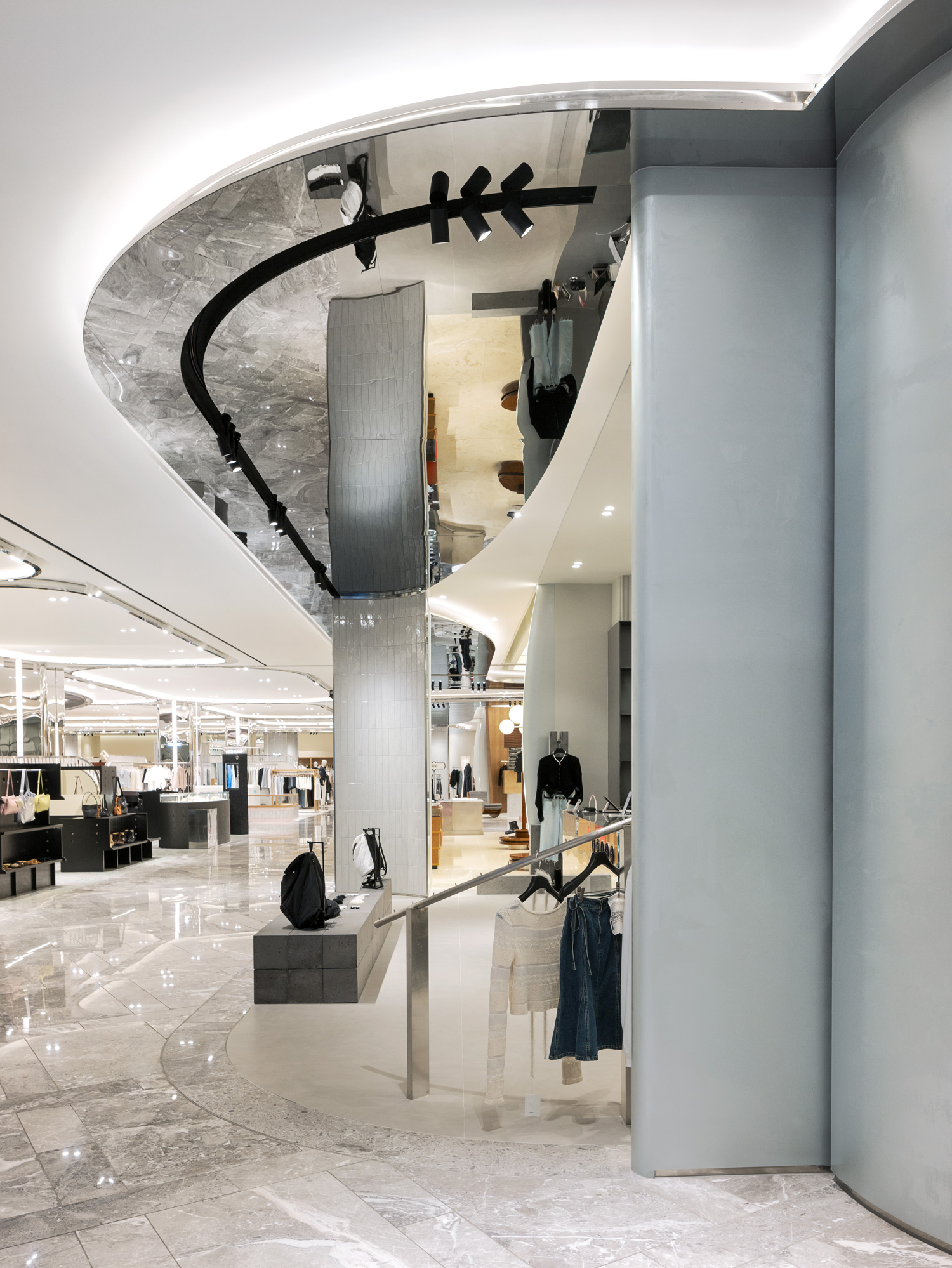
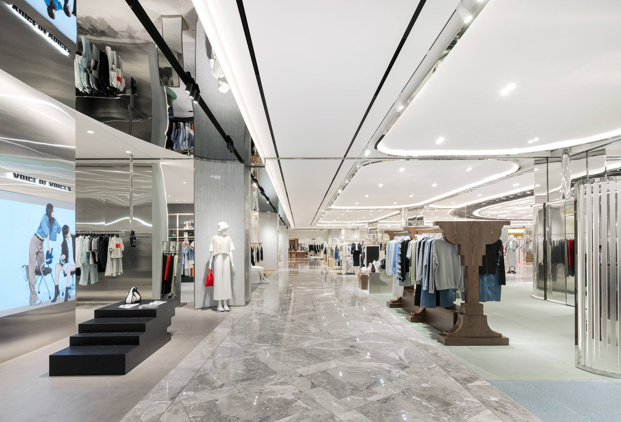
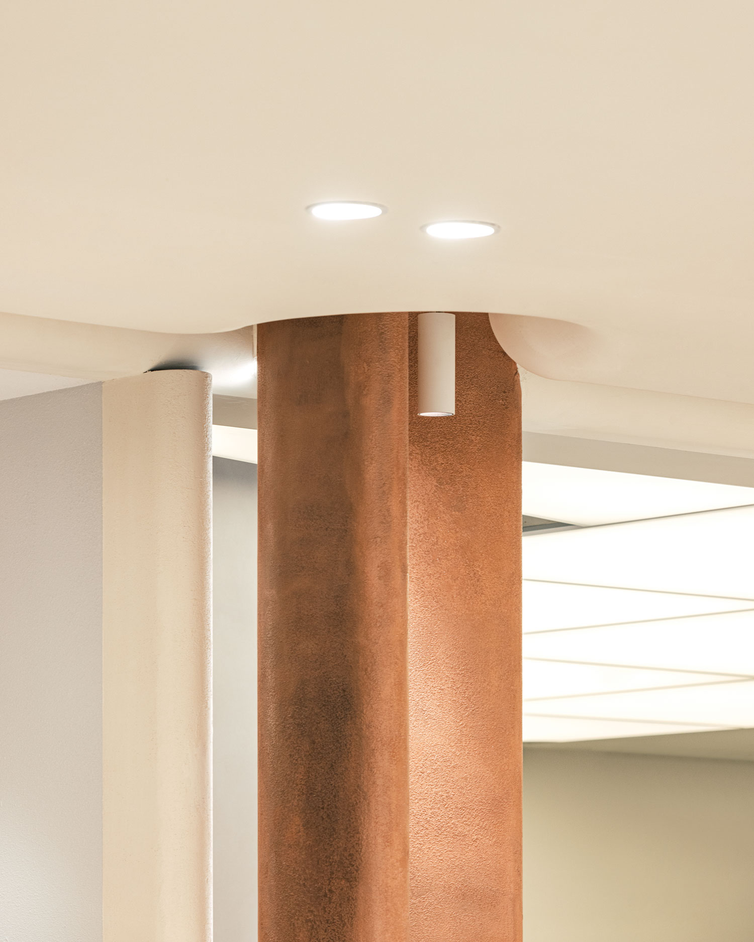
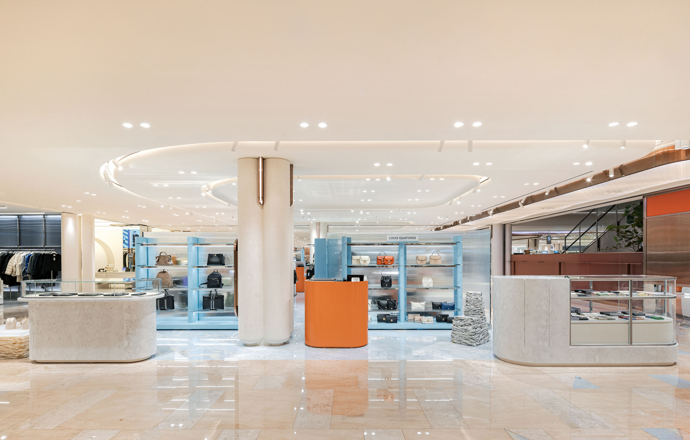
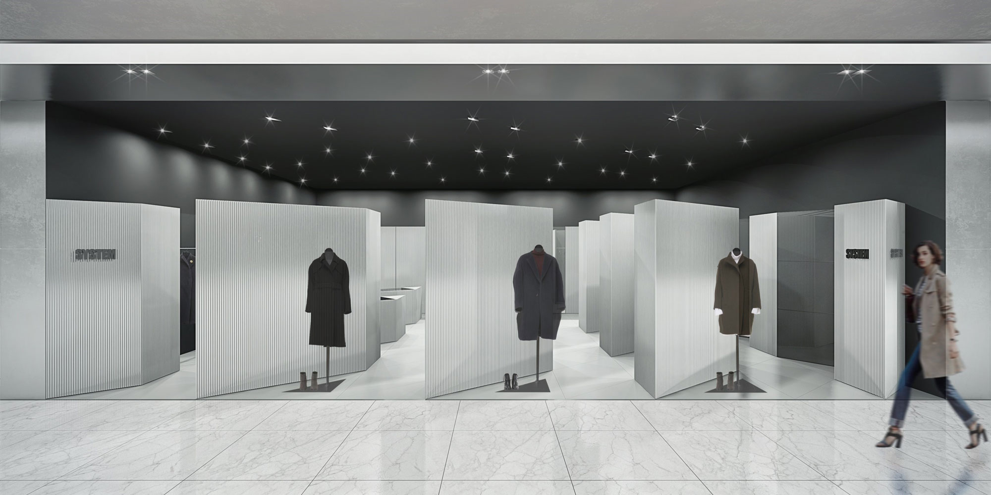
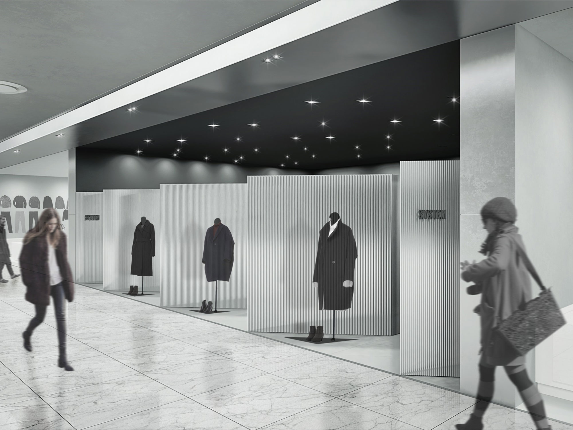
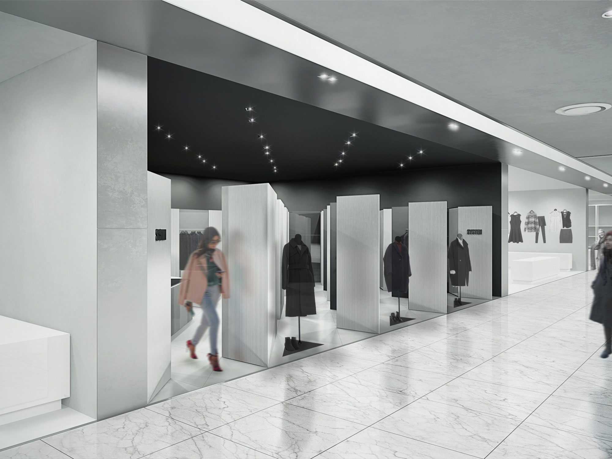
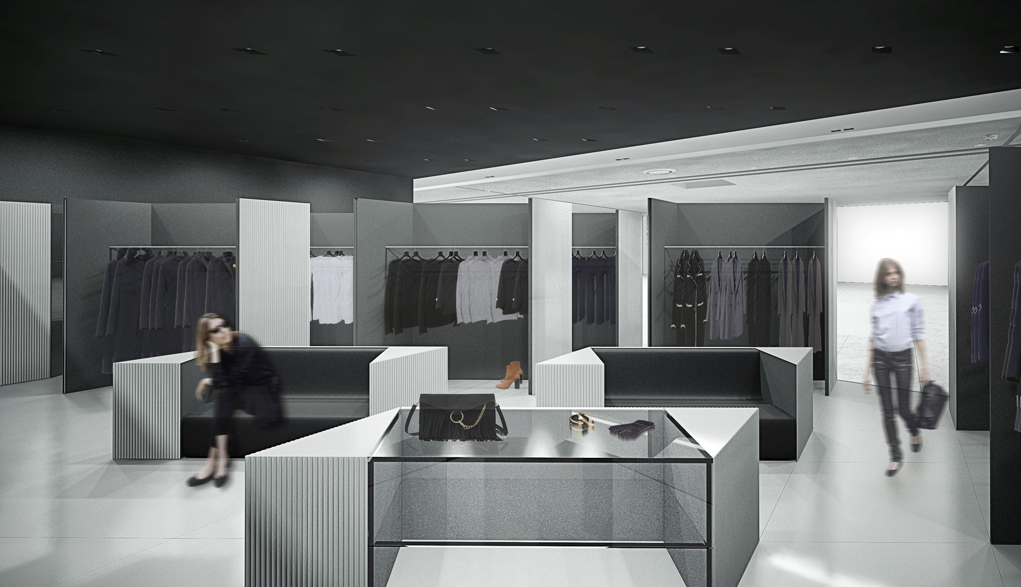
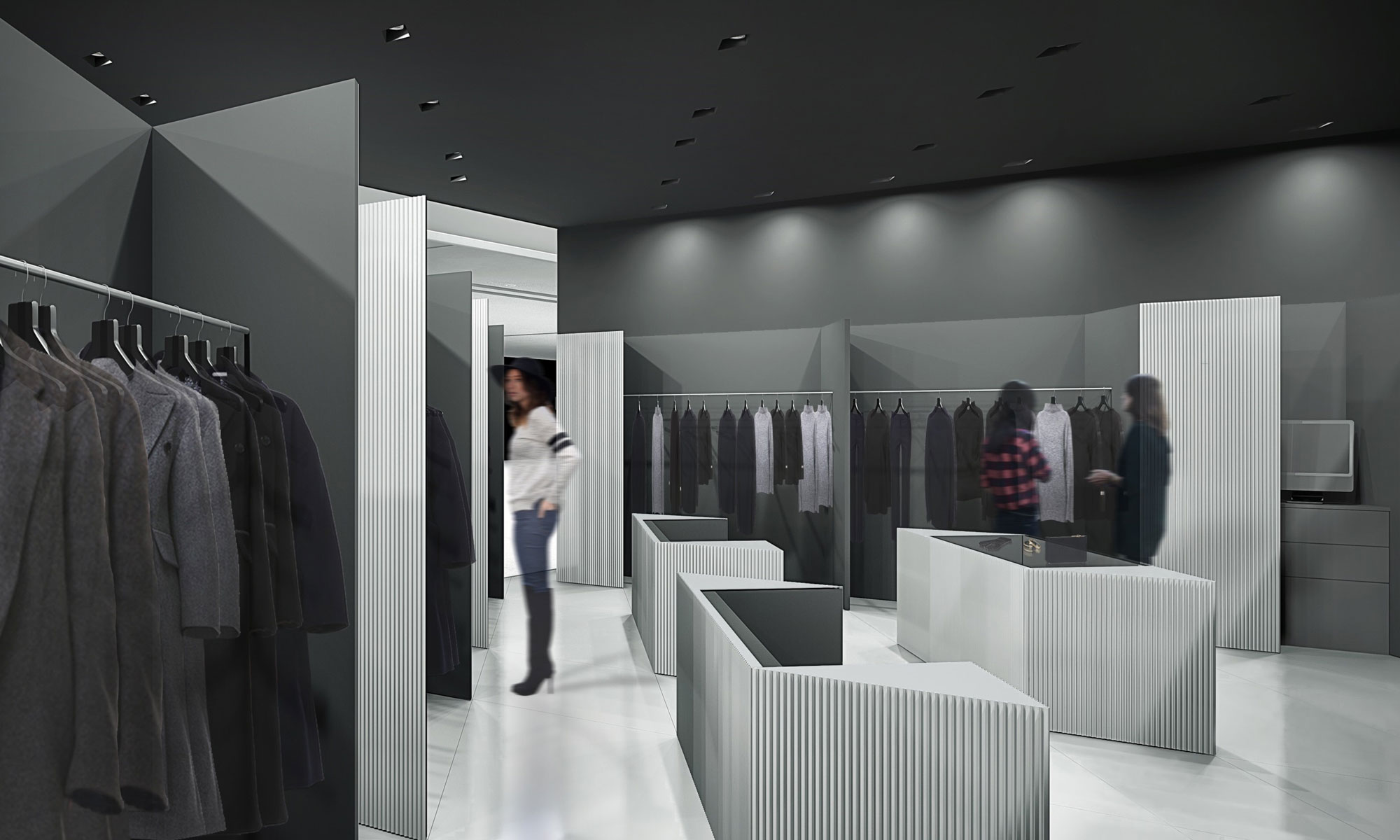
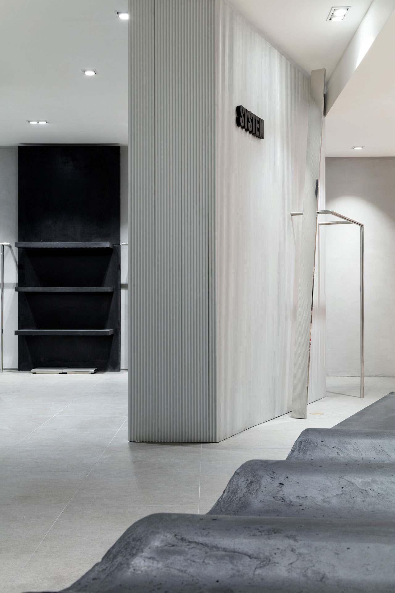
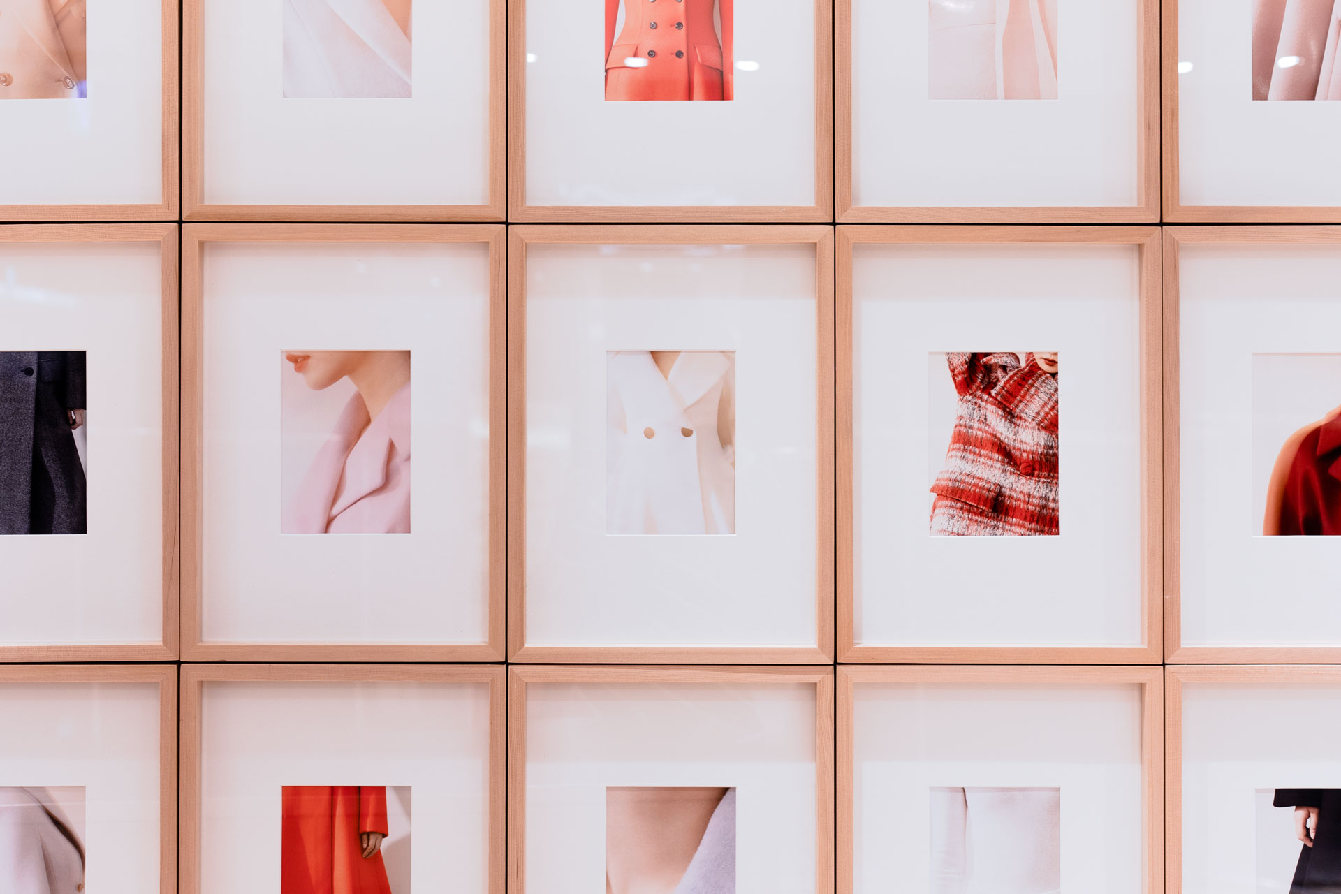
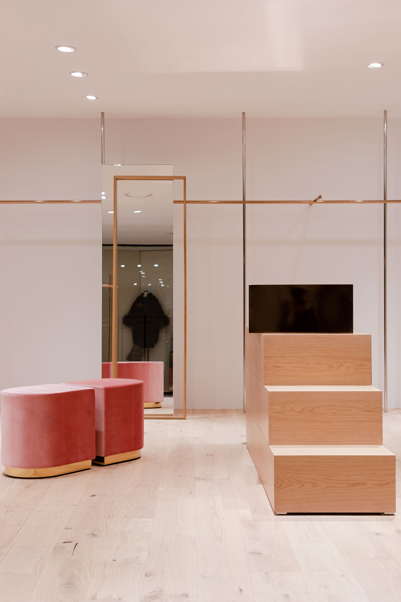
신세계백화점 강남점 5층인 ‘NEW CONTEMPORARY’는 지금 우리가 가장 원하는 패션 브랜드를 선보이는 공간입니다.
트렌디한 스타일을 추구하는 2030을 타깃으로 카테고리를 세분화하여 층 전반이 구성되었고, NBDC 는 이러한 MD 전략에 영감을 얻었습니다. 다른 누구보다 ‘나’ 자신의 아이텐티티를 중요시하는 MZ세대의 욕구에 따라 신세계백화점 본연의 아이텐티티를 재해석하면서 새로운 변화에 집중하였습니다.
신세계백화점 강남점 5층이 마치 하나의 ‘집’과 같은 ‘장소’적인 의미를 가지기를 바랍니다. 집이란 개인의 세계를 표현하는 가장 의미 깊은 중심이며, 어디에 있어도 ‘나’ 로서 존재하는 것들의 집합체로 개인의 아이텐티티를 표현하는 가장 큰 수단입니다.
NBDC는 이러한 ‘집’에서 느껴지는 다양한 분위기와 요소를 공간 곳곳에 투영하였습니다.
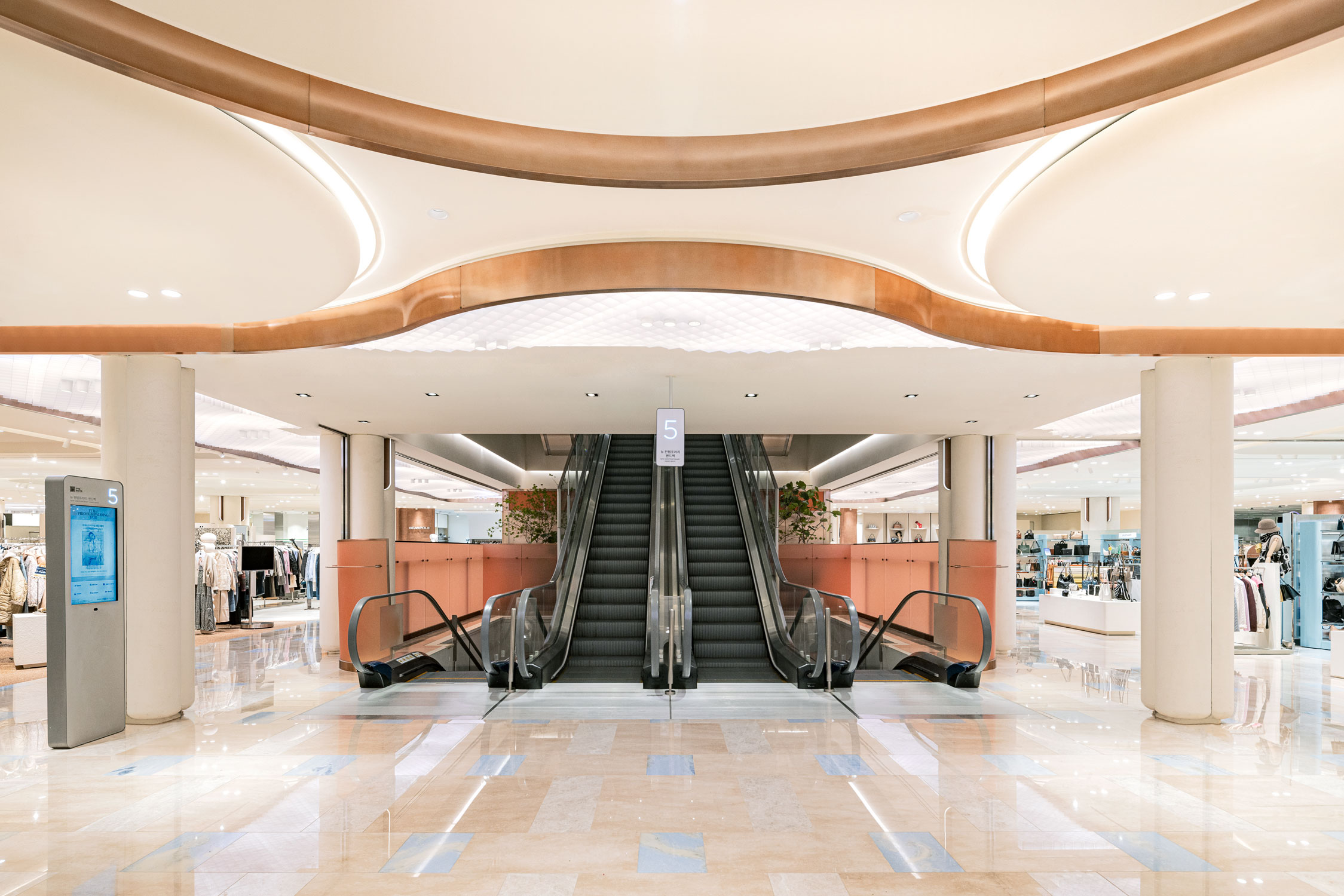
집을 들어섰을 때의 기쁨과 환함을 고객 진입로 천장에, 좁아졌다 넓어지며 마주하는 굴곡진 방의 리듬감 있는 모습들을 MD 라인에, 커튼 사이로 혹은 문과 문 사이를 오고 가며 보이는 흥미롭고 다채로운 씬을 IN-SHOP의 입면 디자인에서 볼 수 있습니다. 그리고 우리들이 가진 아름다운 오브제를 건축의 가장 기초적인 요소인 기둥에 대입해 반전의 재미를 꾀하였습니다.
Located on the fifth floor of the Shinsegae department store / Gangnam branch, lies the ‘NEW CONTEMPORARY’.
By drawing inspiration from today’s youth, the main design idea revolves around the theme, that is, high value being placed, by today’s generation, upon one’s own identity.
The renovations were made to adorn the space with a homelike portrayal.
We perceive a person's home as not just a physical space but as a vessel to one’s own small universe. It encompasses various items, clothing, and furniture meticulously collected over time and through this accumulation of material possessions, one's home becomes a reflection of their unique identity.
Ergo, our goal was to create an environment that resembles one’s home, to emulate the feeling of seamless harmonization that we hope all customers will be able to experience during their time spent in the ‘NEW CONTEMPORARY’.
The entire floor was designed in parts, with each piece being representative of the larger theme at play.
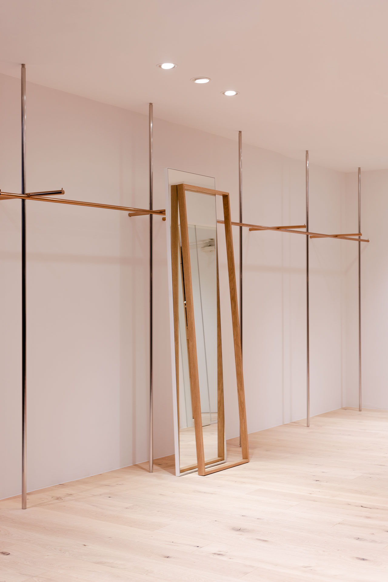
A driveway-like corridor guides you towards the entrance of the store, where ceiling lights gracefully emulate the comforting glow of home, exuding a sense of warmth and happiness that washes over you after a long day.
The pathways rhythmically meander, widening and narrowing at intervals, unveiling openings reminiscent of open doors and drawn curtains. These entrances beckon visitors to explore the diverse shops that lie beyond, resembling twisting corridors that branch off into a myriad of rooms and amenities found within a home.
As a final touch of artistic refinement to the fifth floor of the Shinsegae department store, we took special care not to neglect the supporting pillars and to leave them as mere utilitarian structures.
Through tasteful etching, delicate carving, and thoughtful incorporation we breathed new life into these pillars. No longer bland and uniform, they exude an aura of quiet elegance, showcasing a modest yet captivating artistic transformation that harmonizes with the overall ambiance of the space.
special thanks to
SHINSEGAE INTERIOR DESIGN TEAM
Hyejung Cho
Chaewon Jung
Seunghoon Oh
Gaeun Kim
트렌디한 스타일을 추구하는 2030을 타깃으로 카테고리를 세분화하여 층 전반이 구성되었고, NBDC 는 이러한 MD 전략에 영감을 얻었습니다. 다른 누구보다 ‘나’ 자신의 아이텐티티를 중요시하는 MZ세대의 욕구에 따라 신세계백화점 본연의 아이텐티티를 재해석하면서 새로운 변화에 집중하였습니다.
신세계백화점 강남점 5층이 마치 하나의 ‘집’과 같은 ‘장소’적인 의미를 가지기를 바랍니다. 집이란 개인의 세계를 표현하는 가장 의미 깊은 중심이며, 어디에 있어도 ‘나’ 로서 존재하는 것들의 집합체로 개인의 아이텐티티를 표현하는 가장 큰 수단입니다.
NBDC는 이러한 ‘집’에서 느껴지는 다양한 분위기와 요소를 공간 곳곳에 투영하였습니다.
집을 들어섰을 때의 기쁨과 환함을 고객 진입로 천장에, 좁아졌다 넓어지며 마주하는 굴곡진 방의 리듬감 있는 모습들을 MD 라인에, 커튼 사이로 혹은 문과 문 사이를 오고 가며 보이는 흥미롭고 다채로운 씬을 IN-SHOP의 입면 디자인에서 볼 수 있습니다. 그리고 우리들이 가진 아름다운 오브제를 건축의 가장 기초적인 요소인 기둥에 대입해 반전의 재미를 꾀하였습니다.
Located on the fifth floor of the Shinsegae department store / Gangnam branch, lies the ‘NEW CONTEMPORARY’.
By drawing inspiration from today’s youth, the main design idea revolves around the theme, that is, high value being placed, by today’s generation, upon one’s own identity.
The renovations were made to adorn the space with a homelike portrayal.
We perceive a person's home as not just a physical space but as a vessel to one’s own small universe. It encompasses various items, clothing, and furniture meticulously collected over time and through this accumulation of material possessions, one's home becomes a reflection of their unique identity.
Ergo, our goal was to create an environment that resembles one’s home, to emulate the feeling of seamless harmonization that we hope all customers will be able to experience during their time spent in the ‘NEW CONTEMPORARY’.
The entire floor was designed in parts, with each piece being representative of the larger theme at play.
A driveway-like corridor guides you towards the entrance of the store, where ceiling lights gracefully emulate the comforting glow of home, exuding a sense of warmth and happiness that washes over you after a long day.
The pathways rhythmically meander, widening and narrowing at intervals, unveiling openings reminiscent of open doors and drawn curtains. These entrances beckon visitors to explore the diverse shops that lie beyond, resembling twisting corridors that branch off into a myriad of rooms and amenities found within a home.
As a final touch of artistic refinement to the fifth floor of the Shinsegae department store, we took special care not to neglect the supporting pillars and to leave them as mere utilitarian structures.
Through tasteful etching, delicate carving, and thoughtful incorporation we breathed new life into these pillars. No longer bland and uniform, they exude an aura of quiet elegance, showcasing a modest yet captivating artistic transformation that harmonizes with the overall ambiance of the space.
special thanks to
SHINSEGAE INTERIOR DESIGN TEAM
Hyejung Cho
Chaewon Jung
Seunghoon Oh
Gaeun Kim
Opening Aug. 2022
Build area 3,278㎡
Use Department Store
New Contemporary
Client SHINSEGAE
Interior architect NBDC
Director Yonghwan Shin
Lead designer Rita, Myeonggeun Park
Team Keunwoo Park, Taeun Park, Heegyung Noh, Juwon Kim
in collaboration with
Photography Yongjoon Choi
Build area 3,278㎡
Use Department Store
New Contemporary
Client SHINSEGAE
Interior architect NBDC
Director Yonghwan Shin
Lead designer Rita, Myeonggeun Park
Team Keunwoo Park, Taeun Park, Heegyung Noh, Juwon Kim
in collaboration with
Photography Yongjoon Choi
ⓒ 2022 NBDC
All rights reserved. No part of this publication may be reproduced or transmitted in any form or by any means, electronic or mechanical, including photocopy or any storage and retrieval system, without permission in writing from the publisher.
Respect copyrights, encourage creativity!
All rights reserved. No part of this publication may be reproduced or transmitted in any form or by any means, electronic or mechanical, including photocopy or any storage and retrieval system, without permission in writing from the publisher.
Respect copyrights, encourage creativity!
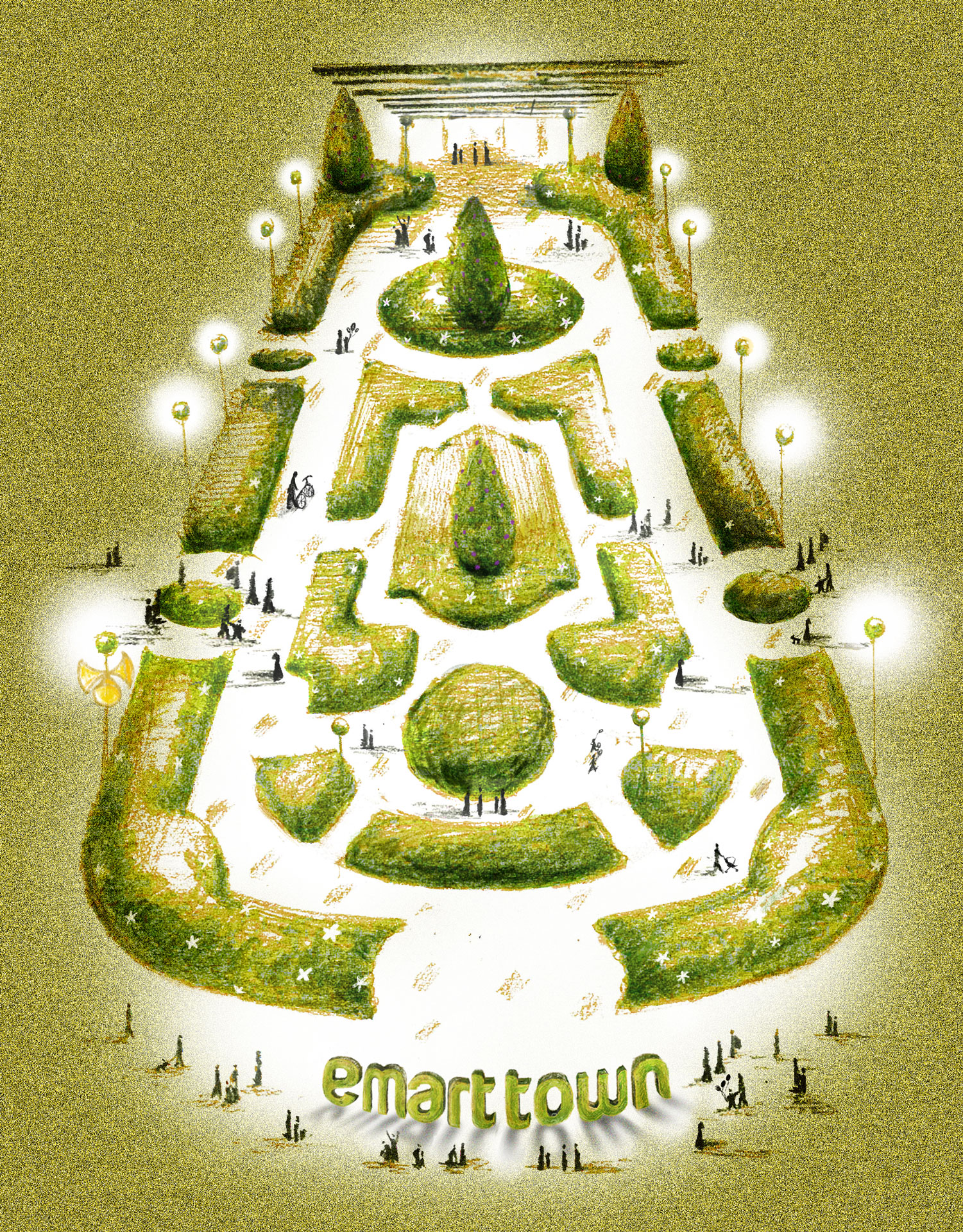
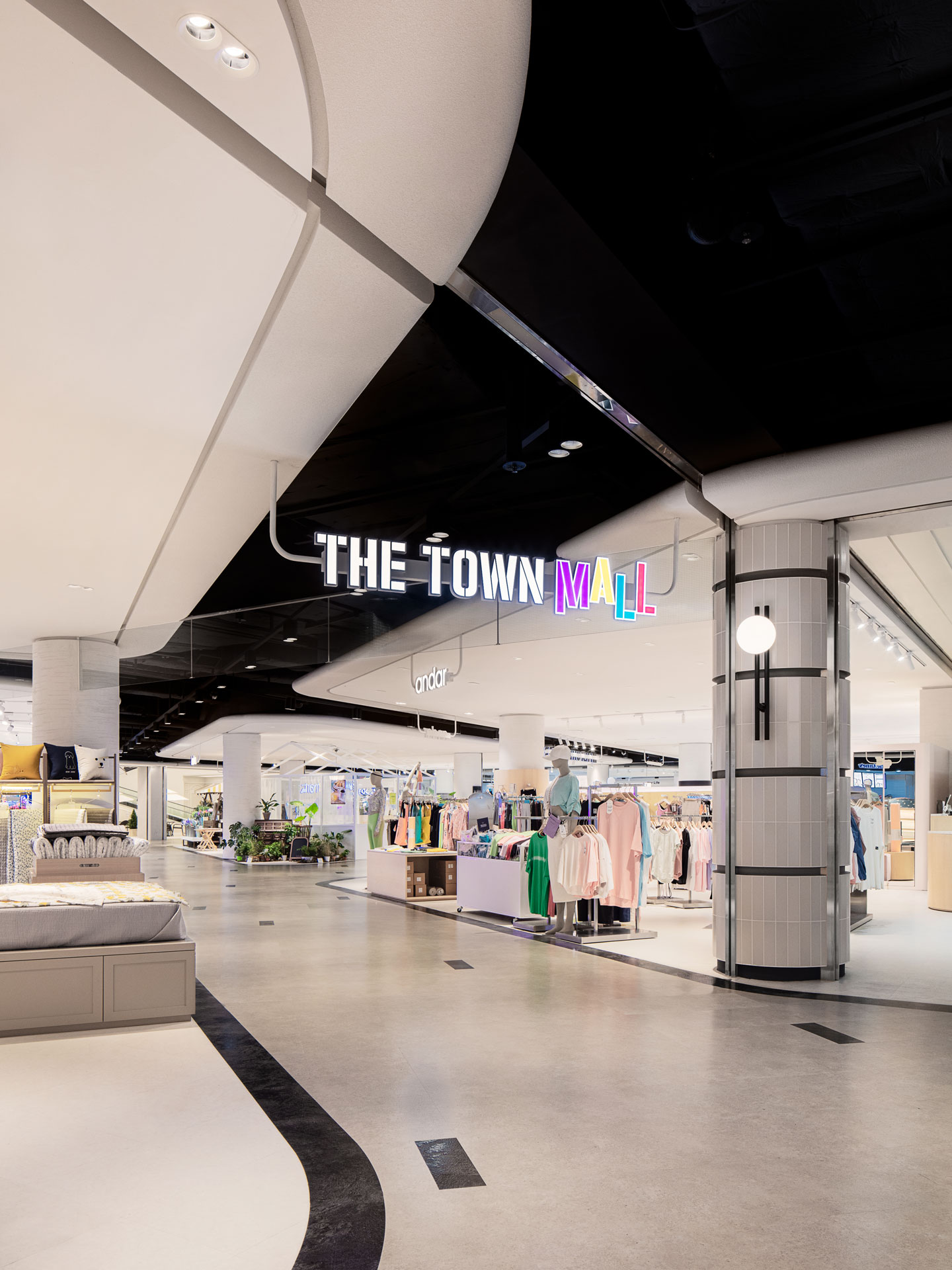
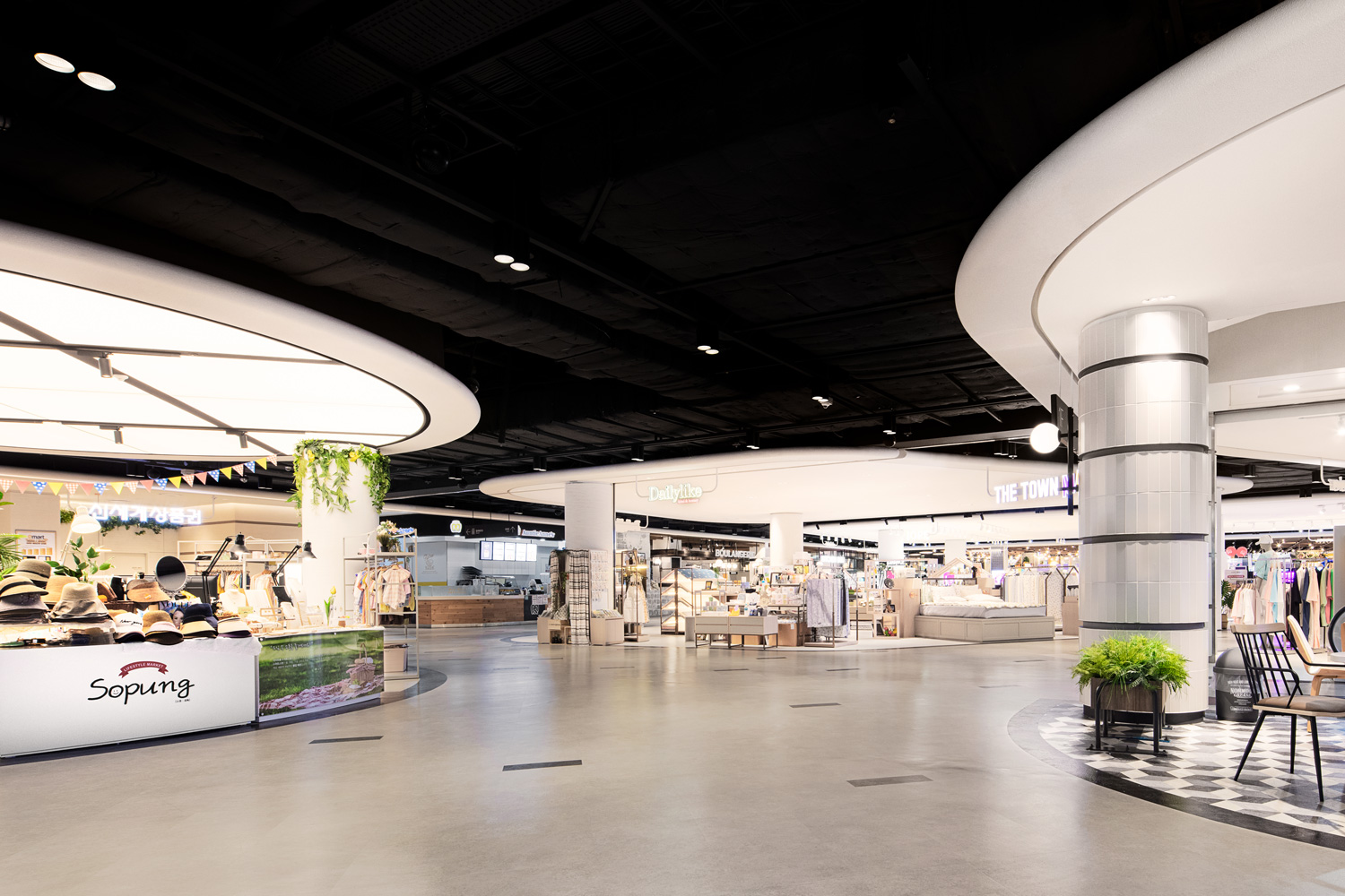
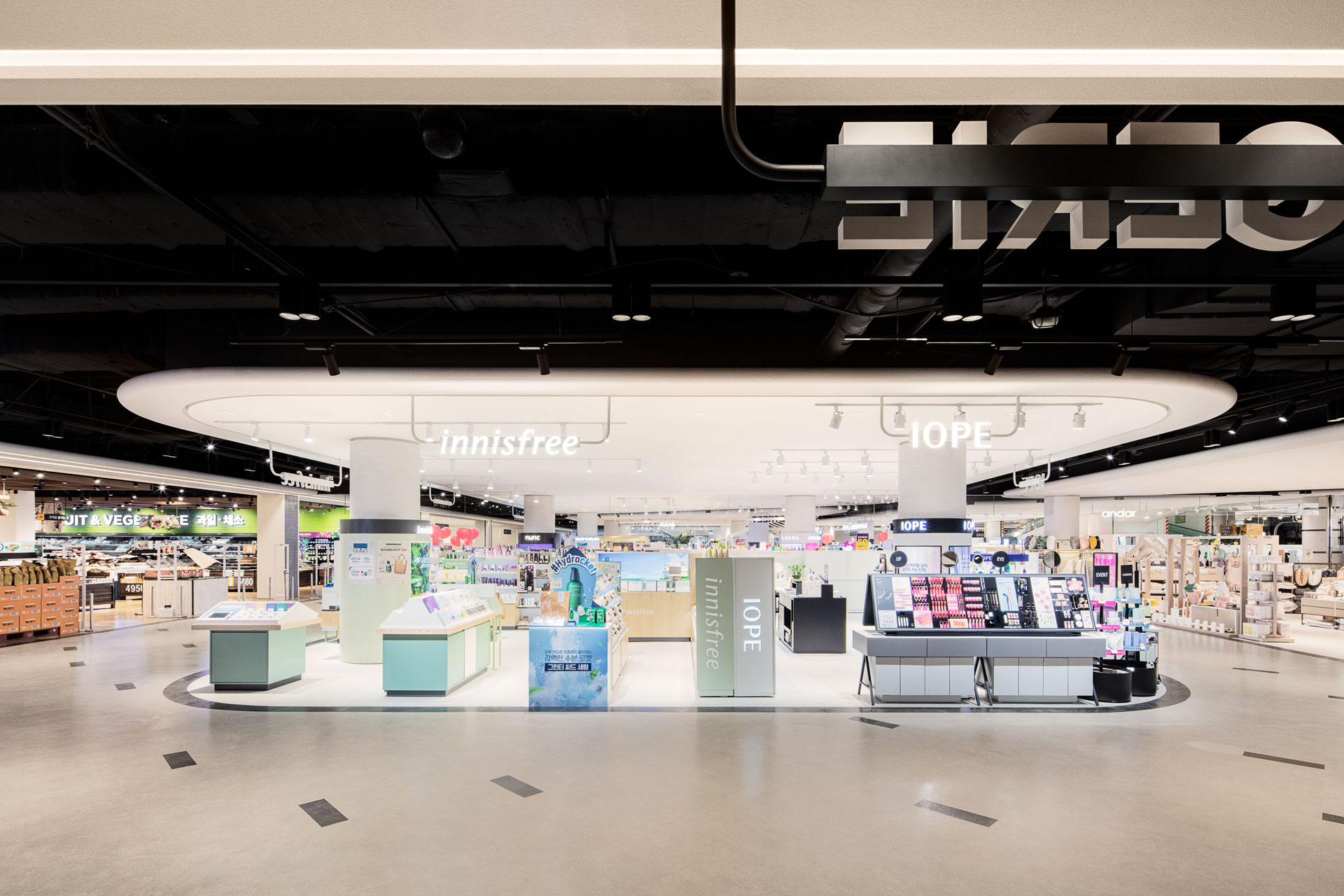
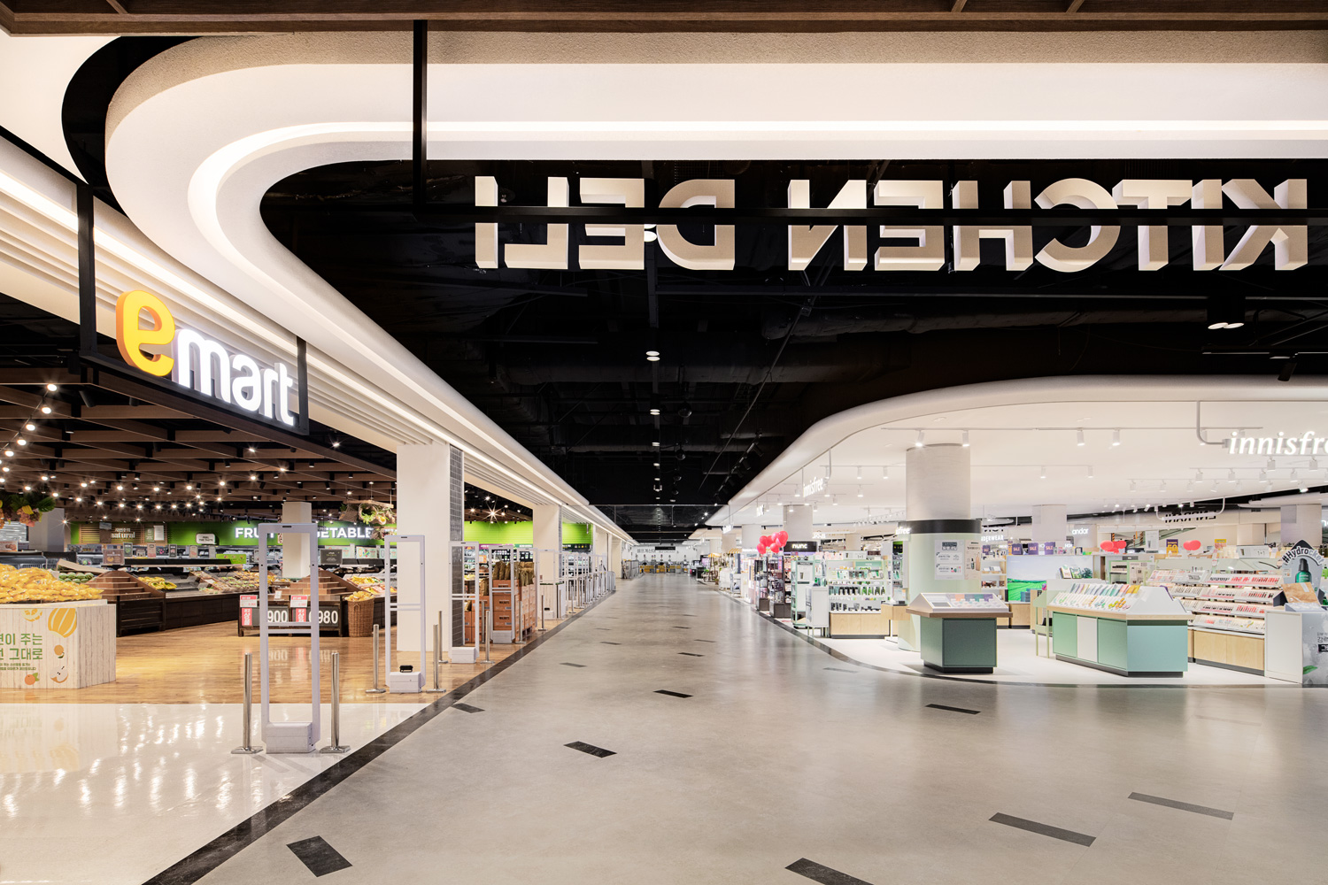
이마트는 대한민국의 대형 할인점이다. 그로서리를 중심으로 장보기에 국한된 장소에서 벗어나 이마트 월계점 ‘THE
TOWN MALL’ 은 6개(F&B,
Culture, Life, Grocery, Fashion, Factory Outlet)의 테마 MD로
구성 되면서 즐거운 쇼핑 경험을 통해 고객이 오래 머물고 싶은 장소로 트랜스포메이션 되었다.
![]()
디자인 스튜디오 NBDC 와 FRINDLEY와의 협업을 통해 설계된 이마트 월계점 ‘THE TOWN
MALL’은 온라인 시장의 가파른 성장으로 인한 오프라인 매장의 역할 변화 필요성이 대두됨에 따라 지역민의 니즈, 데모그라피, 타켓, 라이프
스타일을 반영한 컨텐츠 중심의 앵커 전략에 초점을 맞추어 설계 되었으며 먹고, 놀고, 배우고, 즐기는 장소로 다양한 경험과 문화를 제공한다.
emart is a supercenter based in south korea. No longer limited to a place that is mainly for grocery shopping, "THE TOWN MALL" in emart's wolgye branch consists of merchandisers featuring six themes (F&B, Culture, Life, Grocery, Fashion, Factory Outlet), having been transformed into a space where customers would wish to stay longer with enjoyable shopping experience.
The design of "THE TOWN MALL" in emart's Wolgye branch is the product of its cooperation with two design studios, FRINDLEY and NBDC. It was designed with a focus on an anchor strategy, centering on contents that reflect the local needs, demography, targets, and lifestyle, against the backdrop of the rapid growth of online markets and the need for changes in the roles of offline markets. As a place where customers can eat, play, learn, and have fun, "THE TOWN MALL" provides a variety of experiences and cultures.
special thanks to
EMART STORE DEVELOPMENT DEPT. TEAM
Youngeun Shim
Kyungwon Seo
Dokyeong Kim
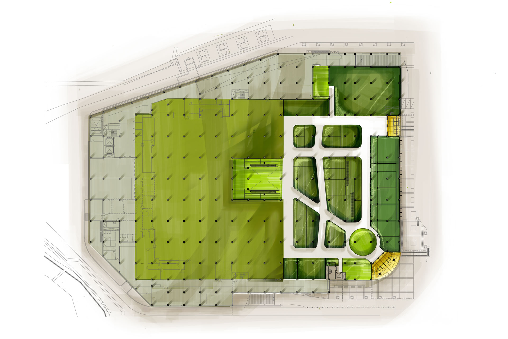 First floor
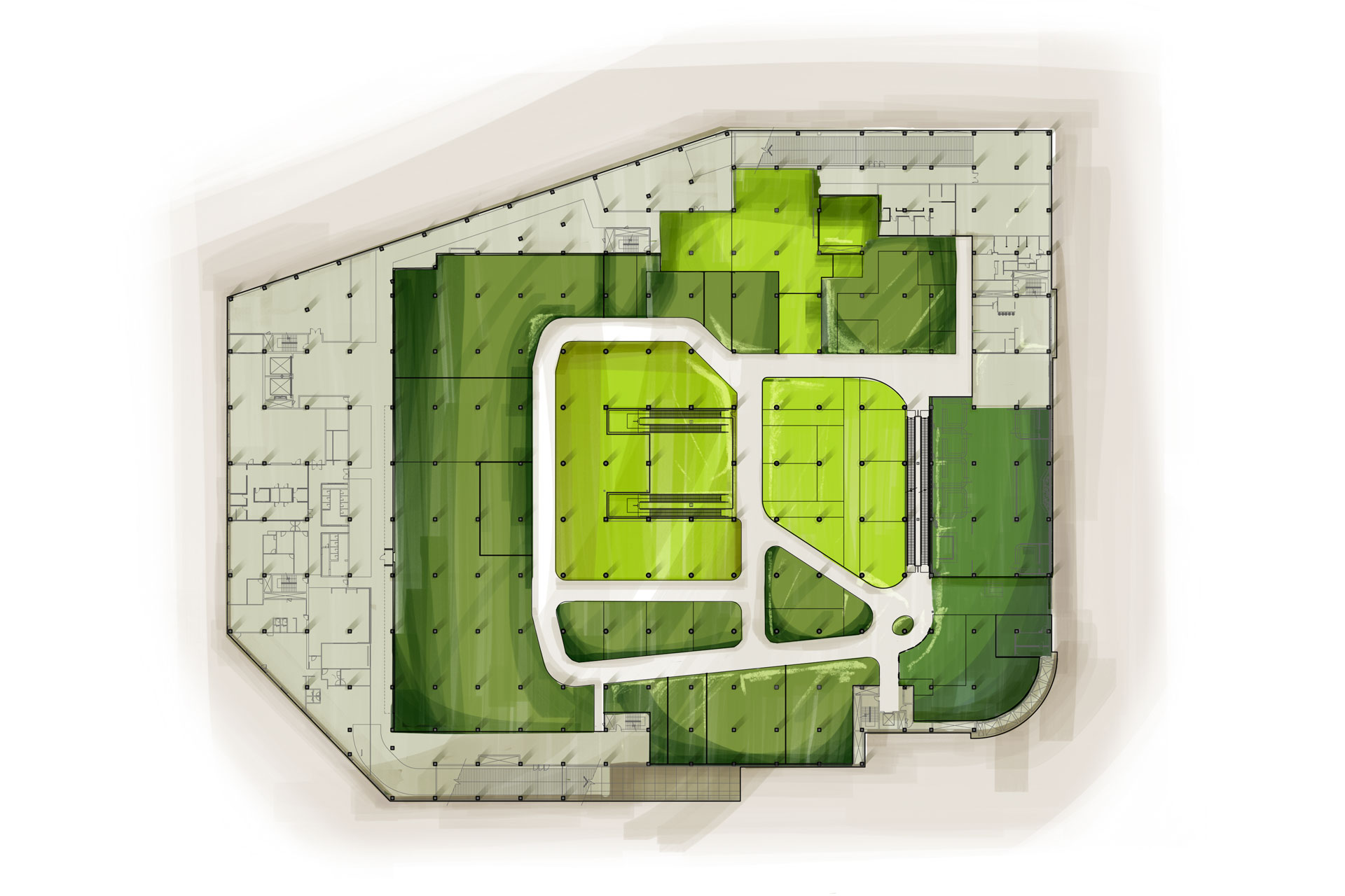
Second floor
Opening May 2020
Build area first floor 4,182㎡
Second floor 4,959㎡
Use Multi Shopping Mall
Client emart
Interior architect NBDC
Director Yonghwan Shin
Lead designer Rita, Myeonggeun Park
Team Hanna Park
in collaboration with
Spatial planning Seungyong Shin of FRINDLEY
Interior contractor Dau Inc.
Photography Yongjoon Choi
ⓒ 2020 NBDC
All rights reserved. No part of this publication may be reproduced or transmitted in any form or by any means, electronic or mechanical, including photocopy or any storage and retrieval system, without permission in writing from the publisher.
Respect copyrights, encourage creativity!
All rights reserved. No part of this publication may be reproduced or transmitted in any form or by any means, electronic or mechanical, including photocopy or any storage and retrieval system, without permission in writing from the publisher.
Respect copyrights, encourage creativity!
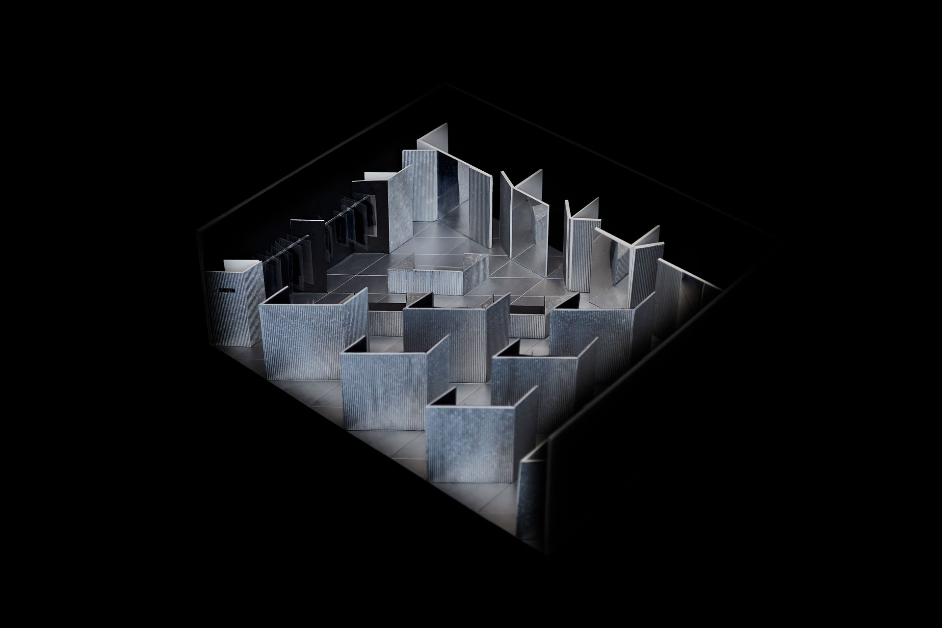
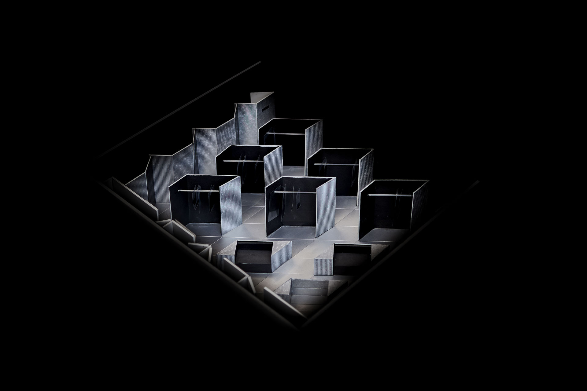
DESIGN COMPETITION
Jan. 2016Streets and squares bring the city to life through its role as a unique place.
urban ; connected with a town or city
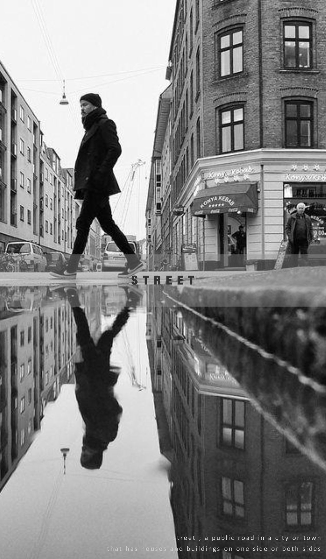
street ; a public road in a city or town
that has houses and buildings on one side or both sides
that has houses and buildings on one side or both sides
square ; a plaza is an open square in a city
SHINSEGAE
Gimhae
Jun. 2016

THE HYUNDAI
Mokdong
Feb. 2017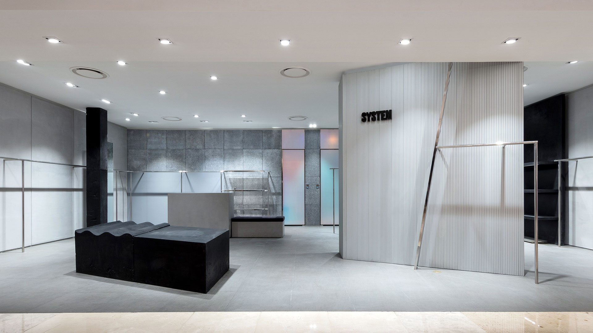

ⓒ 2017 NBDC
All rights reserved. No part of this publication may be reproduced or transmitted in any form or by any means, electronic or mechanical, including photocopy or any storage and retrieval system, without permission in writing from the publisher.
Respect copyrights, encourage creativity!
All rights reserved. No part of this publication may be reproduced or transmitted in any form or by any means, electronic or mechanical, including photocopy or any storage and retrieval system, without permission in writing from the publisher.
Respect copyrights, encourage creativity!
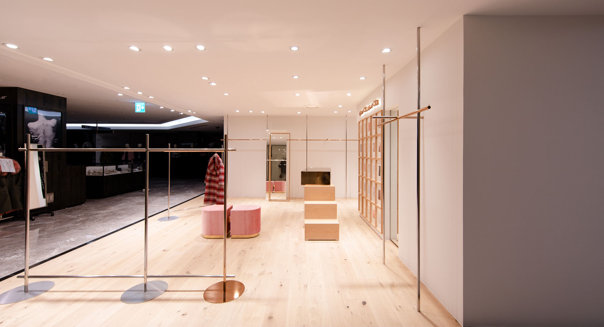
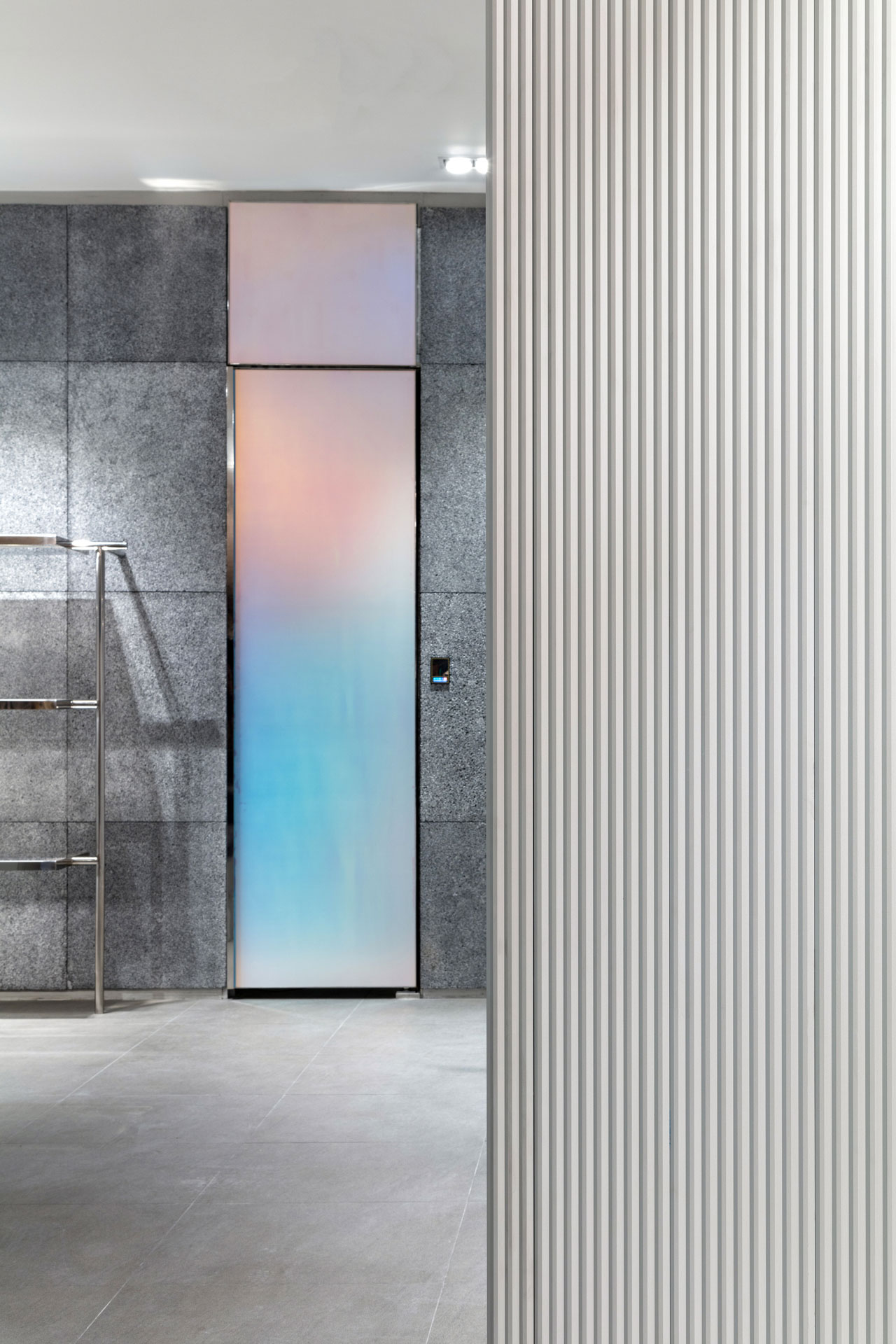
avouavou is a women's apparel brand with its own color of Modern coutureon the boundaries of RTW and Haute couture.
We started system integration by talking about various topics to find out how to express their values in space.
We started system integration by talking about various topics to find out how to express their values in space.
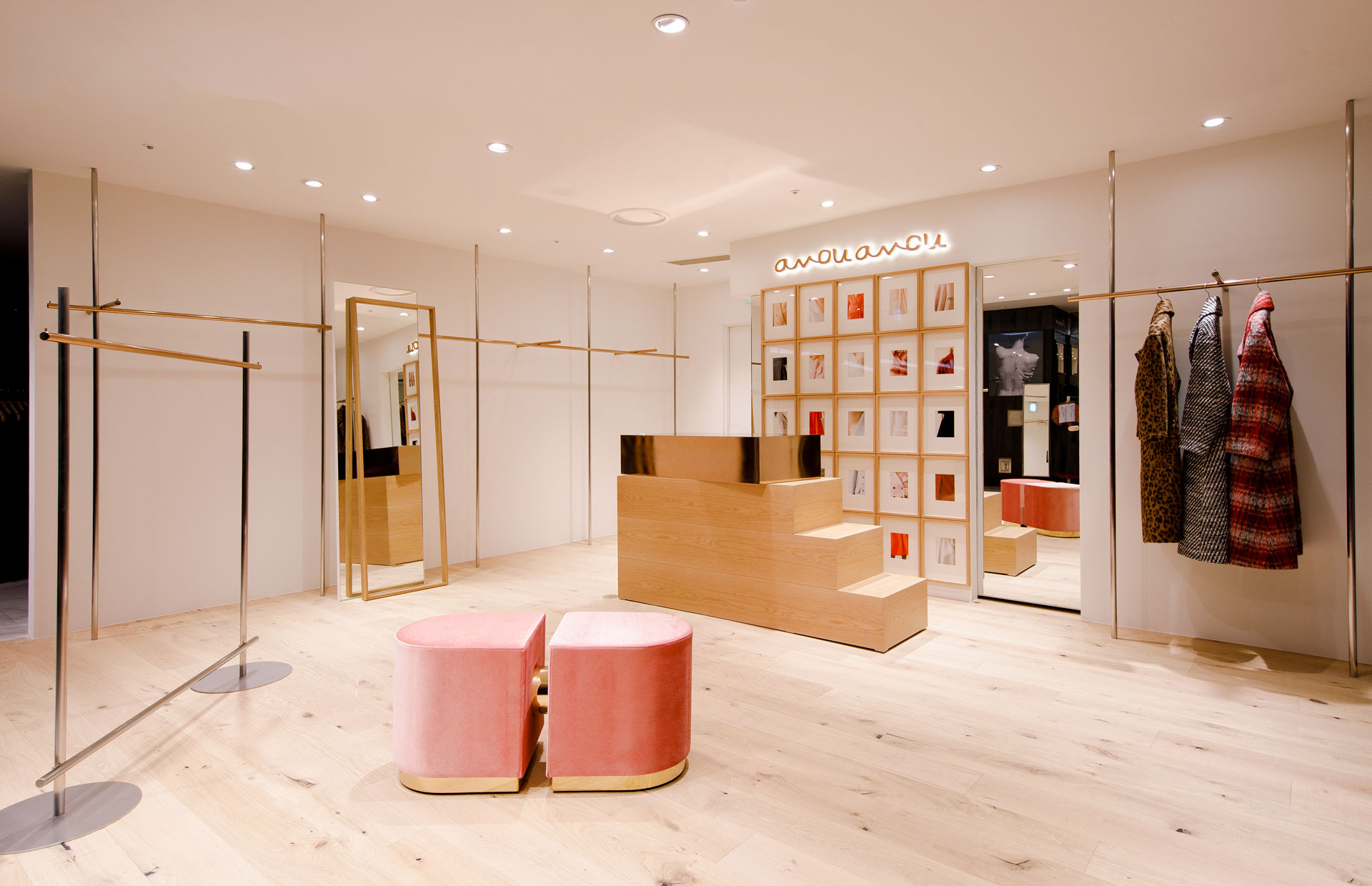

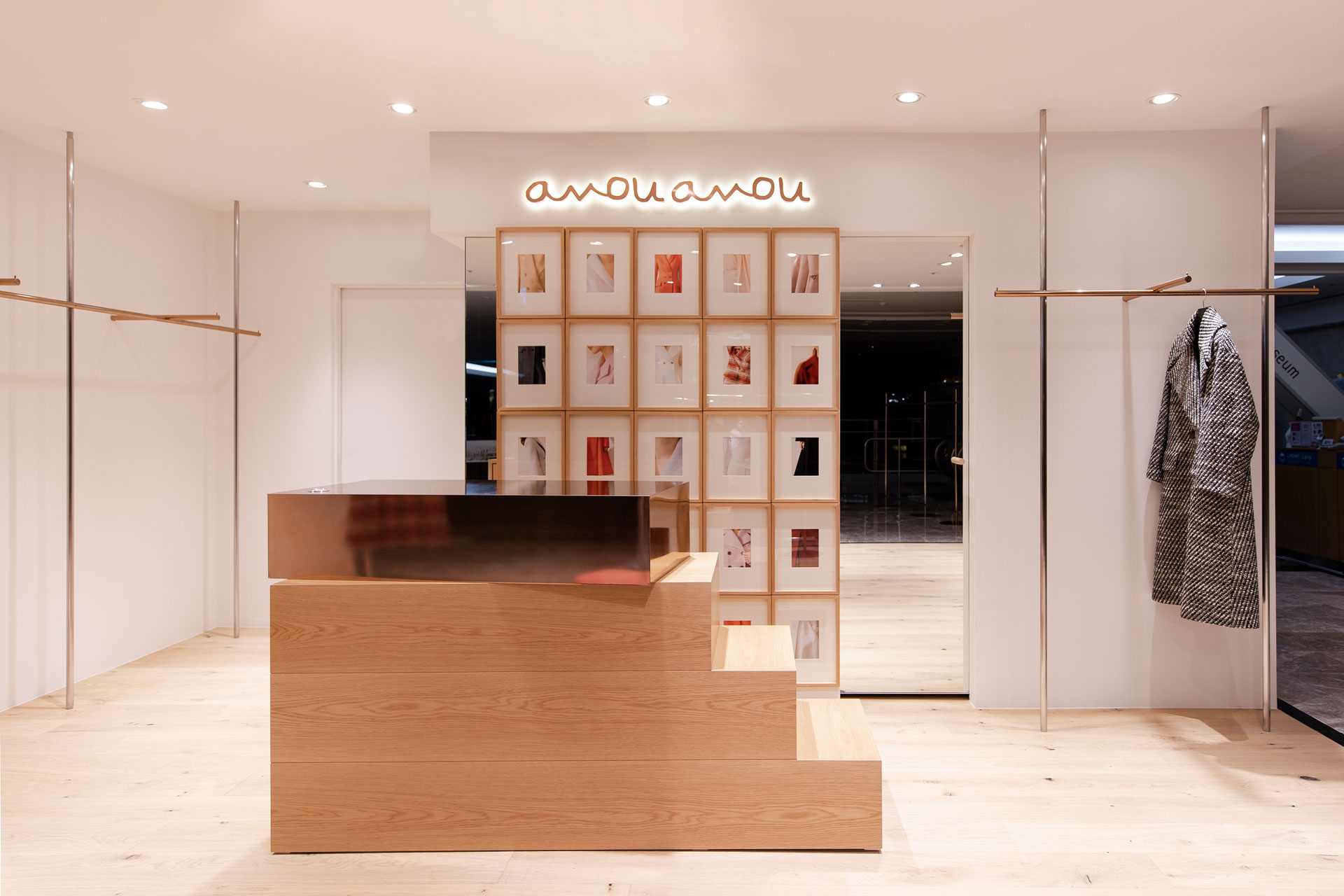
Because of its local characteristics of Myeongdong and its central of department store, the layout could be limited.
Our team's first draft is to place the curation look at the front of the store so customers can focus on the brand's colors.
However, we decided to change stance as we had difficulty arranging opinions inside the department store.
The second draft, with consideration about how to fill the brand's unique characteristics along with the sales.
The concept of the collection was expressed in furnishings and the brand was completed with wit.
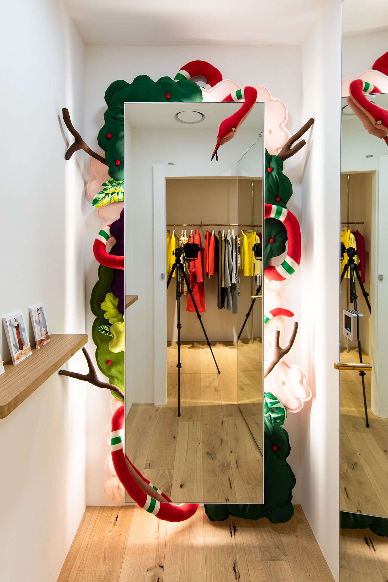
‘Sweet temptation’
Taeryeong Byeon
The work is completed when Eve, the first woman in the Garden of Eden, appears as a mirror.
Eve is attracted to the fruit of the Tree of Knowledge, and Adam is tempted by Eve to describe a human who can not resist sweet temptation.
Theme and sketch that add pleasant imagination of budding artist to Haute couture that put fashion into art are launched. And filled the fitting room with it to add depth to the space.
ⓒ 2017 NBDC
All rights reserved. No part of this publication may be reproduced or transmitted in any form or by any means, electronic or mechanical, including photocopy or any storage and retrieval system, without permission in writing from the publisher.
Respect copyrights, encourage creativity!
All rights reserved. No part of this publication may be reproduced or transmitted in any form or by any means, electronic or mechanical, including photocopy or any storage and retrieval system, without permission in writing from the publisher.
Respect copyrights, encourage creativity!
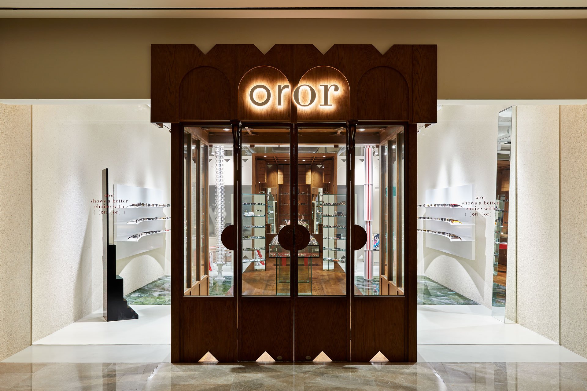
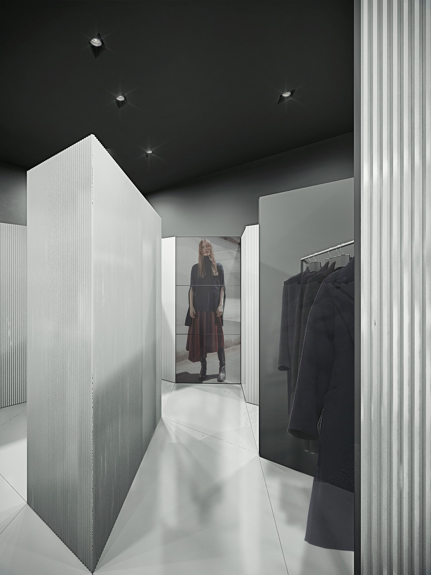
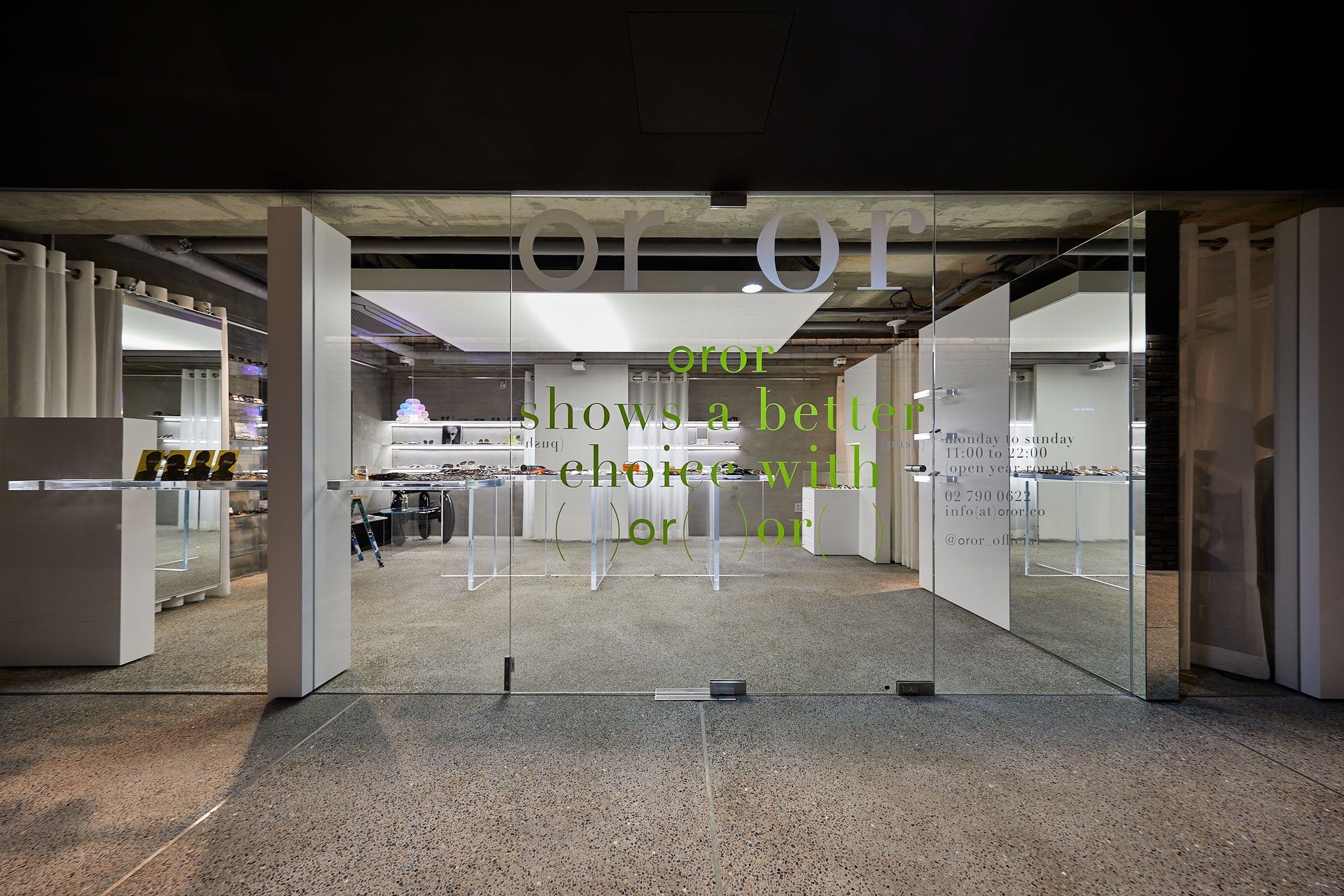
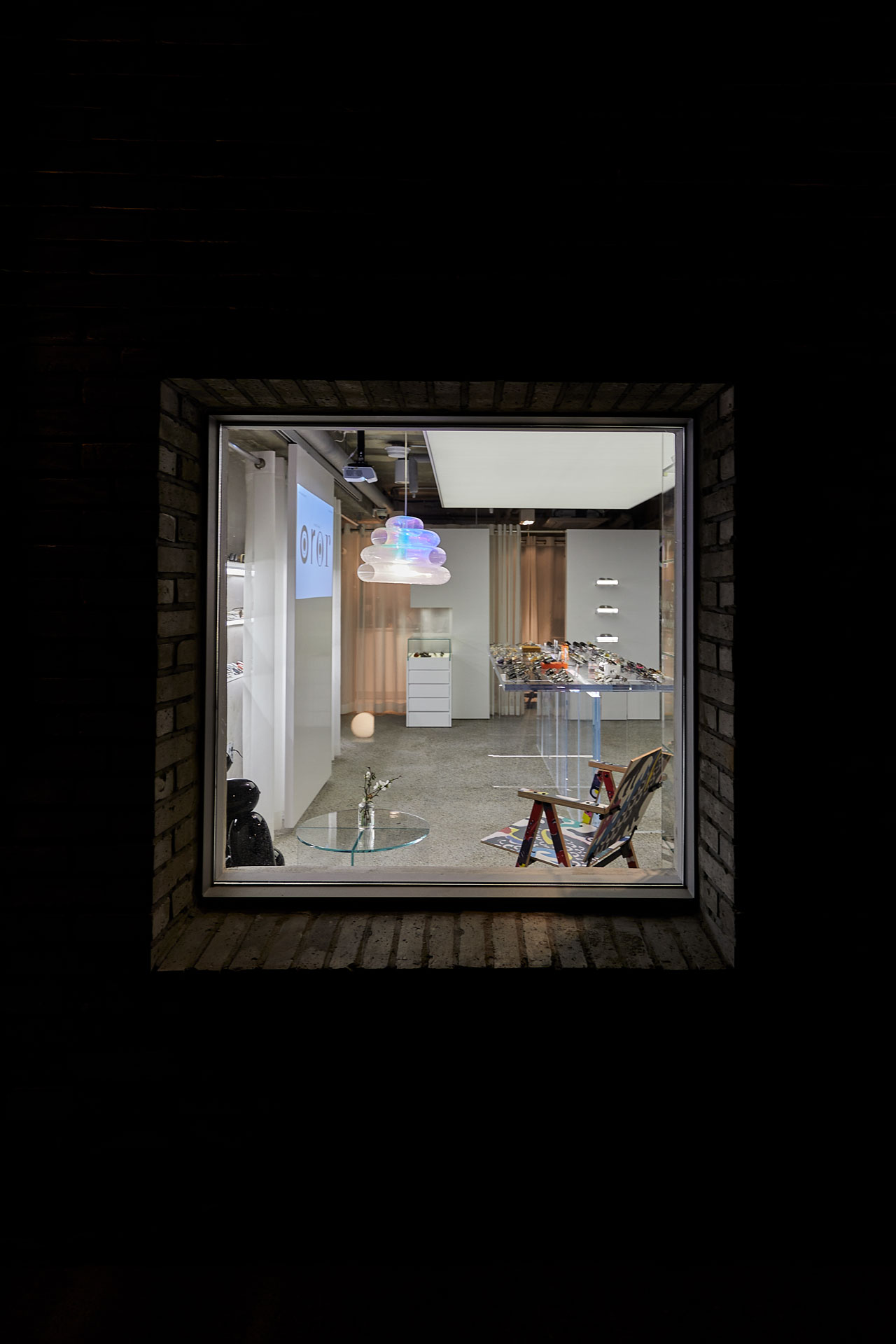
oror had its second grand opening at a commercial complex in Seoul, namely 'The Shops at Centerfield'.
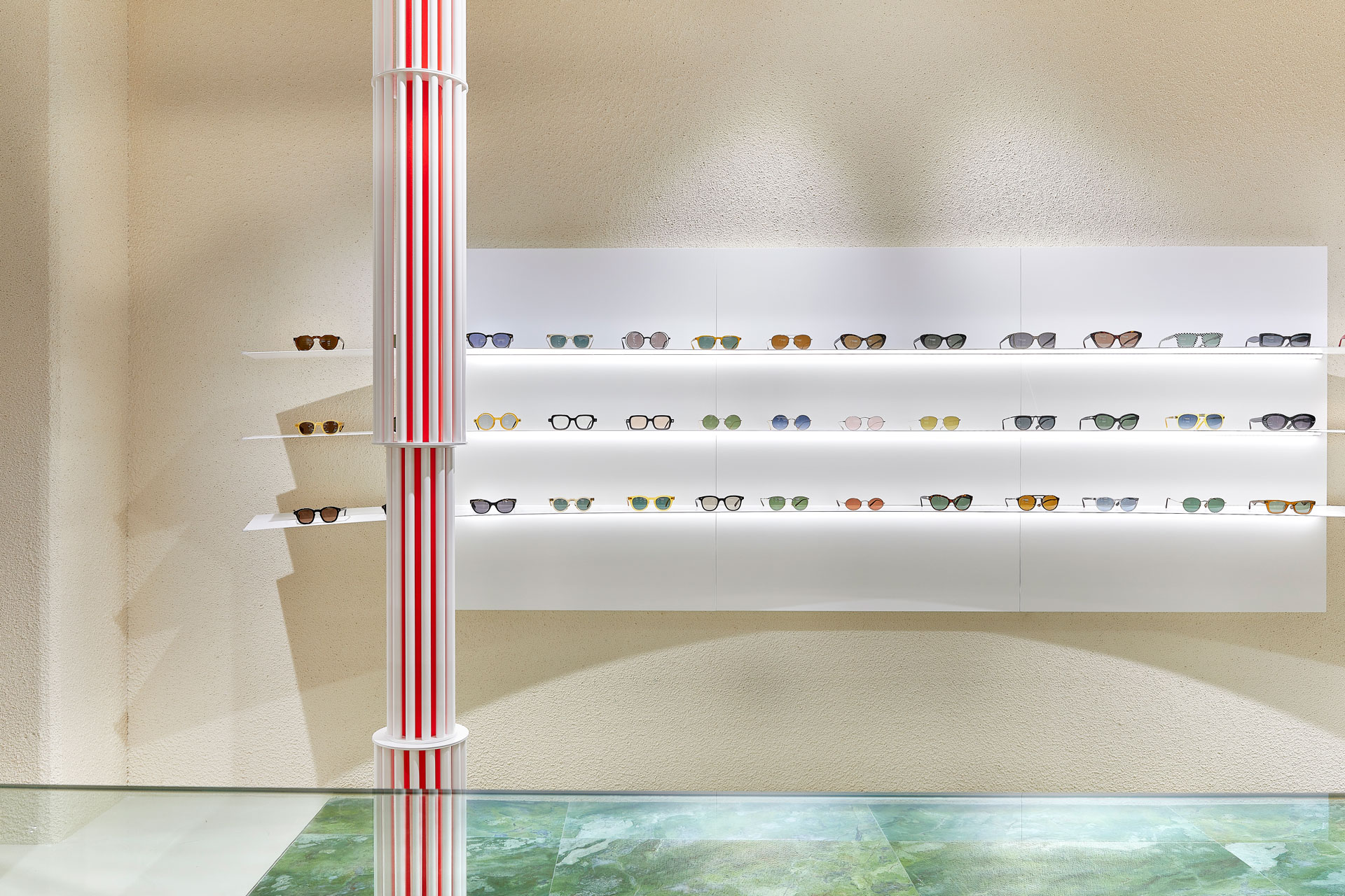
모든 공간의 아이디어는 시대를 초월하는 안경들을 선보이는 'oror'만의 아이덴티티에서 시작되었습니다.
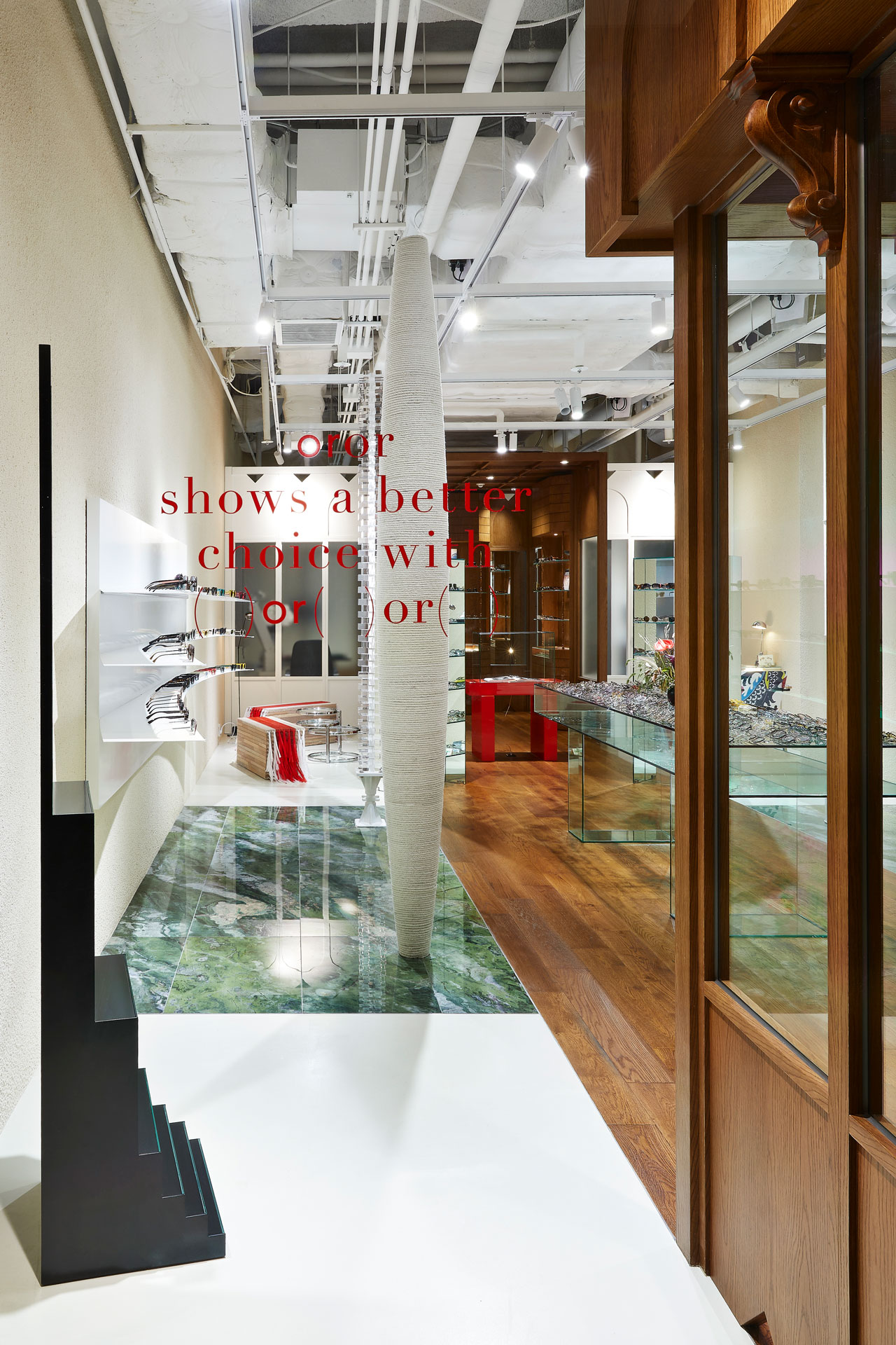
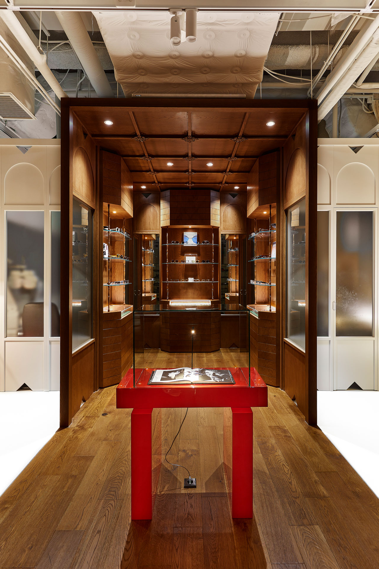
oror는 유니크한 스타일의 아이웨어부터 빈티지 아이웨어까지 다채롭고 폭넓은 아이웨어를 선보이는 편집 샵입니다. NBDC는 이러한 브랜드의 정체성에서 영감을 얻어 한 시대에만 머무르는 것이 아닌 현대(Contemporary)와 과거(classic)의 끊임없는 변주가 일어나는 공간을 만들고자 하였습니다.
![]()
독창적 파사드
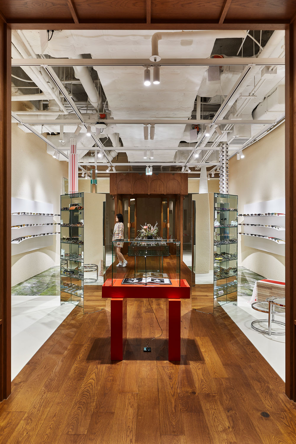
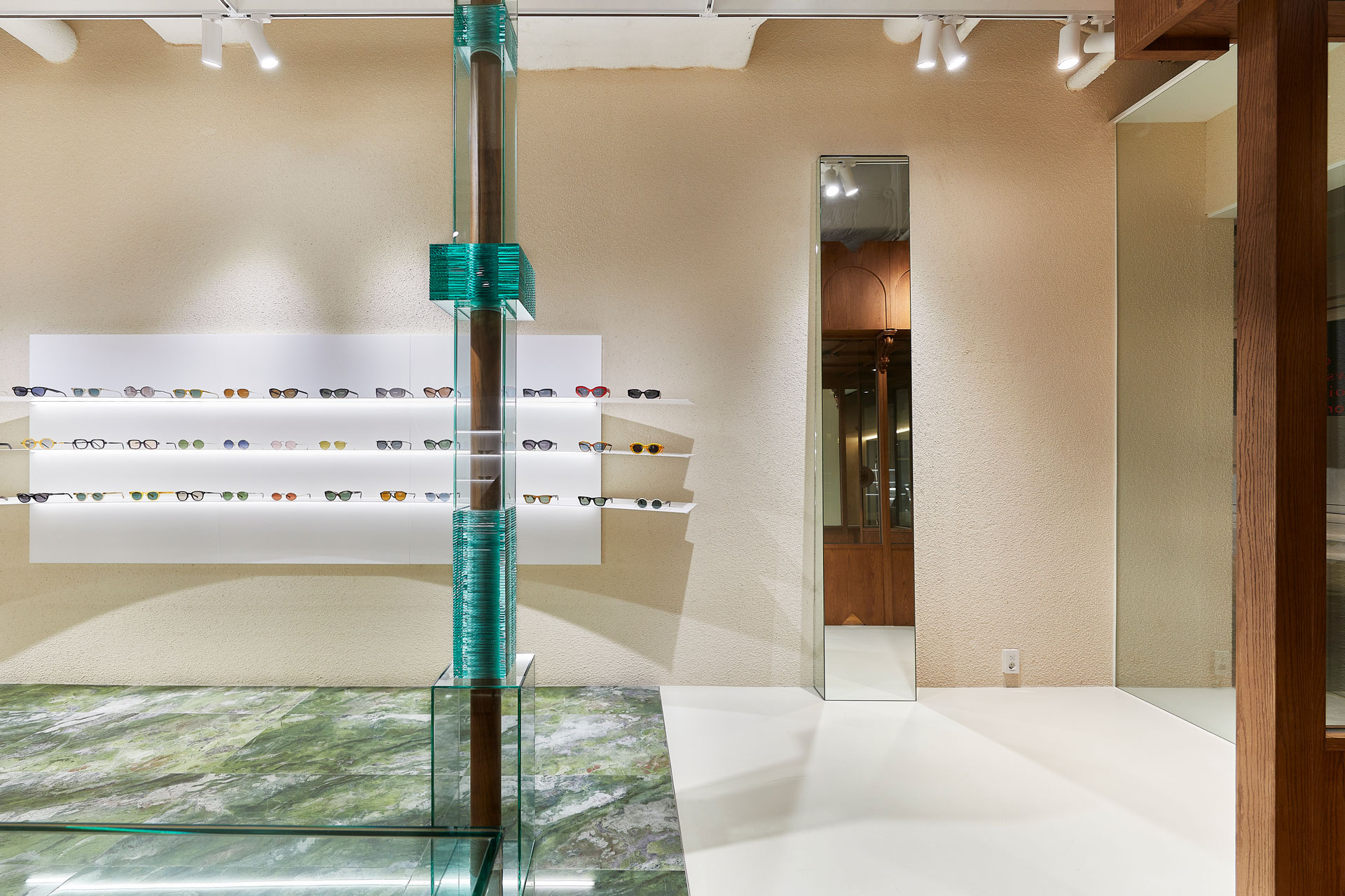
몰 내 규격화 된 직사각형 파사드(Exterior) 가이드라인에서 벗어나 입체적이고 독창적인 파사드를 구현하였습니다. 중앙의 입체적인 클래식 박스는 멀리서도 이목을 집중시키며 shop의 가장 깊은 곳까지 시선을 끌어당깁니다. 바닥과 천장의 목재 구조물들이 자연스럽게 공간 속으로 인도합니다. 이러한 구조는 공간자체로 하나의 새로운 세계로 진입한다는 신비로운 경험을 선사하게 합니다. 좁고 긴 레이아웃의 단점을 극복하기 위해 공간을 등분하여 안에서 밖으로 잡아당기고 넣기를 반복하였고, 중앙을 기점으로 공간의 스펙트럼을 확장하였습니다. 전면의 좌우 유리월은 내, 외부의 경계를 모호하게 만듦으로써 보는 이로 하여금 확장된 내부를 느끼게 합니다. 소실된 거리감이 자아내는 분위기는 다양한 정서를 환기시키게 됩니다.
현대와 고전의 융합
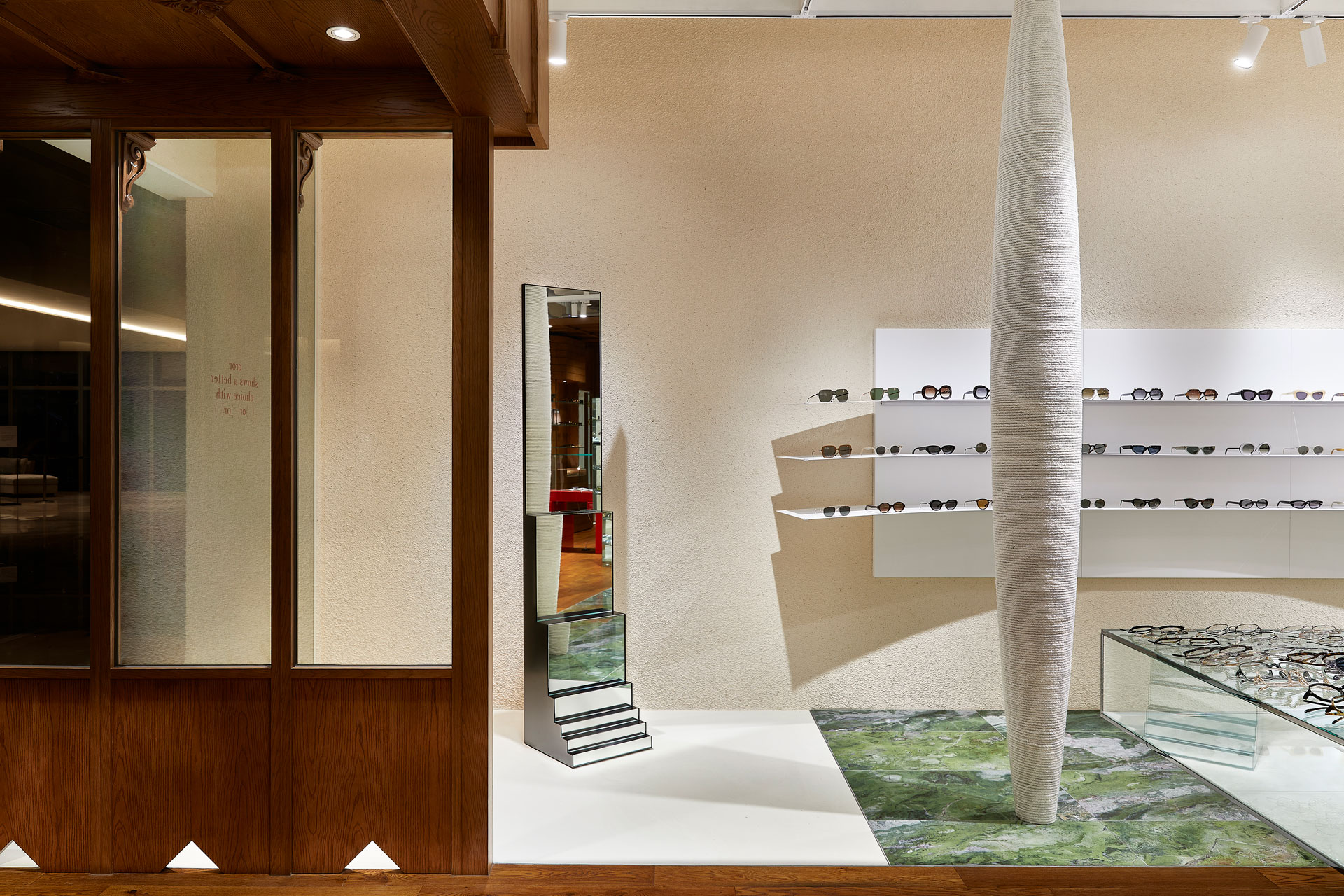
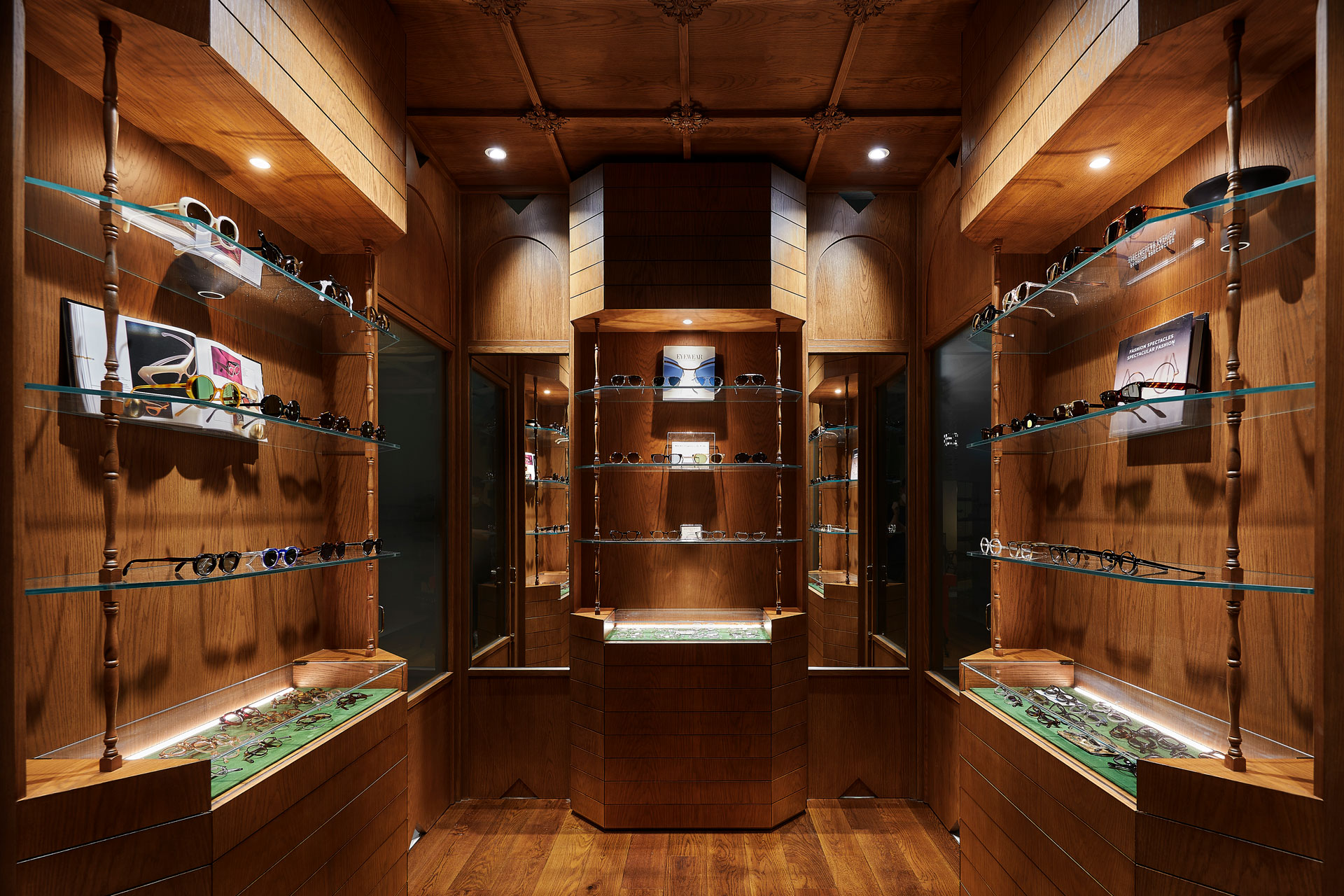
현대(Contemporary)적인 질감을 바탕으로 중앙을 관통하는 클래식(classic)적인 요소를 통해 현대와 고전의 정서를 융합하였습니다. 조화와 이질성을 동시에 담아내기 위해 명확한 소재와 디테일로써 공간을 구획했습니다. shop내부는 우드와 화이트 두가지 컬러로 대비되어 있으며 컬러와 상응하는 고전적인 디테일과 현대적인 조형미를 가미하여 '우리가 단순히 하나의 컨셉 만을 취급하는 곳은 아닙니다' 라는 사실을 명확하게 보여주고 있습니다. 클래식한 우드 디테일은 매장의 가장 안쪽까지 깊이 있게 흘러 들어가게 함으로써 oror가 오랜 시간 소싱한 하이클래스 빈티지 제품들을 은유적이고도 강력하게 제시하고 있습니다. 공간의 대부분은 오픈 천장으로 계획하였으나 시작과 끝을 담아내는 공간은 클래식한 천장을 계획하여 공간에 집중도를 더합니다.
감각적 오브제
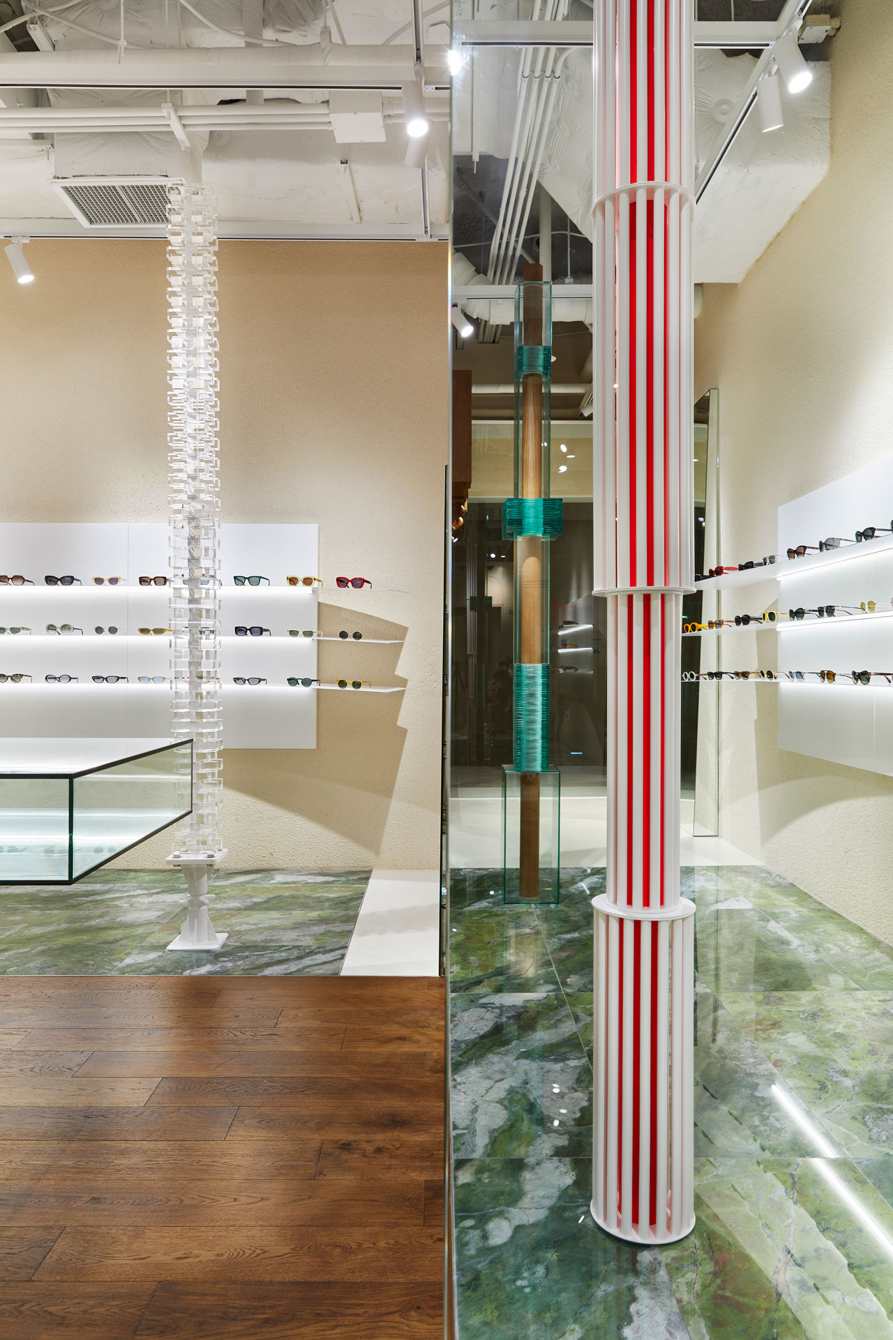
대부분의 집기들은 빛을 흡수하거나 반사하는 소재를 사용함으로써 공간 속 제품을 담아내는데 집중했습니다. 심플한 가구들은 각도의 변화에 따라 새로운 씬을 보여주며 발걸음을 흥미롭게 만듭니다. 또한 몇 가지의 포인트 가구에서는 브랜드 컬러인 'Red'를 다양한 방식으로 표현하여 브랜드의 아이덴티티를 은유적으로 표현했습니다.
수작업으로 만들어진 섬세한 4개의 인공적인 기둥은 공간 전체를 지지하는 견고함을 드러냄과 동시에 오브제로써 현대의 갤러리를 연상시킵니다. 공간을 구성하는 뼈대 가운데 하나인 기둥을 오브제로 재해석함으로써 기능성과 예술성의 양가적 효과를 도출했습니다.
기둥들은 밧줄, 유리, 아크릴, 금속과 같이 각자 다른 물성의 집합체로 존재감을 뿜어냅니다. 각각의 작은 요소들을 밀도 있게 쌓아 올려 탄생시킨 아름다운 아트 피스는 시각적 유희를 선사합니다.
The ideas for the space were inspired by the unique identity of oror that is reflected in its products. oror is an eyewear boutique shop that has a wide range of eyewear collections - from unique to vintage styles. Inspired by the brand's identity, NBDC sought to create a space where continuous variations of a contemporary and a classic may occur.
Original façade
The façade was designed to be original and visually vibrant by escaping from the conventional framework. The classical style of the entrance placed at the center catches your eyes from a far distance and brings them to the end of the place. Wood structures on the floor and the ceiling bring you into the space with delicate comfort. The space itself with this sort of structure allows you to have a sense of stepping into another phase of the world. The narrow layout given was a major obstacle to portraying diversified products. Yet, this was resolved by vertically partitioning the space into 3 parts, assigning modern styles on the sides and classics at the center. The clear glass wall on the sides of the entrance blurs the boundary between the hallway and the store, making the space appear more extended. Such a device creates an atmosphere that may evoke a variety of emotions.
Fusion of contemporary and classic
Different materials and details were used to embody the line between a classic and a contemporary. And it is oddly satisfying to see these two distinct styles together in one scene. The interior of the shop is contrasted with a wood tone color and a white color; each color is meant to portray a sense of vintage and contemporary respectively. The combination of the two colors implies the diverse concepts that oror demonstrates. The classical wood details engraved in the interior of the store metaphorizes the high-class vintage style eyewear that oror has been sourcing for a long time. The space was originally constructed to have an open ceiling. Yet, we intentionally placed a ceiling at the entrance and the end to give a cozier ambiance as well as focus to the place.
Creative Objects
We blended glossy objects with matte ones to let the eyewear stand out. Depending on where you are from these glossy objects, different scenes can be shown, and it makes your tour quite enjoyable. In addition, oror's brand color, red is incorporated into some furniture to express its identity in a subtle way.
The four hand-made artificial pillars are very delicate in their own ways, making the space look like a modern gallery. And visually, giving a sense of stability to the place is yet another function of themselves. These pillars were keystones in dividing the space for our own framing purposes. Aside from practical purposes, we recreated them to have an aesthetic function. The pillars are made with different materials such as rope, glass, acryl, and metal. And their gleaming presence is very vivid.
oror는 유니크한 스타일의 아이웨어부터 빈티지 아이웨어까지 다채롭고 폭넓은 아이웨어를 선보이는 편집 샵입니다. NBDC는 이러한 브랜드의 정체성에서 영감을 얻어 한 시대에만 머무르는 것이 아닌 현대(Contemporary)와 과거(classic)의 끊임없는 변주가 일어나는 공간을 만들고자 하였습니다.
독창적 파사드
몰 내 규격화 된 직사각형 파사드(Exterior) 가이드라인에서 벗어나 입체적이고 독창적인 파사드를 구현하였습니다. 중앙의 입체적인 클래식 박스는 멀리서도 이목을 집중시키며 shop의 가장 깊은 곳까지 시선을 끌어당깁니다. 바닥과 천장의 목재 구조물들이 자연스럽게 공간 속으로 인도합니다. 이러한 구조는 공간자체로 하나의 새로운 세계로 진입한다는 신비로운 경험을 선사하게 합니다. 좁고 긴 레이아웃의 단점을 극복하기 위해 공간을 등분하여 안에서 밖으로 잡아당기고 넣기를 반복하였고, 중앙을 기점으로 공간의 스펙트럼을 확장하였습니다. 전면의 좌우 유리월은 내, 외부의 경계를 모호하게 만듦으로써 보는 이로 하여금 확장된 내부를 느끼게 합니다. 소실된 거리감이 자아내는 분위기는 다양한 정서를 환기시키게 됩니다.
현대와 고전의 융합
현대(Contemporary)적인 질감을 바탕으로 중앙을 관통하는 클래식(classic)적인 요소를 통해 현대와 고전의 정서를 융합하였습니다. 조화와 이질성을 동시에 담아내기 위해 명확한 소재와 디테일로써 공간을 구획했습니다. shop내부는 우드와 화이트 두가지 컬러로 대비되어 있으며 컬러와 상응하는 고전적인 디테일과 현대적인 조형미를 가미하여 '우리가 단순히 하나의 컨셉 만을 취급하는 곳은 아닙니다' 라는 사실을 명확하게 보여주고 있습니다. 클래식한 우드 디테일은 매장의 가장 안쪽까지 깊이 있게 흘러 들어가게 함으로써 oror가 오랜 시간 소싱한 하이클래스 빈티지 제품들을 은유적이고도 강력하게 제시하고 있습니다. 공간의 대부분은 오픈 천장으로 계획하였으나 시작과 끝을 담아내는 공간은 클래식한 천장을 계획하여 공간에 집중도를 더합니다.
감각적 오브제
대부분의 집기들은 빛을 흡수하거나 반사하는 소재를 사용함으로써 공간 속 제품을 담아내는데 집중했습니다. 심플한 가구들은 각도의 변화에 따라 새로운 씬을 보여주며 발걸음을 흥미롭게 만듭니다. 또한 몇 가지의 포인트 가구에서는 브랜드 컬러인 'Red'를 다양한 방식으로 표현하여 브랜드의 아이덴티티를 은유적으로 표현했습니다.
수작업으로 만들어진 섬세한 4개의 인공적인 기둥은 공간 전체를 지지하는 견고함을 드러냄과 동시에 오브제로써 현대의 갤러리를 연상시킵니다. 공간을 구성하는 뼈대 가운데 하나인 기둥을 오브제로 재해석함으로써 기능성과 예술성의 양가적 효과를 도출했습니다.
기둥들은 밧줄, 유리, 아크릴, 금속과 같이 각자 다른 물성의 집합체로 존재감을 뿜어냅니다. 각각의 작은 요소들을 밀도 있게 쌓아 올려 탄생시킨 아름다운 아트 피스는 시각적 유희를 선사합니다.
The ideas for the space were inspired by the unique identity of oror that is reflected in its products. oror is an eyewear boutique shop that has a wide range of eyewear collections - from unique to vintage styles. Inspired by the brand's identity, NBDC sought to create a space where continuous variations of a contemporary and a classic may occur.
Original façade
The façade was designed to be original and visually vibrant by escaping from the conventional framework. The classical style of the entrance placed at the center catches your eyes from a far distance and brings them to the end of the place. Wood structures on the floor and the ceiling bring you into the space with delicate comfort. The space itself with this sort of structure allows you to have a sense of stepping into another phase of the world. The narrow layout given was a major obstacle to portraying diversified products. Yet, this was resolved by vertically partitioning the space into 3 parts, assigning modern styles on the sides and classics at the center. The clear glass wall on the sides of the entrance blurs the boundary between the hallway and the store, making the space appear more extended. Such a device creates an atmosphere that may evoke a variety of emotions.
Fusion of contemporary and classic
Different materials and details were used to embody the line between a classic and a contemporary. And it is oddly satisfying to see these two distinct styles together in one scene. The interior of the shop is contrasted with a wood tone color and a white color; each color is meant to portray a sense of vintage and contemporary respectively. The combination of the two colors implies the diverse concepts that oror demonstrates. The classical wood details engraved in the interior of the store metaphorizes the high-class vintage style eyewear that oror has been sourcing for a long time. The space was originally constructed to have an open ceiling. Yet, we intentionally placed a ceiling at the entrance and the end to give a cozier ambiance as well as focus to the place.
Creative Objects
We blended glossy objects with matte ones to let the eyewear stand out. Depending on where you are from these glossy objects, different scenes can be shown, and it makes your tour quite enjoyable. In addition, oror's brand color, red is incorporated into some furniture to express its identity in a subtle way.
The four hand-made artificial pillars are very delicate in their own ways, making the space look like a modern gallery. And visually, giving a sense of stability to the place is yet another function of themselves. These pillars were keystones in dividing the space for our own framing purposes. Aside from practical purposes, we recreated them to have an aesthetic function. The pillars are made with different materials such as rope, glass, acryl, and metal. And their gleaming presence is very vivid.
Opening Aug. 2021
Build area 80㎡
Use eyewear shop
Client oror
Interior architect NBDC
Director Yonghwan Shin
Lead designer Rita
Team Heegyung Noh
Construction Hanung Lee, Keunwoo Park
Build area 80㎡
Use eyewear shop
Client oror
Interior architect NBDC
Director Yonghwan Shin
Lead designer Rita
Team Heegyung Noh
Construction Hanung Lee, Keunwoo Park
ⓒ 2021 NBDC
All rights reserved. No part of this publication may be reproduced or transmitted in any form or by any means, electronic or mechanical, including photocopy or any storage and retrieval system, without permission in writing from the publisher.
Respect copyrights, encourage creativity!
All rights reserved. No part of this publication may be reproduced or transmitted in any form or by any means, electronic or mechanical, including photocopy or any storage and retrieval system, without permission in writing from the publisher.
Respect copyrights, encourage creativity!


oror is an eyewear brand editing shop that begins with the word or. The space located in Saunds Hannam is a concept complete with hidden gem, filling it with transparent material and light with main material in a roughly finished background. Hopefully, products from different brands with different backgrounds will be found and be a place to shine.
ⓒ 2018 NBDC
All rights reserved. No part of this publication may be reproduced or transmitted in any form or by any means, electronic or mechanical, including photocopy or any storage and retrieval system, without permission in writing from the publisher.
Respect copyrights, encourage creativity!
All rights reserved. No part of this publication may be reproduced or transmitted in any form or by any means, electronic or mechanical, including photocopy or any storage and retrieval system, without permission in writing from the publisher.
Respect copyrights, encourage creativity!
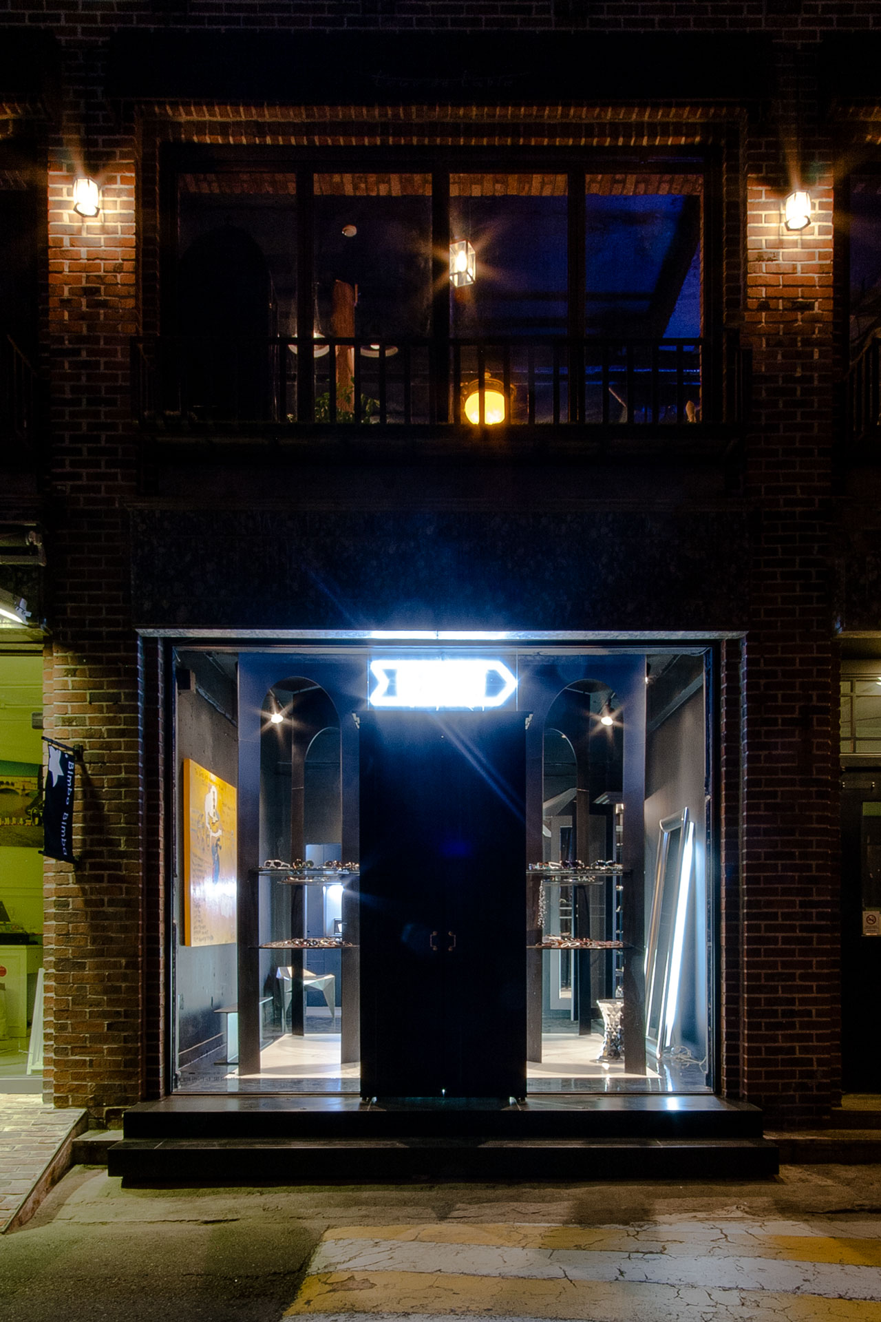
interior
The designer thought over a story focusing on the image of RETROKIT through the space of the
RETROKIT concept store in Hannam-dong, a hot place of Seoul, South korea and where the luxurious
villas are clustered.
The space is filled with the structures about "grand" and concentrated in the argin divided by the structures.
façade
The client asked to leave the natural elements (red bricks and granite canopies) rather than
decorating the facade of the existing building anew, and wanted the designer to find a new way that focuses on the harmony between the interior and the exterior.
The designer put emphasis on the door, the beginning and the end of the Hannam store, and developed the design about "a fantasy in a wardrobe."

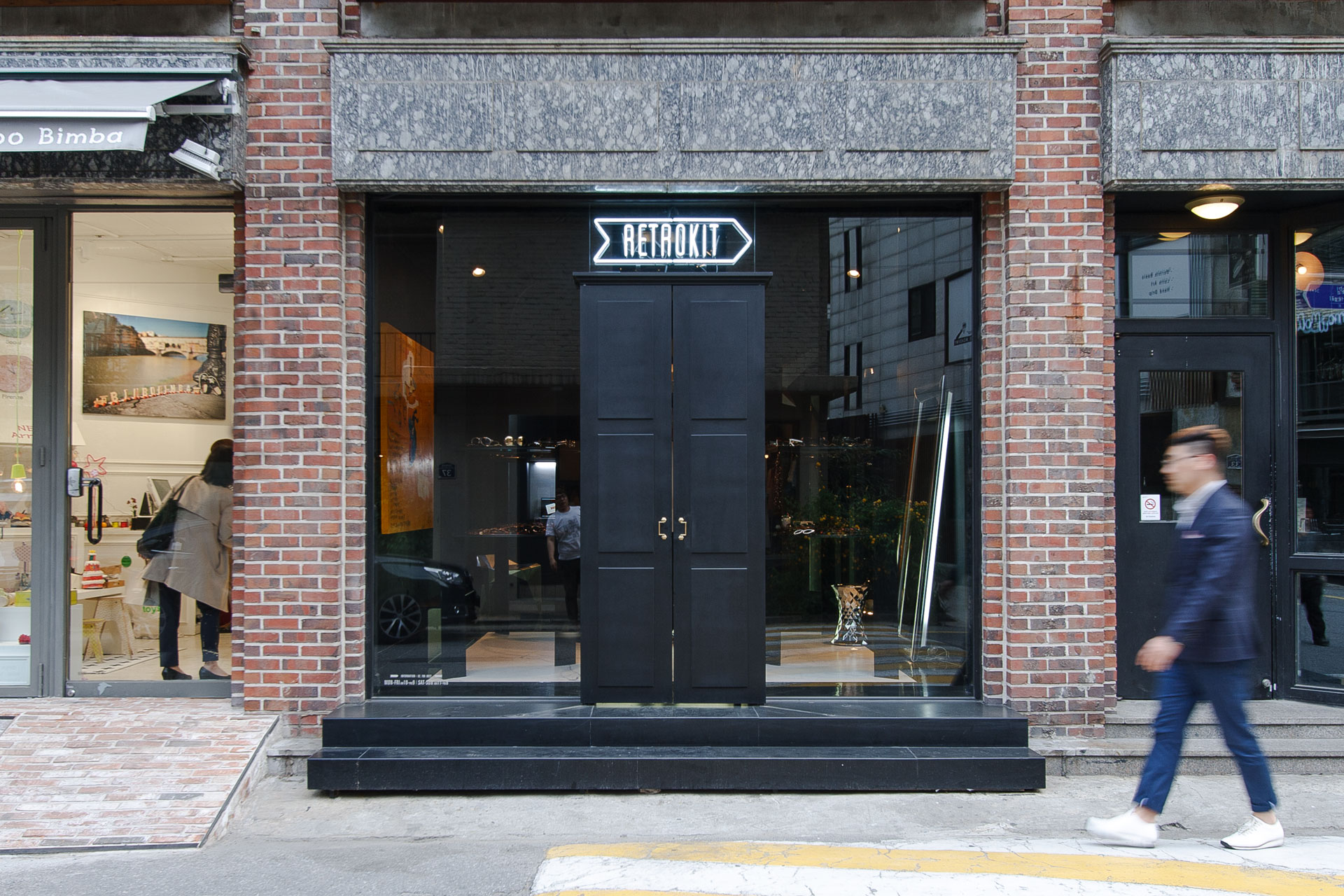
RETROKIT
If the goal of the Seorae Store was to dismantle the “height,” it is to fill the “depth” for the Hannam Store. The store “thoroughly” deals with the brand and rientations selected
carefully by RETROKIT.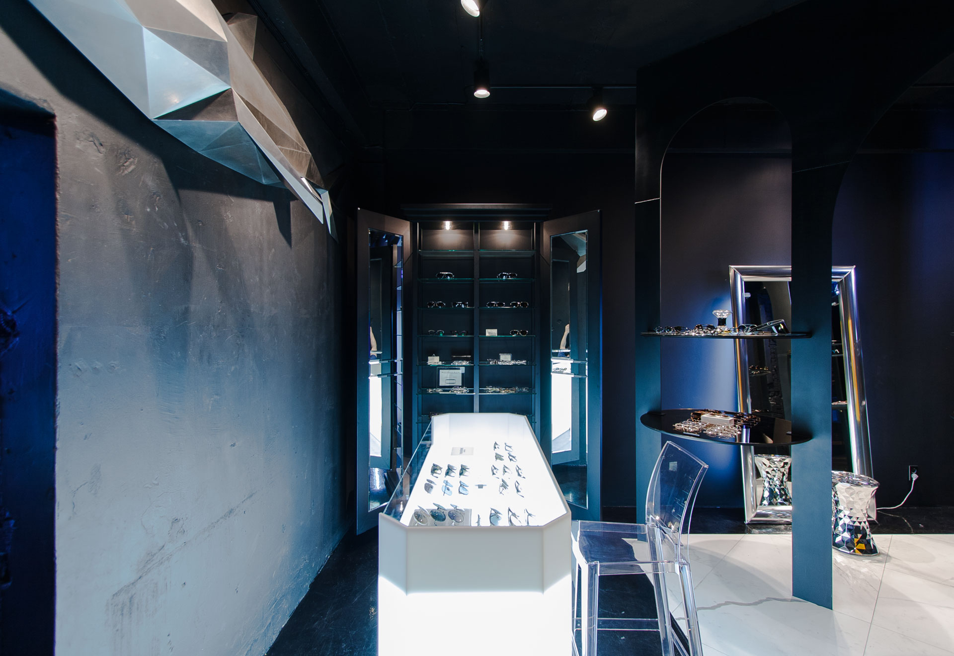
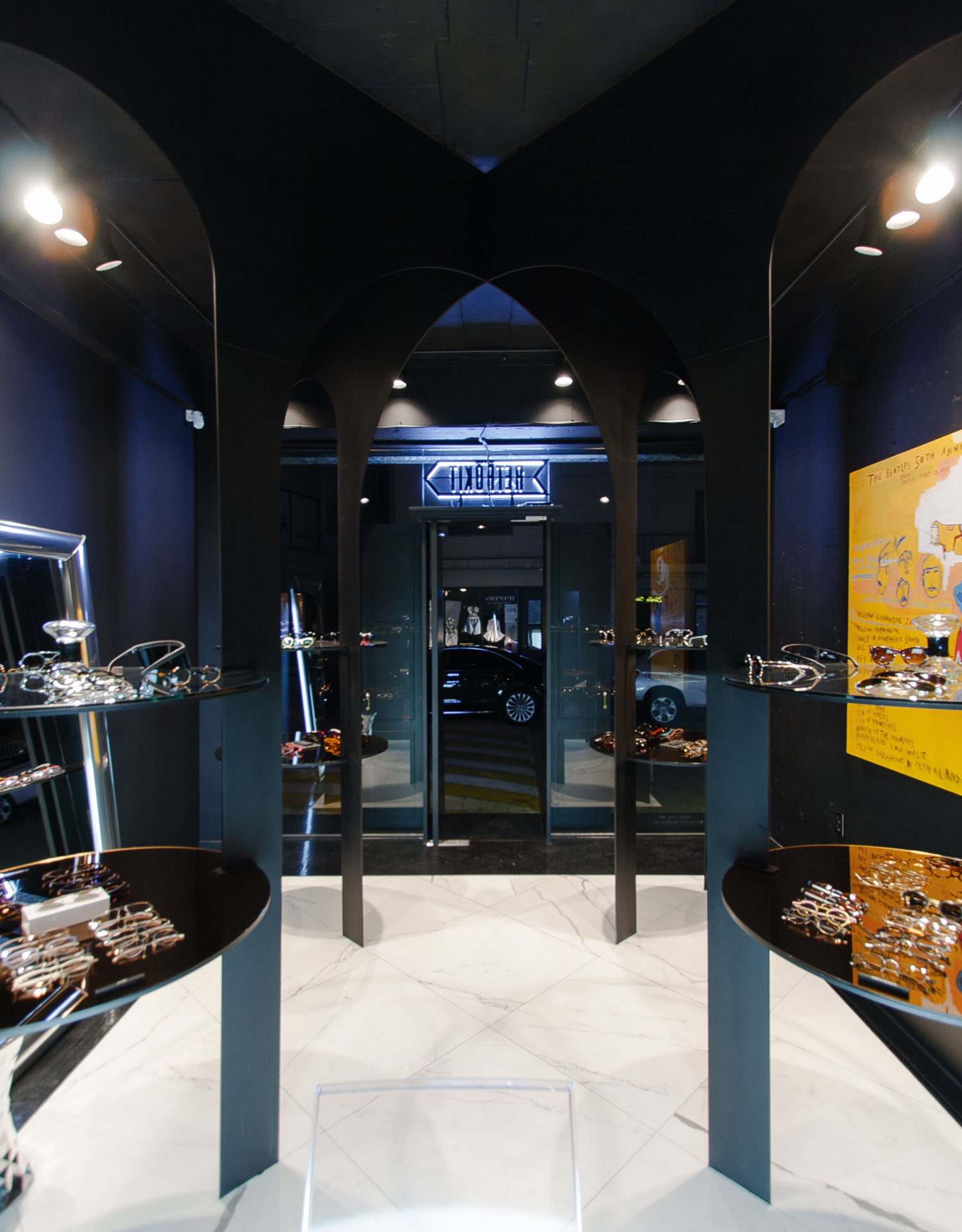
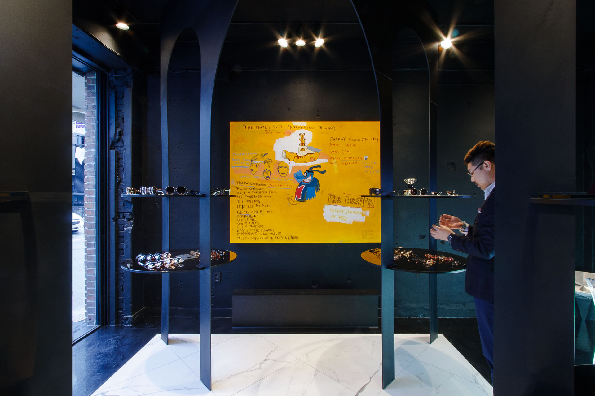
"RETROKIT" inspired by RETROROCKET, is an eyewear concept store which took its motif from a variety of needs situated at their extremes such as various cultures, past and future, and reverse and advance.
The Hannam(South Korea, Seoul) store, newly planned in 2015, wanted to become a small but in-depth space taking another step towards "a concept store that can take a broad view and move creatively beyond the idea of EYE-WEAR = glasses or sunglasses" pursued by RETROKIT.
The client asked the designer to make the space of 27㎡ as a place that can communicate with ustomers and deliver an identity taking a break from concentration in selling.
The designer derived the subject throwing many questions in the process of the project and completed the “RETROKIT Hannam Store” which coordinated the interpretations between the client and the designer.
ⓒ 2015 NBDC
All rights reserved. No part of this publication may be reproduced or transmitted in any form or by any means, electronic or mechanical, including photocopy or any storage and retrieval system, without permission in writing from the publisher.
Respect copyrights, encourage creativity!
All rights reserved. No part of this publication may be reproduced or transmitted in any form or by any means, electronic or mechanical, including photocopy or any storage and retrieval system, without permission in writing from the publisher.
Respect copyrights, encourage creativity!
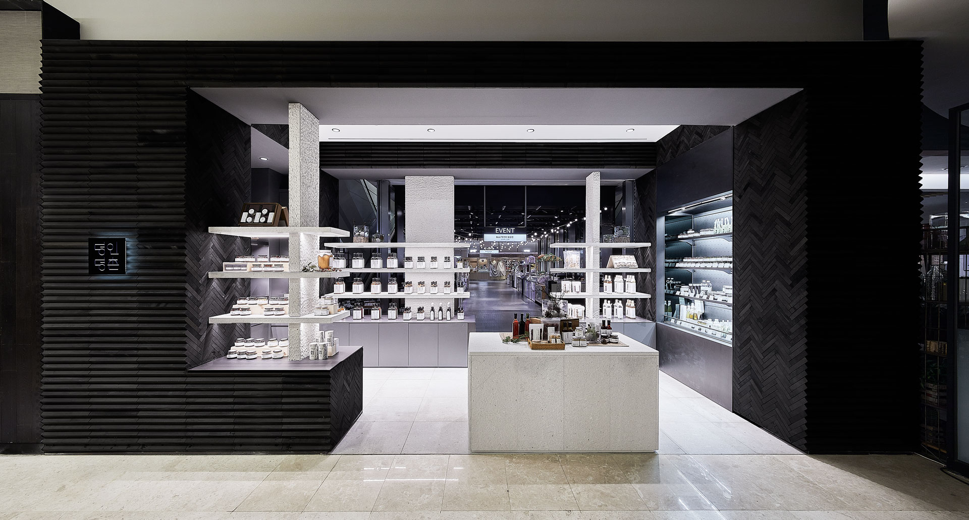
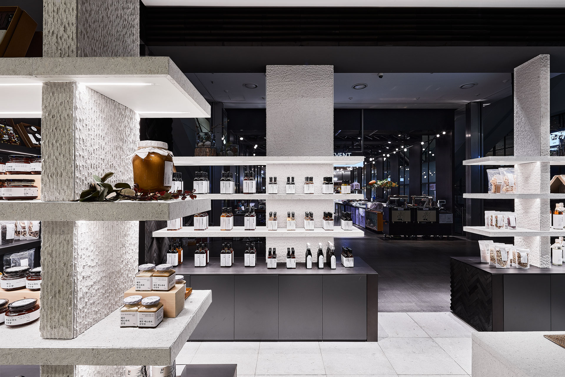
myeongin myeongchon is a professional brand
that brings together products of artisans from all over the country who produce
tradition and culture.
The myeongin myeongchon pangyo branch was located between the common area and the food hall boundary on the first basement floor of hyundai department store, and it was necessary to reinterpret the renewed BI and spatial branding to be applicable to island shop.
The myeongin myeongchon pangyo branch was located between the common area and the food hall boundary on the first basement floor of hyundai department store, and it was necessary to reinterpret the renewed BI and spatial branding to be applicable to island shop.
We focused on the original properties of myeongin myeongchon and searched for the keyword of conciseness. In order to
make the product, which is the essence of the sales space, stand out, the
project was carried out with the concept of refining and arranging.
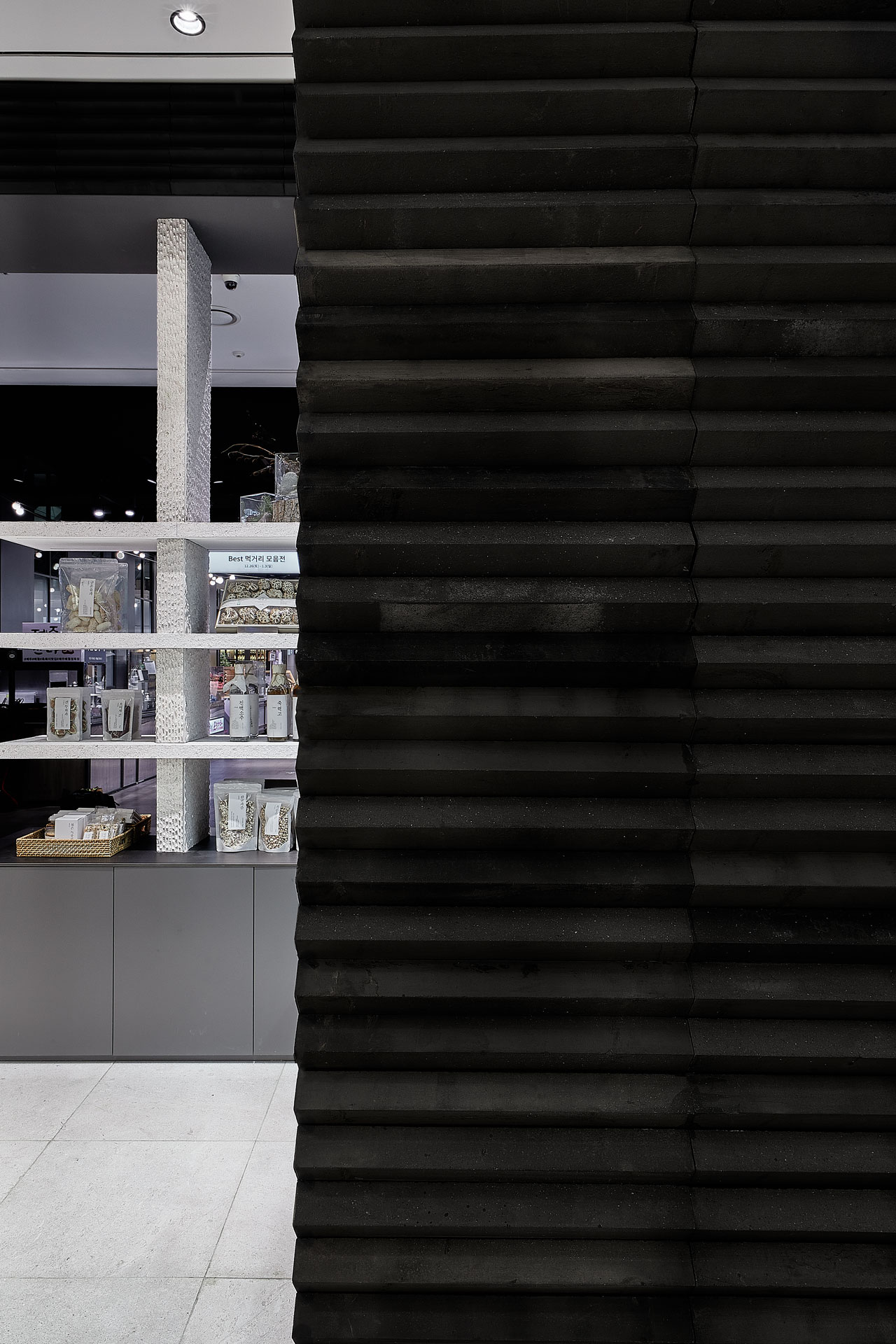
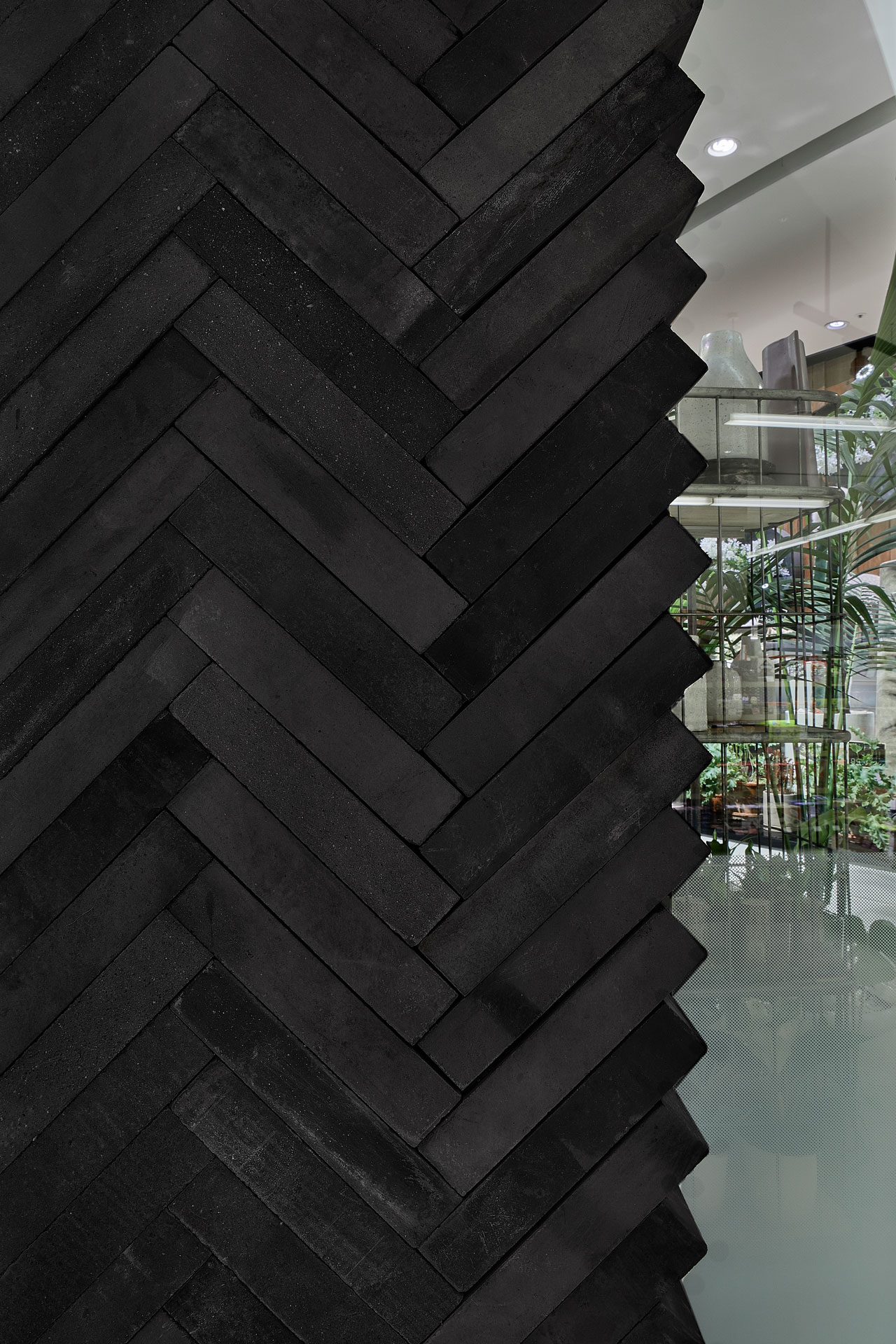
Charcoal grey bricks are stacked in a
herringbone style to express a neat giwa(Korean traditional roofing tiles)
shape. It was planned so that the wall and the storage could be seen as a
single mass.
In the space, minimal finishing materials
and monotones were used to bring out the colors of the products. The wall has developed a pattern derived
from the stacking form, which is a large texture of the space, and the
partially constructed wall raises curiosity about the product and space.
ⓒ 2020 NBDC
All rights reserved. No part of this publication may be reproduced or transmitted in any form or by any means, electronic or mechanical, including photocopy or any storage and retrieval system, without permission in writing from the publisher.
Respect copyrights, encourage creativity!
All rights reserved. No part of this publication may be reproduced or transmitted in any form or by any means, electronic or mechanical, including photocopy or any storage and retrieval system, without permission in writing from the publisher.
Respect copyrights, encourage creativity!

ⓒ 2019 NBDC
All rights reserved. No part of this publication may be reproduced or transmitted in any form or by any means, electronic or mechanical, including photocopy or any storage and retrieval system, without permission in writing from the publisher.
Respect copyrights, encourage creativity!
All rights reserved. No part of this publication may be reproduced or transmitted in any form or by any means, electronic or mechanical, including photocopy or any storage and retrieval system, without permission in writing from the publisher.
Respect copyrights, encourage creativity!
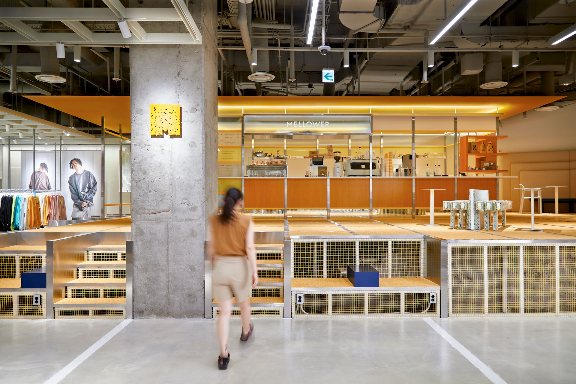
The infinite is a road-type cafe in
Mellower, an SI design that can be expanded by infinitely transforming
according to entered place and location.
The Mellower the infinite, which was first store in peer, began by exploring the understanding and attraction of Sinchon and completed the Mellower the infinite x peer through the keyword 'young'.
The Mellower the infinite, which was first store in peer, began by exploring the understanding and attraction of Sinchon and completed the Mellower the infinite x peer through the keyword 'young'.
concept
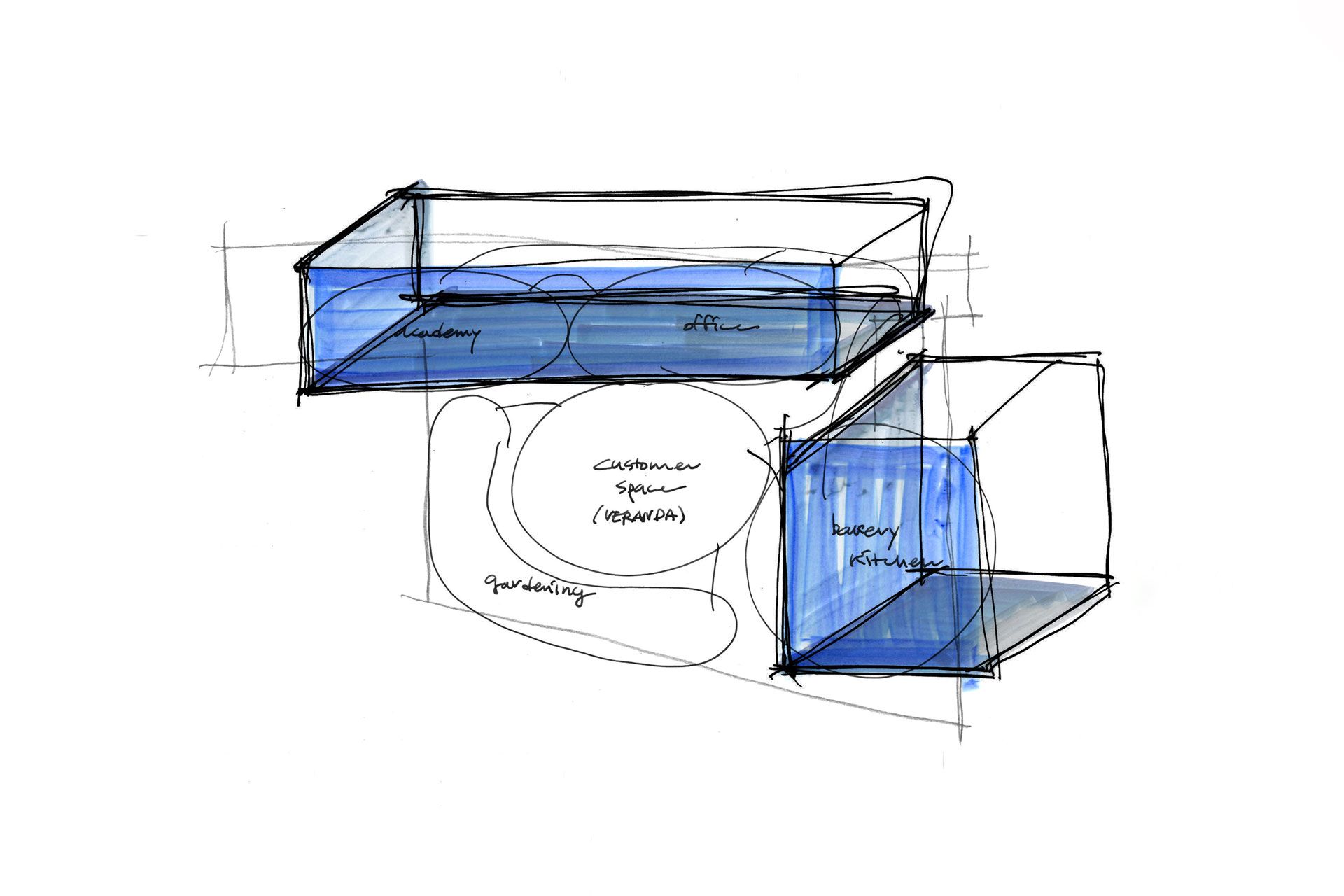
We wanted Peer's different brands and Mellower the infinite to be consumed together, and we started the project with the concept of our old pavilion, built as a shelter and playground under a shade tree at the village entrance.
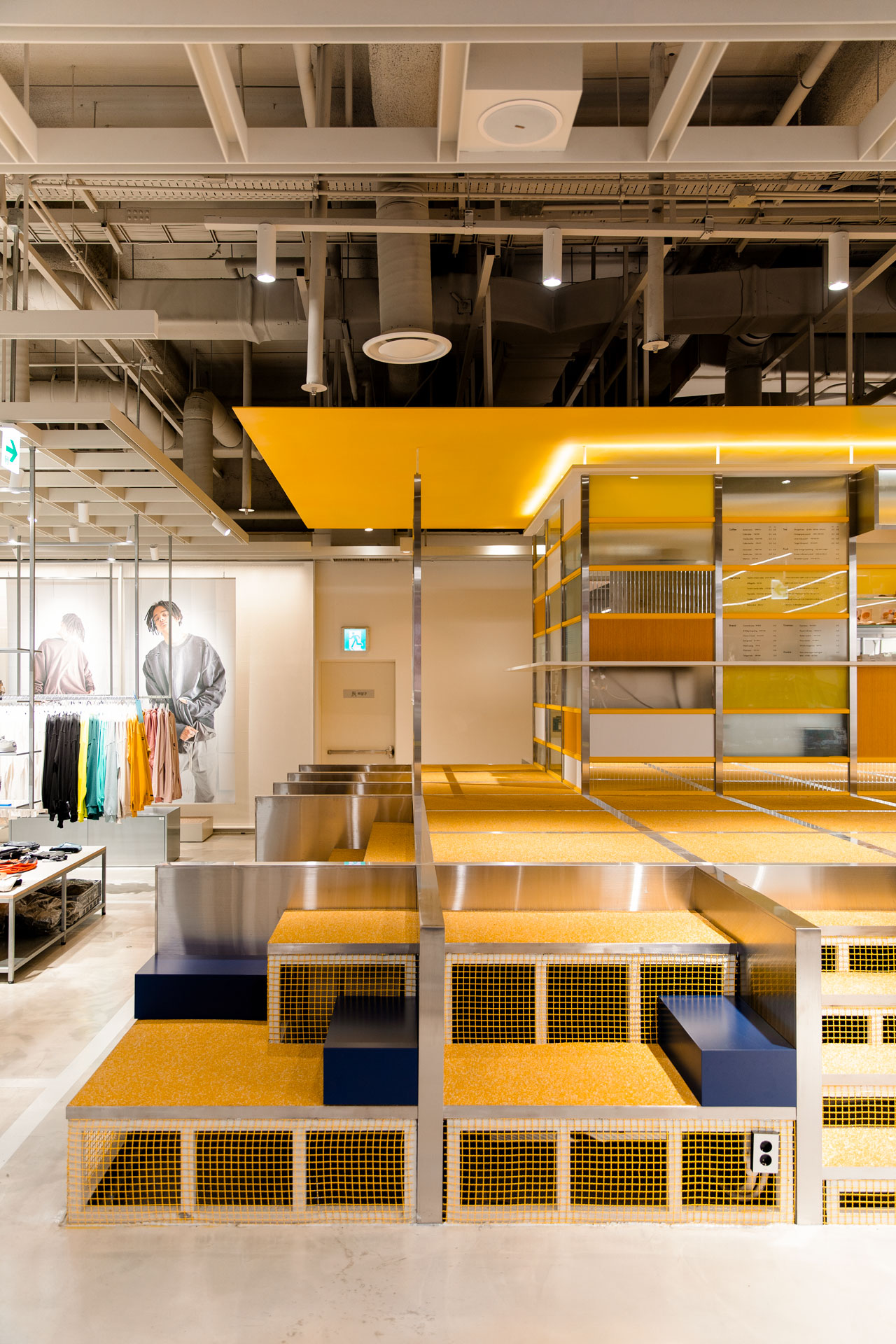
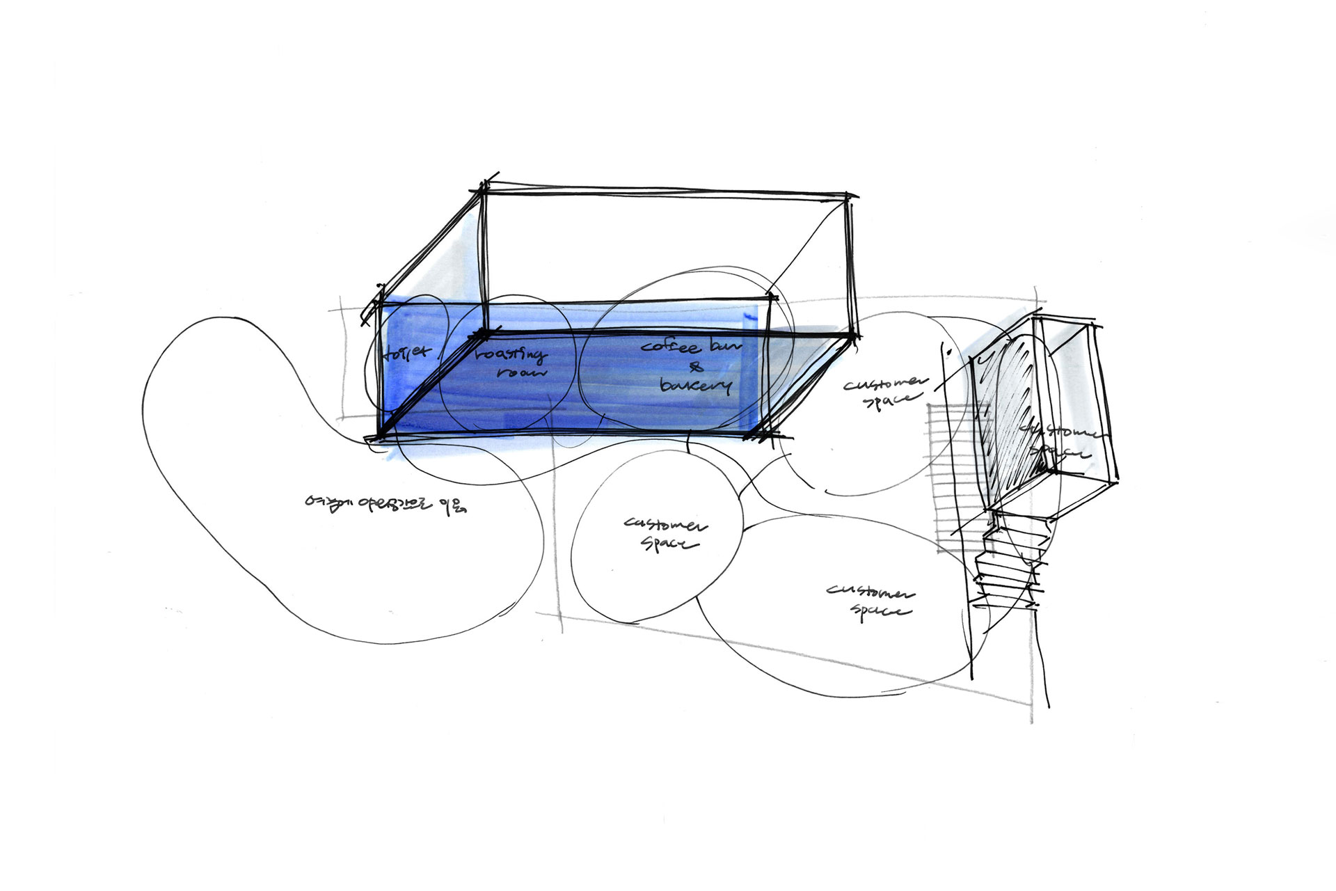
floor, elevation, ceiling
On a floor plan, the Mellower the infinite is located at the innermost part of the select shop, where a 900-millimeter-high stepped unit is formed due to the building's parking slope.
In order to break the boundaries of Peer's different brands, we can display a collaborative product between the brands in our Mellower the infinite neighborhood. And a stairway that can sit down to rest was designed to attract interest and breathing, and the Mellower the infinite, which is placed on top, features floor grids and walls connected and supported to each other, shape to climbing the hill.
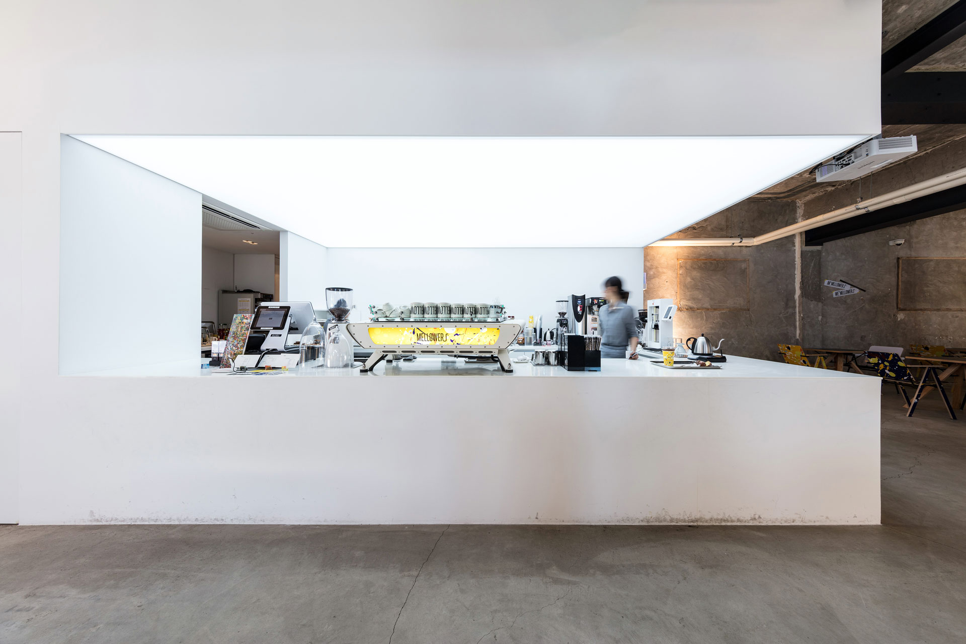
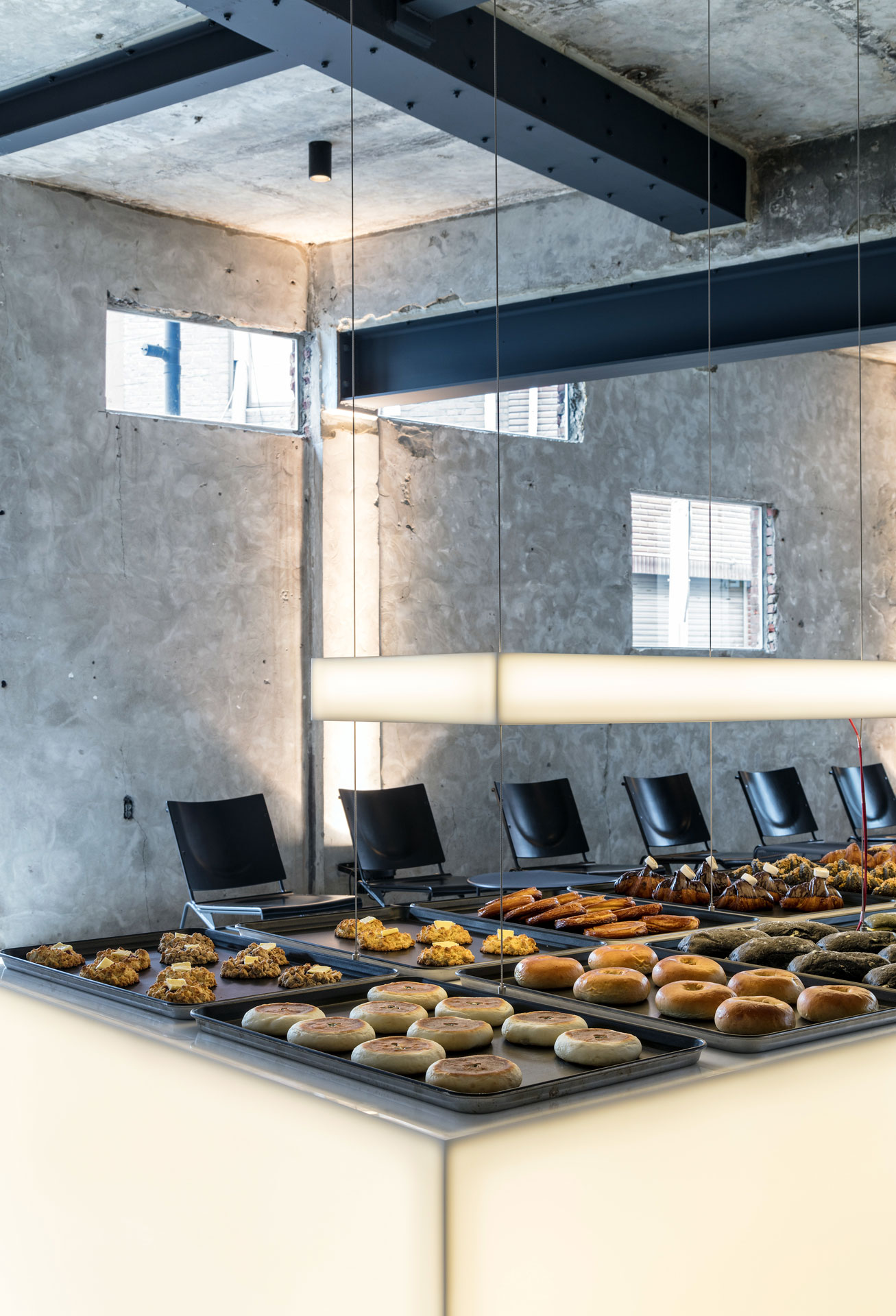
On the wall of Mellower the infinite, based on the inspiration from the old building, where the old pieces added by the mending came together to create a new look, the role of Coffee Bar and Bakery Kitchen and the pieces of different materials were mixed together. A long eaves were placed on the ceiling to give meaning as a small shelter under the shade.
The space past the mellower the infinite is used as a clothing warehouse. It is a space specialized to enjoy the original taste of Mellower along with the rest of Peer as well as the hidden space for relaxation.

colour, identity
Mellower the infinite, which is derived in the direction of generation sharing (Generation Y and Z), is a new hot spot among more than 70 different fashion brands.
This is a space where Mellower can be read anew by spreading the color of the brand into space through the properties of various materials to emphasize the young Mellower. In addition, it completed the project by working on a branding interpreted as space.
ⓒ 2019 NBDC
All rights reserved. No part of this publication may be reproduced or transmitted in any form or by any means, electronic or mechanical, including photocopy or any storage and retrieval system, without permission in writing from the publisher.
Respect copyrights, encourage creativity!
All rights reserved. No part of this publication may be reproduced or transmitted in any form or by any means, electronic or mechanical, including photocopy or any storage and retrieval system, without permission in writing from the publisher.
Respect copyrights, encourage creativity!
Brooklyn of the U.S., Hackney of the U.K.
and Seongsu-dong of Korea,
which not only reformed the old but also
successfully led to urban regeneration strategies through conservation.
‘No past No future’
Seongsu-dong, where the MELLOWER Seongsu flagship store is located, was a manufacturing plant-intensive area where the indigenous industry continued to decline, and the residential environment was deteriorating due to the aging urban environment and insufficient infrastructure.
As it was selected as a "Seoul-type urban regeneration demonstration area" in 2014, the number of unique shops by young entrepreneurs is increasing as urban regeneration is carried out with a focus on improving living conditions, revitalizing the industrial economy, restoring regional identity and realizing sustainable integrated urban regeneration in connection with local resources, receiving favorable responses from consumers, and attracting a growing number of younger generations.
Mellower and designers have launched the 'MELLOWER Seongsu flagship store' after agreeing to the purpose of urban regeneration, which is achieving a balanced recovery through the unique characteristics and charm of Seongsu-dong.


Concept issue
The concept of the MELLOWER Seong-su
flagship store is 'Rejuvenation,' meaning recover young. It tries to capture
space based on the interpretation of the area so that the faded past space can
be rejuvenated by the sensation of new.
Existing buildings were established under
the concept of 'external' to focus on quality service, and 'Creative box' was
established with the concept of 'internal' and defined as a space for the
mellowers to enhance their skills.
The bones of the building, which had been used for plating and dyeing plants, were kept alive and the "Creative Box" was inserted into the exterior and interior of the building to allow the Mellower to permeate the area.
The white 'Creative Box' each has a function of a Mellower, and around the stairway where each 'Creative Box' is connected, the designer has completed the Flagship store with a rainbow of light to express the actively developing area in a witty way.
It is hoped that the new thickness of time will accumulate in the space where the past and the present coexist, and the Mellower will mature.
ⓒ 2017 NBDC
All rights reserved. No part of this publication may be reproduced or transmitted in any form or by any means, electronic or mechanical, including photocopy or any storage and retrieval system, without permission in writing from the publisher.
Respect copyrights, encourage creativity!
All rights reserved. No part of this publication may be reproduced or transmitted in any form or by any means, electronic or mechanical, including photocopy or any storage and retrieval system, without permission in writing from the publisher.
Respect copyrights, encourage creativity!
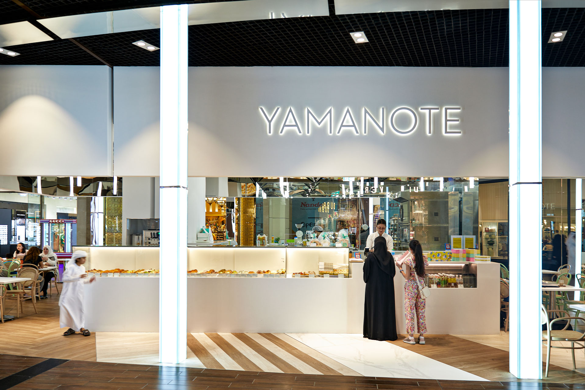
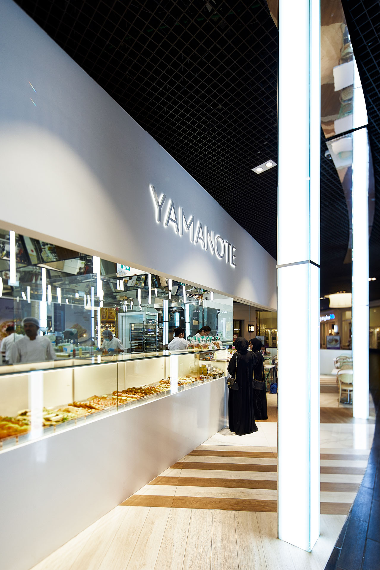
UNAS is a cafe and baking studio started by the owner and chef UNA LEE to share the
pleasure of dessert together with many people.
Under the concept of 'Creative Dessert Box', the project coupled with sweet imagination of the designer is intended to provide the visitors of the cafe with a new experience as
well as the clients of the studio with the pleasure and nspiration of the creative activity
with the heart of the owner and chef who never stops her unique and experimental efforts
into the dessert.
The space completed with the efforts to capture the identity of UNAS will give a new sight and a meaning of the space via the strange situation to the people who come and expect newer and sweeter dessert like raw materials and unfamiliar combinations.
The space completed with the efforts to capture the identity of UNAS will give a new sight and a meaning of the space via the strange situation to the people who come and expect newer and sweeter dessert like raw materials and unfamiliar combinations.

Compared to Before operated for a single purpose of a baking studio, this project
which had to include the sales of Fine Dessert, drinking, and the baking studio in one
space focused on various behaviors that will be performed in the space as much as complex
functions were required.
Functional elements were separated but no boundaries were set between the space to enjoy dessert and the space for learning. Thus, it secured a flexible and open space and the
diversity of behaviors could be presented in the space.
ⓒ 2016 NBDC
All rights reserved. No part of this publication may be reproduced or transmitted in any form or by any means, electronic or mechanical, including photocopy or any storage and retrieval system, without permission in writing from the publisher.
Respect copyrights, encourage creativity!
All rights reserved. No part of this publication may be reproduced or transmitted in any form or by any means, electronic or mechanical, including photocopy or any storage and retrieval system, without permission in writing from the publisher.
Respect copyrights, encourage creativity!
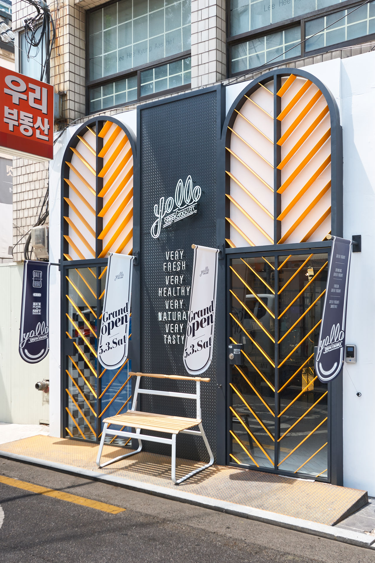
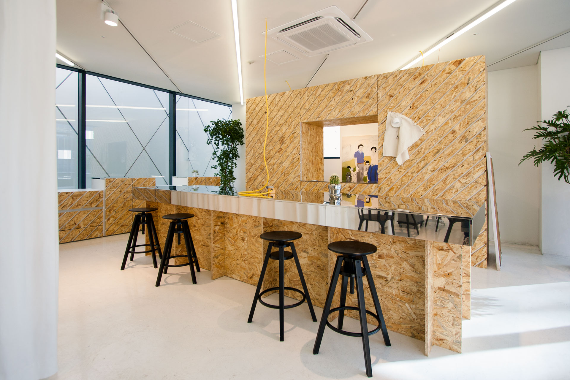
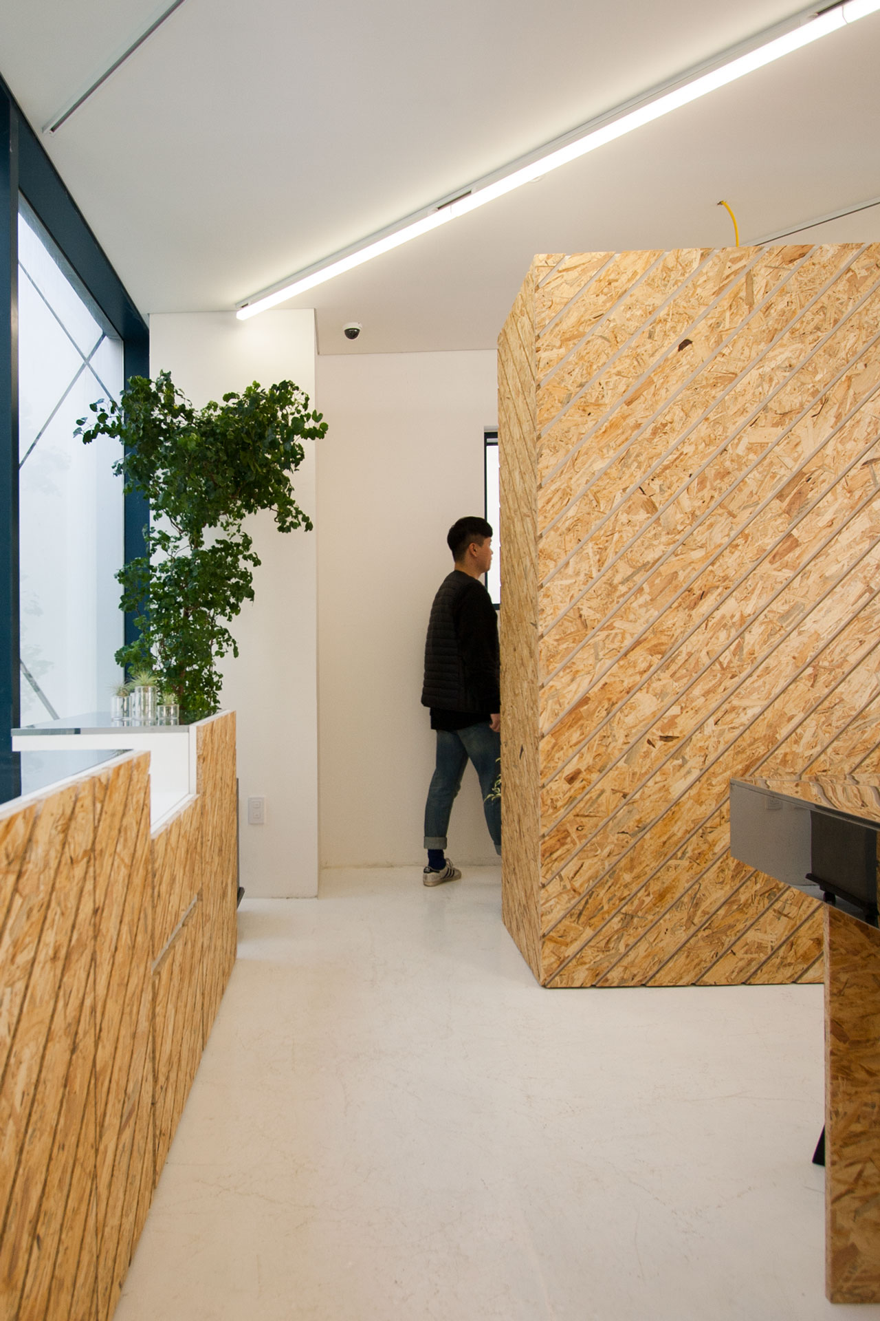
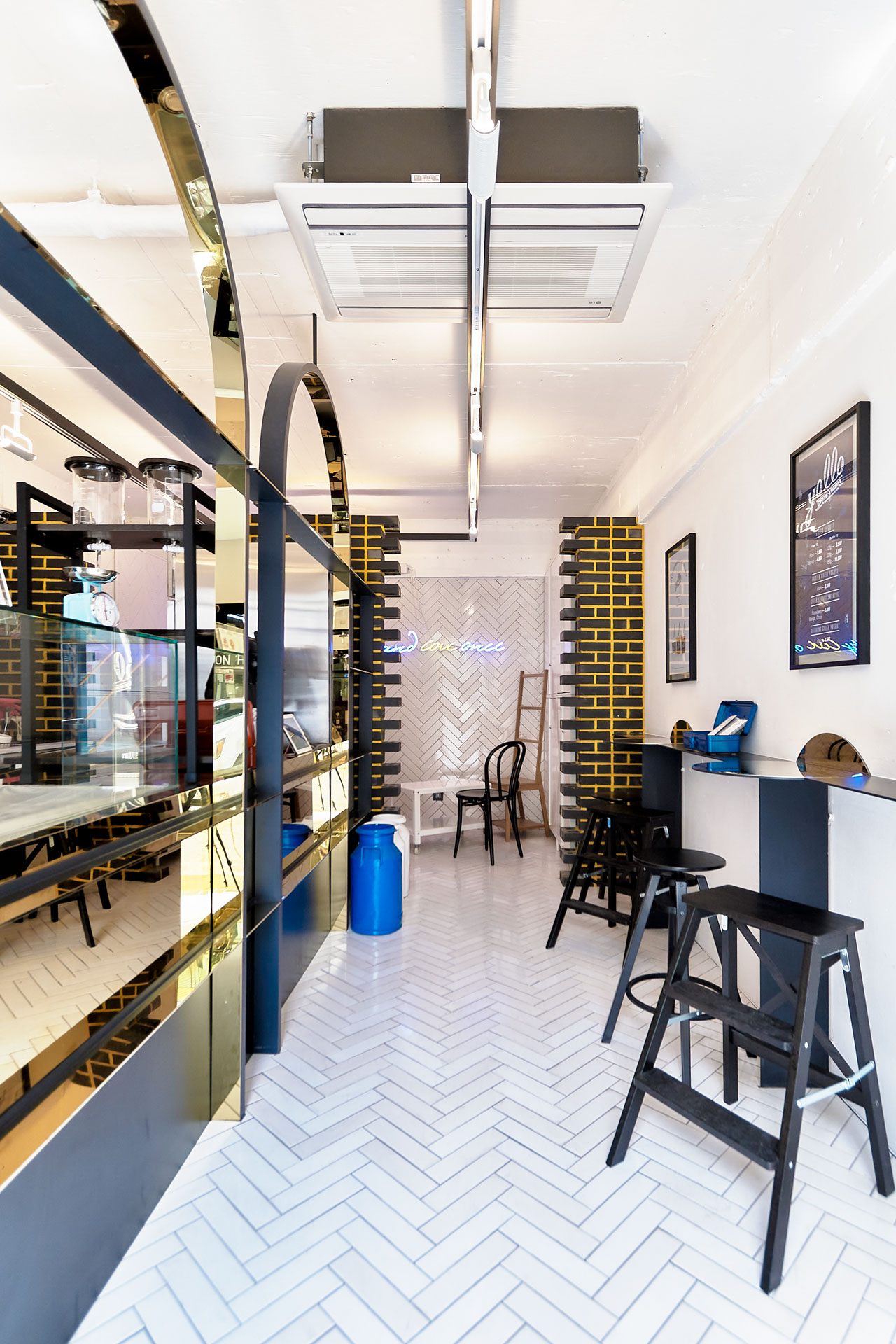
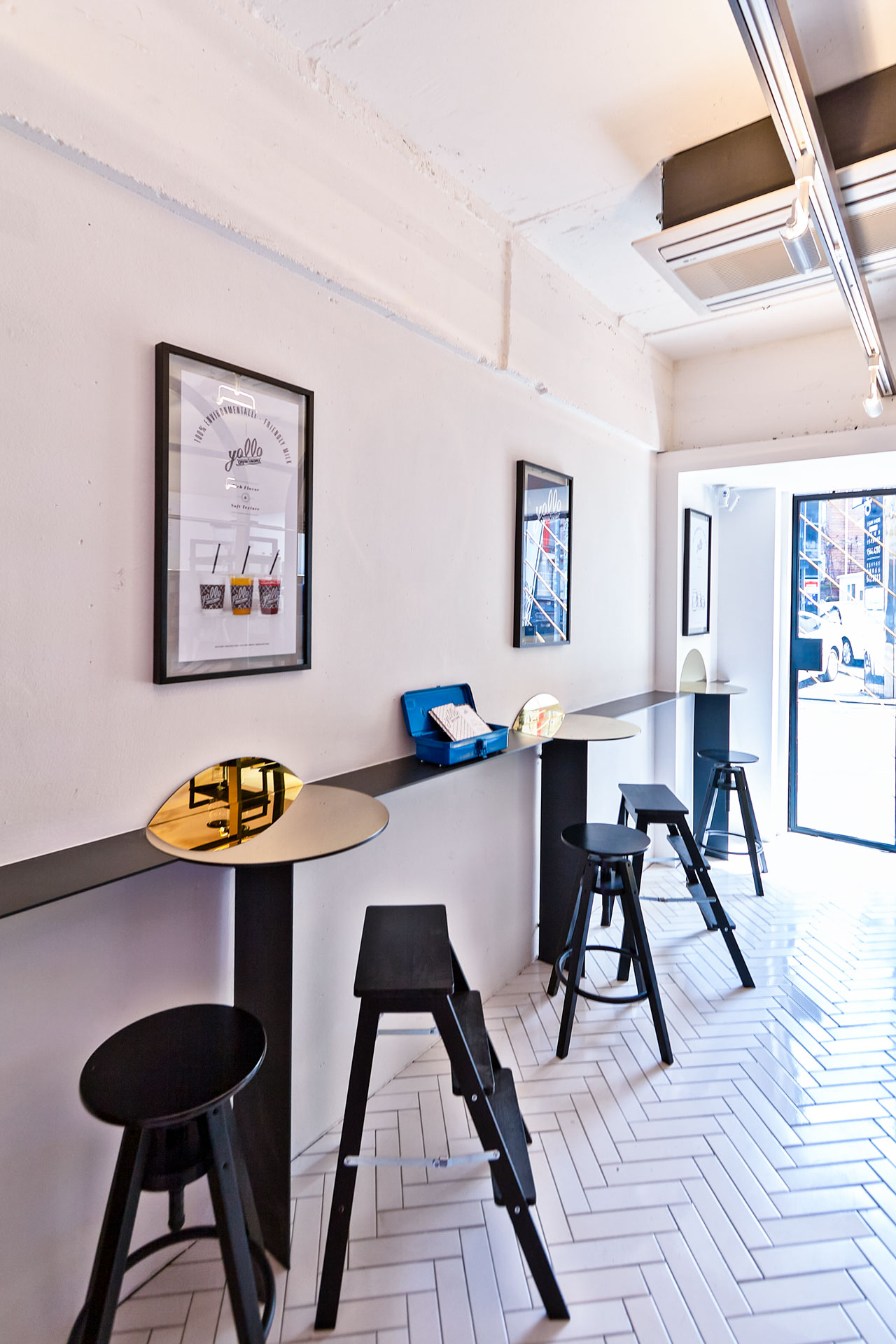
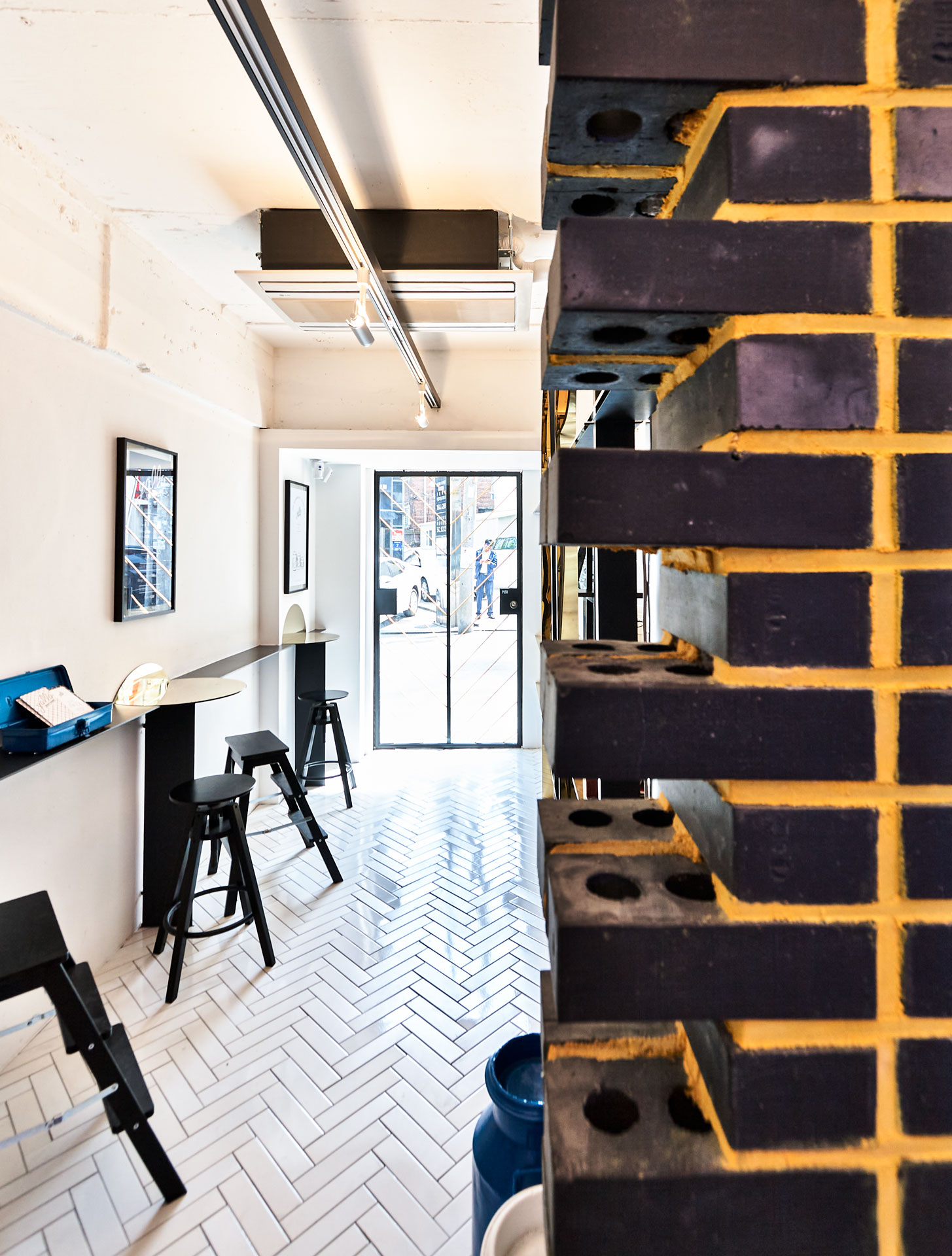
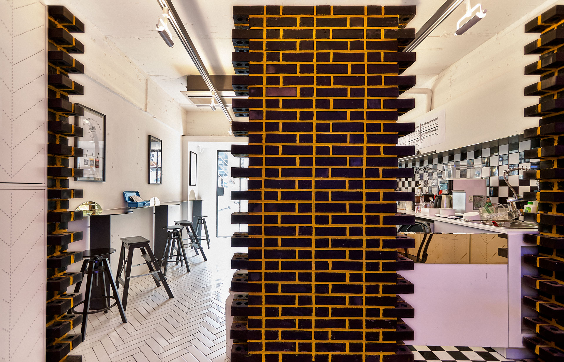
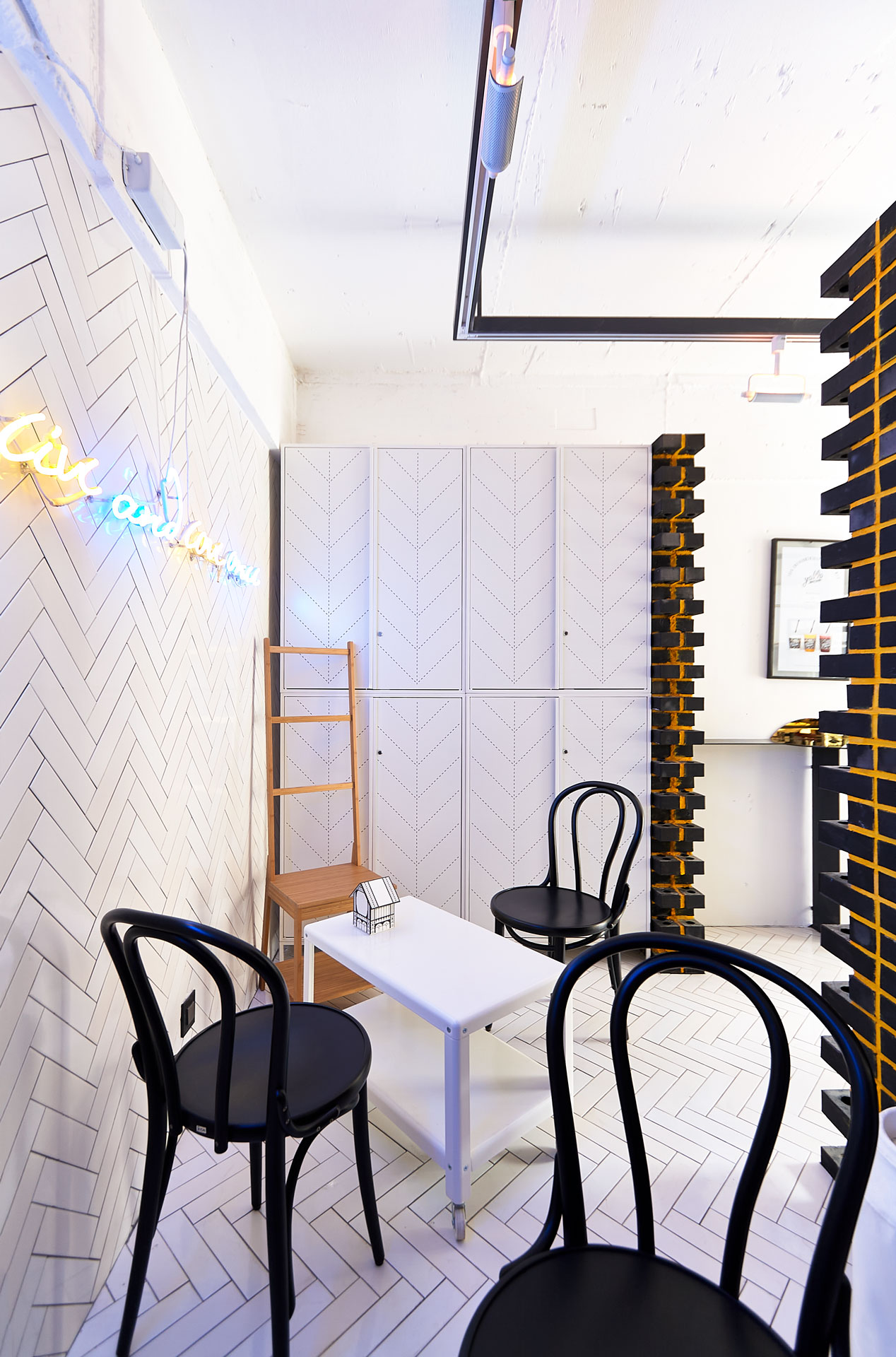
Based on the Retro design of the theme ‘golden
age’ the client required the newly interpreted space design fitting to the
young generation.
Designer had various discussions about different culture, especially food-related culture, of different generations and made a consensus on having ‘golden age’ as a theme of the store and expanded the idea more.
The space tried to arouse the curiosity of general customers visiting the store by not including the stereotypical images people can associate with greek yogurt.
ⓒ 2014 NBDC
All rights reserved. No part of this publication may be reproduced or transmitted in any form or by any means, electronic or mechanical, including photocopy or any storage and retrieval system, without permission in writing from the publisher.
Respect copyrights, encourage creativity!
All rights reserved. No part of this publication may be reproduced or transmitted in any form or by any means, electronic or mechanical, including photocopy or any storage and retrieval system, without permission in writing from the publisher.
Respect copyrights, encourage creativity!
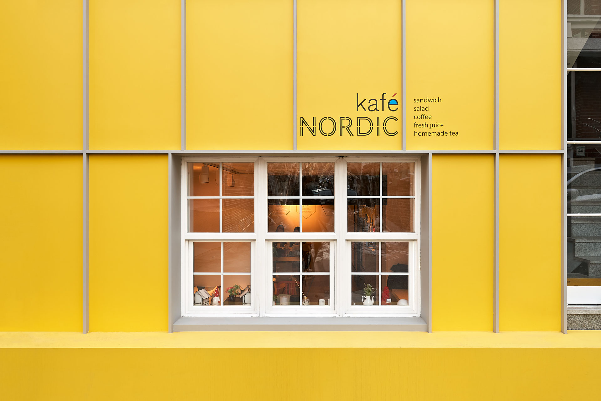
NBDC has an in-depth discussion of “Nordic” with the clients; enriched life, new life style, humor, artistic expression based
on functionalism, smaller but stronger. So, they develop the space design under the concept of “esthetic of inconvenience” in which space is situated in a semi-basement built as residential space.

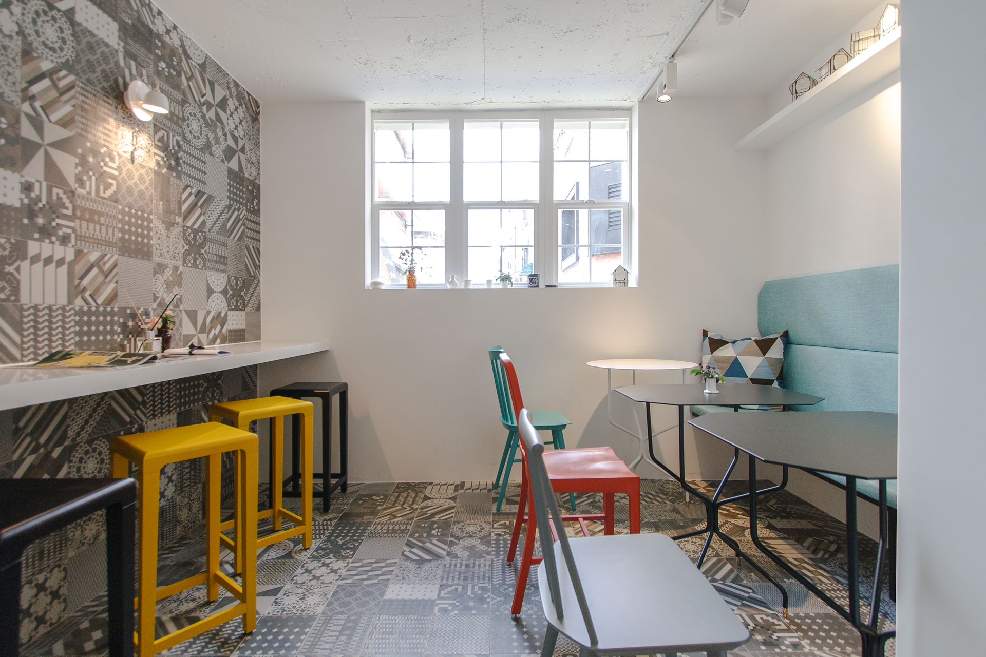
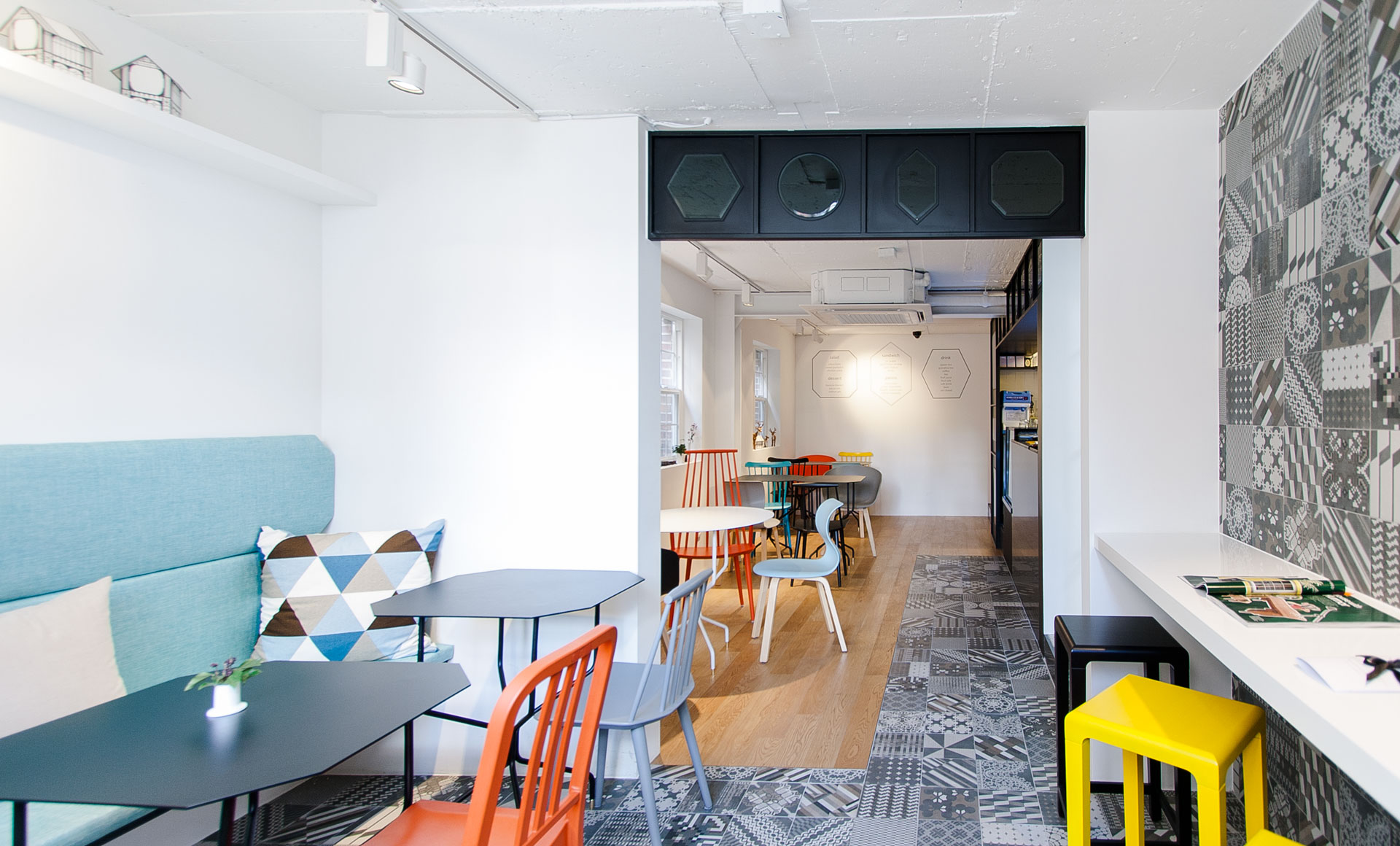
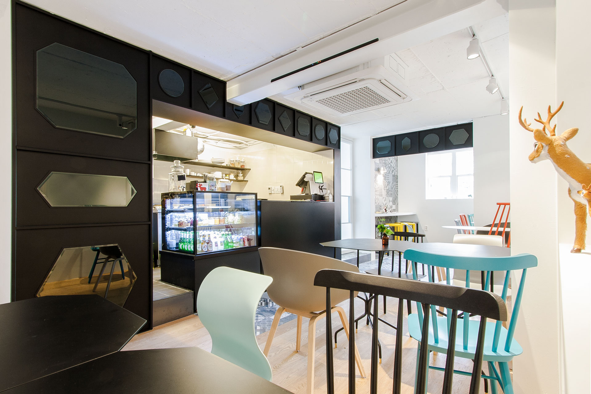
Meaning of Kafe Nordic is combination that is “Kafe” from Swedish, make household of daily life be more beautiful, and “Nordic”, northern Europe. They offer homemade sandwich, Panini and organic tea.
ⓒ 2013 NBDC
All rights reserved. No part of this publication may be reproduced or transmitted in any form or by any means, electronic or mechanical, including photocopy or any storage and retrieval system, without permission in writing from the publisher.
Respect copyrights, encourage creativity!
All rights reserved. No part of this publication may be reproduced or transmitted in any form or by any means, electronic or mechanical, including photocopy or any storage and retrieval system, without permission in writing from the publisher.
Respect copyrights, encourage creativity!


We need
a strategy to capture meaningful stories in your space.
a space with consideration and empathy.
a delicate and comfortable environment.
The individuality of the organization should be reflected in the work environment.

ⓒ 2020 NBDC
All rights reserved. No part of this publication may be reproduced or transmitted in any form or by any means, electronic or mechanical, including photocopy or any storage and retrieval system, without permission in writing from the publisher.
Respect copyrights, encourage creativity!
All rights reserved. No part of this publication may be reproduced or transmitted in any form or by any means, electronic or mechanical, including photocopy or any storage and retrieval system, without permission in writing from the publisher.
Respect copyrights, encourage creativity!
entered someone's space But what if it's just my taste and it's awesome?
It will look different from the owner who uses the space right now, the beginning starts with this simple principle.
It will look different from the owner who uses the space right now, the beginning starts with this simple principle.
ⓒ 2009 NBDC
All rights reserved. No part of this publication may be reproduced or transmitted in any form or by any means, electronic or mechanical, including photocopy or any storage and retrieval system, without permission in writing from the publisher.
Respect copyrights, encourage creativity!
All rights reserved. No part of this publication may be reproduced or transmitted in any form or by any means, electronic or mechanical, including photocopy or any storage and retrieval system, without permission in writing from the publisher.
Respect copyrights, encourage creativity!